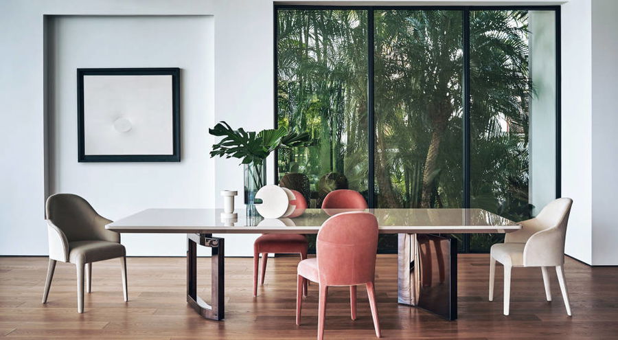
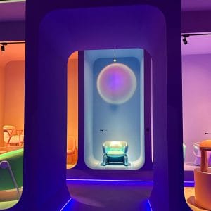
Interior design trends are the result of an ever-changing art highlighted in design shows like the amazing Solone del Mobil in Milan. Taking place inside the cultural hub of Italy and a landmark of innovation in Europe, it is a prime attraction in Milan. Gilded bonsais, pink mannequins, and bubble filled bathtubs replace snow cones, ferris wheels, and the many other stereotypical fair icons. Excitement is in the air for design lovers everywhere!
This week, we take a virtual tour inside the April fair with a fresh lens to view design. Saturated with creations of the world’s top designers and emerging talents, one can’t help but be overwhelmed by the opportunities that exist for interior spaces. Condensed to seven featured studios of this design show, it gives us just enough to dote over.
1. Kid spirit (Circu)
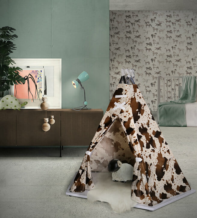
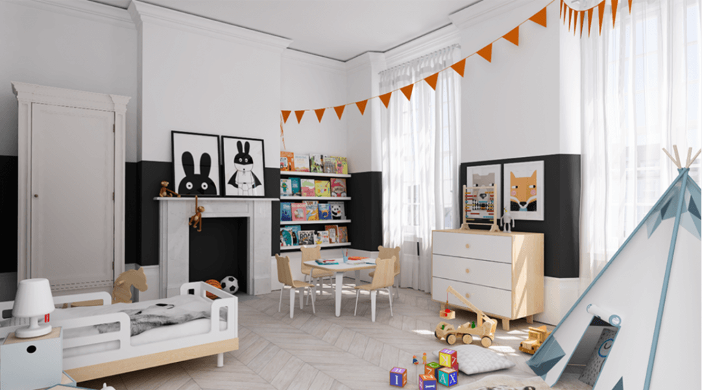
Fresh looks for the little ones were featured by vendors from all across the globe. Circu displayed realities of childhood dreams. From the Wild West, to the tortoise and the hare, the newly launched design firm has an unparalleled imaginative approach to design.
OUR PICKS:
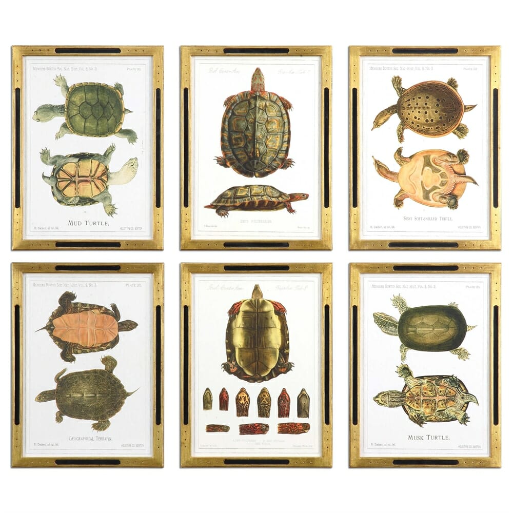
Selecting art is sometimes challenging. One quick filter that proves to be effective, is finding imagery that the entire home can enjoy. Age is irrelevant for this playful yet sophisticated art collection. Naturalistic images like with an array of textures and color come to life when displayed in black satin frames with refined gold details.
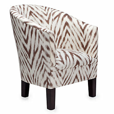
Worried you won’t have a use for the tent featured in Milan? Here’s one way to bring the safari home that is a little more practical. Both bold and geometric, this club chair silently screams adventure.
2. Playful geometrics (Lievore Altherr Molina for Arper)
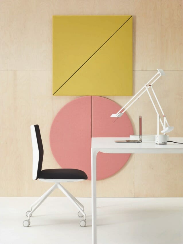
Geo pieces are definitely an interior design trend spotted this year. Focused on spaces for concentration and productivity, Arper designs thoughtfully playful interiors. Geometric acoustic panels reduce background noise and add a splash of color to high volume areas. Think kids spaces or rec rooms for this application. Never again will you have to shout “inside voices please.”
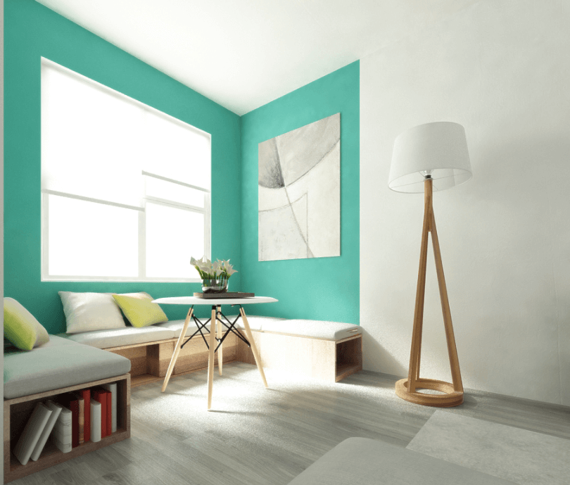
Color creates geometry in many ways. Planes of aquamarine highlight the light filled reading nook of the living area above. Brighter cool hues draw attention in, while darker warm and neutral colors have the potential to reduce focus to certain spaces.
OUR PICKS:
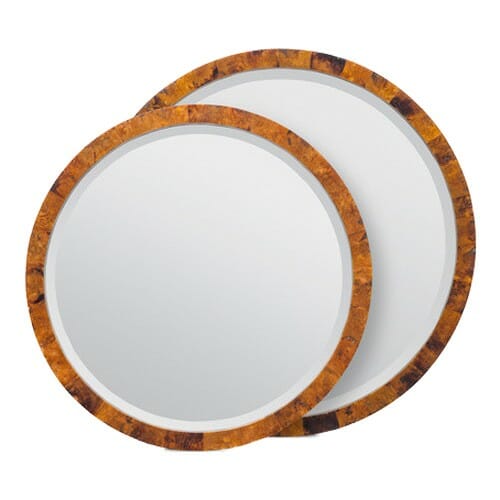
When you go geometric, dramatic or subtle, round pieces are softening to the sight. These Albert mirrors embrace a round form in polished shell frames that are rich and sophisticated.
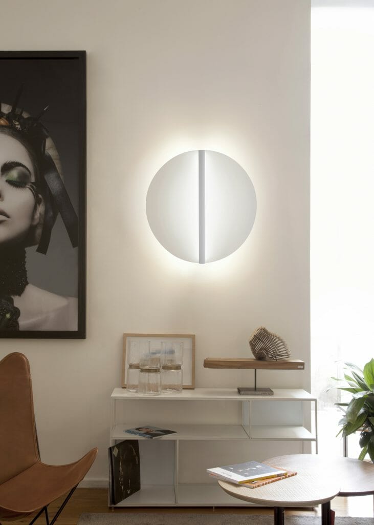
Clear geometry and quick functionality are fully realized in the shield lamp. Whether off or lit, the lamp is a sculptural statement breaking the straight lines of a room. Even better, the lamp comes in many styles ranging from floor to ceiling, all able to be dimmed for endless ambiance.
3. Glam styles (Koket)
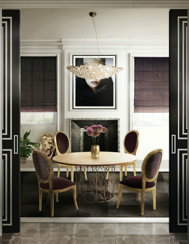
Our partners at Koket displayed approachable luxury and jewel toned interiors in Milan. Attendees described the display as “highly edited collection of case goods, upholstery, lighting, textiles and soft goods. KOKET’s savoire faire is intoxicating: any detail or element isn’t forgotten by their artisans in their dining room sets.”
OUR PICKS:
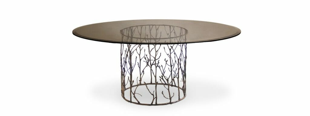
Koket uses the language found in a fairytale, describing the table as having the “essence of an enchanted forest. The antique gilded branch like structure can’t help but mesmerize the beholder.”
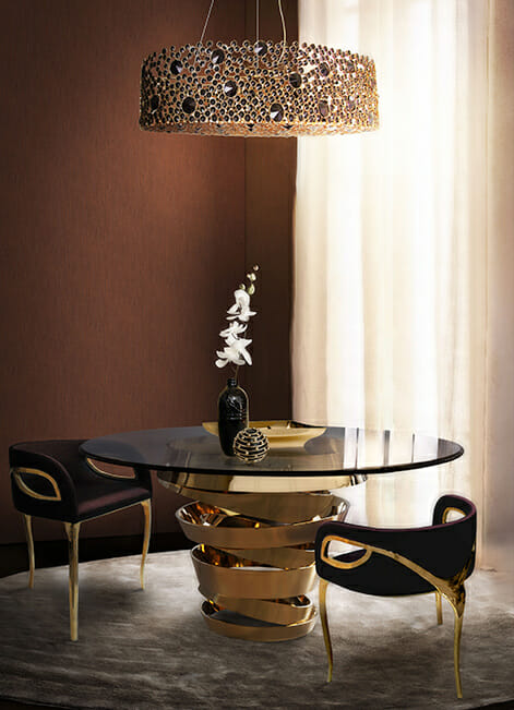
Can’t miss out on another escape to the surreal, so here is Koket’s very own description of thee luminaire: “The elegant silhouette of this chandelier takes its brilliance from the skillful application of the crystal. The eternal circles are individually wrapped in brass and placed with astonishing attention to detail. The end result is an extraordinary source of light.” Gorgeously glam!
4. Featured color: noir (Artifort)
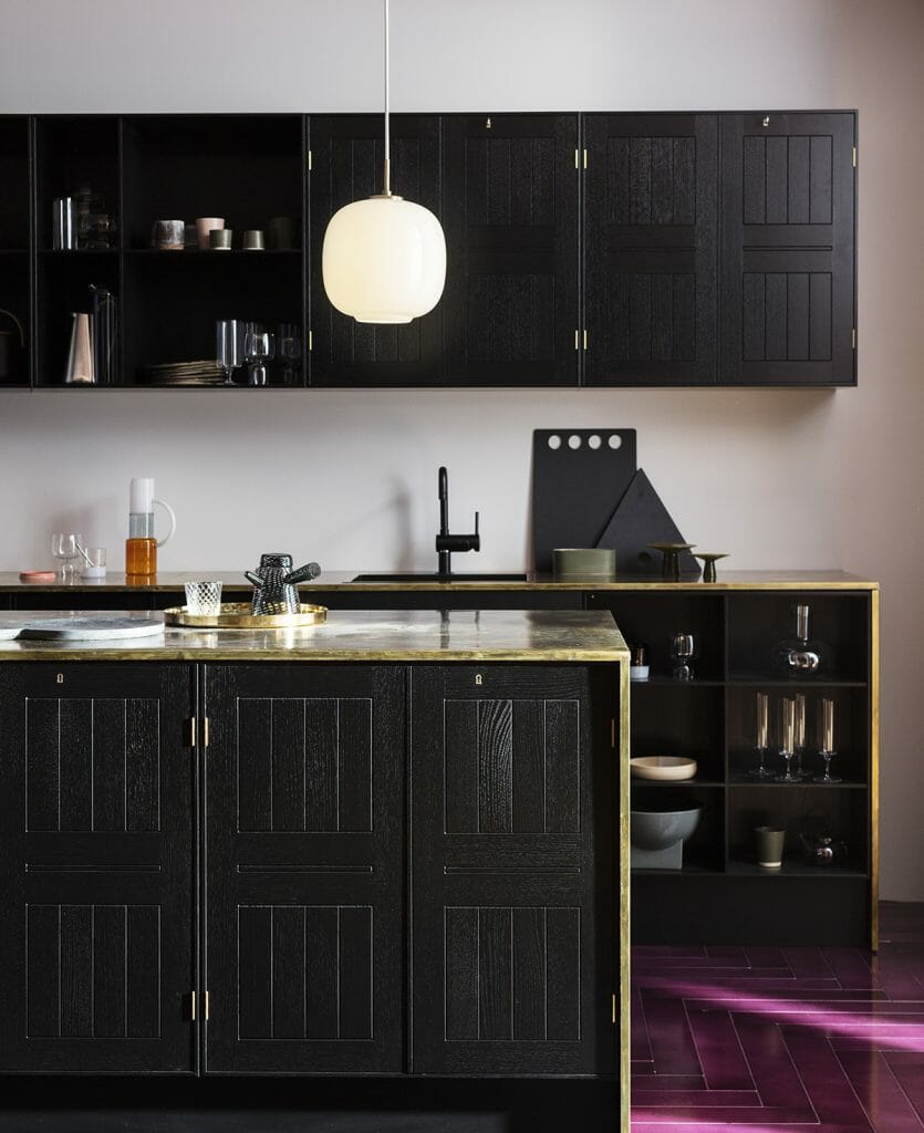
Introducing black into your space is in line with recent interior design trends spotted. The word complexity sums up this kitchen ensemble perfectly. Reminiscent of arts and crafts, a blackened finish highlights more than shadows the inlayed detailing. Trimmed in a thin yet endless countertop, it’s impossible to stop gazing at the space. It leaves you asking what exactly is it that is so charming.
OUR PICKS:
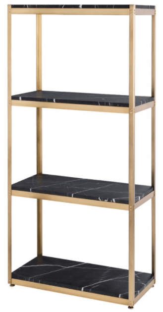
At first glance, it looks like a handyman’s DIY gone glamour. A simple garage shelving system meets luxe marble and gold, redefining industrial glamour. Equally at home in the kitchen or home library, The Iro Shelving Unit both heightens and enlightens its surroundings.
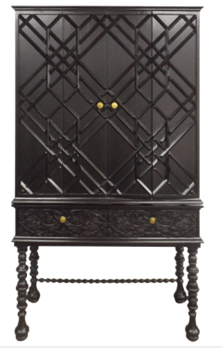
Art deco styling lifts an everyday hutch to neo-deco heights. The number of styles represented by the piece is nearly mesmerizing. Baroque drawers juxtaposed against spindled legs and Victorian-esque hoof feet.
5. Golden natural elements (Boca Do Lobo)
http://diningroomideas.eu/dining-room-furniture-exhibitors-salone-del-mobile-2017-visit/
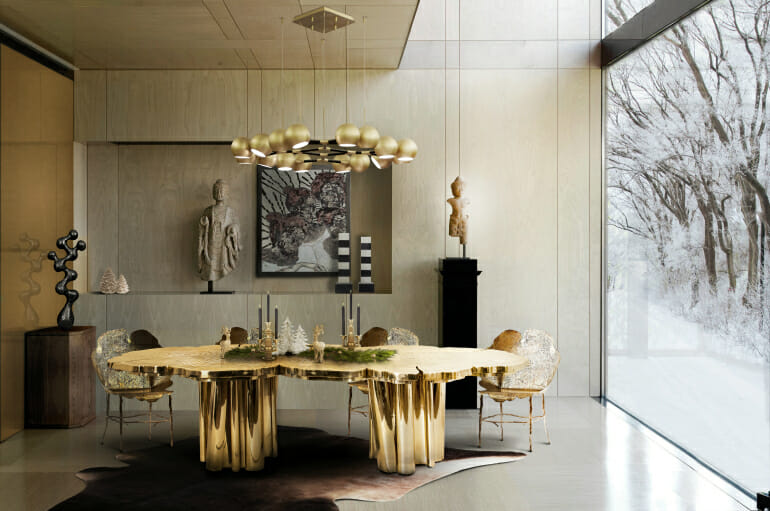
Floor to ceiling windows effortlessly integrate the exterior with interior space. For those not so lucky to have this feature, interior elements can have a powerful exterior pull. Texture and form are two essentials in selecting furnishings that bring the outdoors in. Add a rich metallic finish and a show-stopper is made.
OUR PICKS:
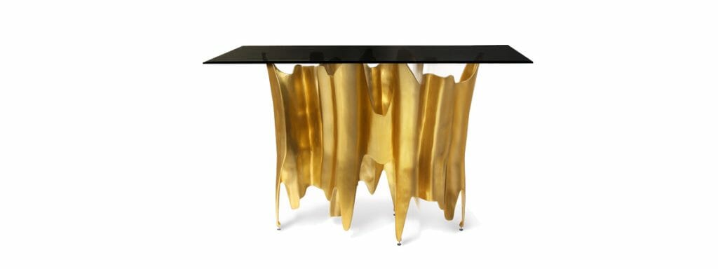
After living with a console table for a month or two, you soon realize it’s an extremely critical piece. Its value comes by way of having a place to drop keys, drinks, and bags. It has become the new age junk drawer. For this reason, why can’t it be sculptural? Attention is instantly drawn to the base of the Obssedia console with a gilded aluminum base.
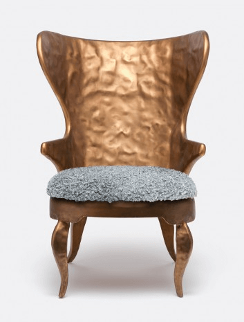
Textures are at play on the Alfred Chair. An appropriate name giving the chair the likeness of a human, you can feel its personality immediately. A gilded iron frame holds a nappy cushion for stylish comfort.
6. Curves (Yabu Pushelberg for Linteloo, Henge, and Glas Italia)
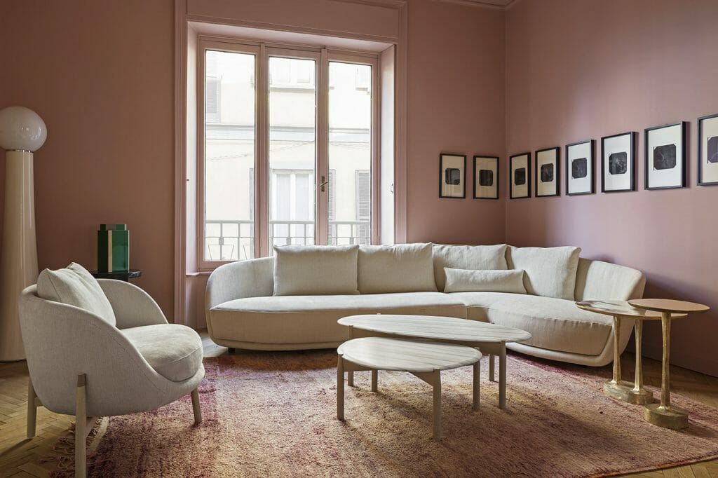
Straight edges and angles will always be fundamental to modern style. However, curves are a sexy alternative, adding a softness and interest to contemporary pieces. Such appealing decor is one of the appealing interior design trends shown in the Milan Furniture design show.
OUR PICKS:
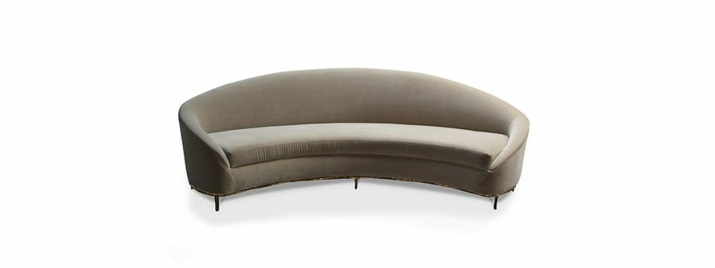
The curvature of the Vamp Sofa makes it the perfect rule breaker. Wrapped in luxurious velvet and elevated by brass legs, the piece speaks volumes. Against ornate molding or standing alone in a gallery, it offers both sleek style and textural contrast.
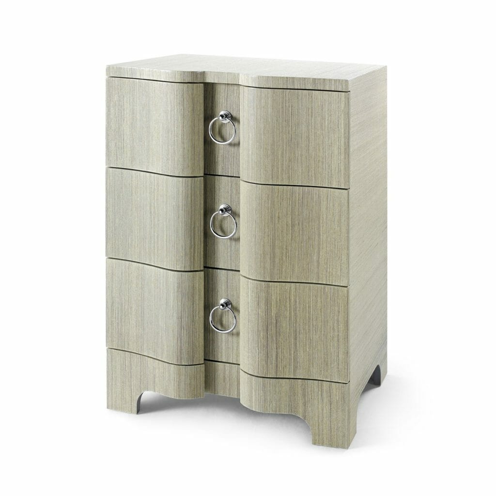
Curves get tamed on the silently small three drawer side table. Its cubic form balances a serpentine front holding nickel-finished pull rings. In brightly lit rooms, the table reaches its full potential with shadows and highlight display.
7. Ombre love (Bloc Studios x Sabine Marcelis and Carl Kleiner)
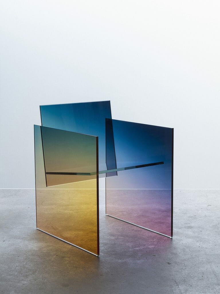
Artists and their unique creations bring a freshened take on what interior space can become. For instance, what happens when a simple ombre finish inspires not only accents but furniture pieces as well?
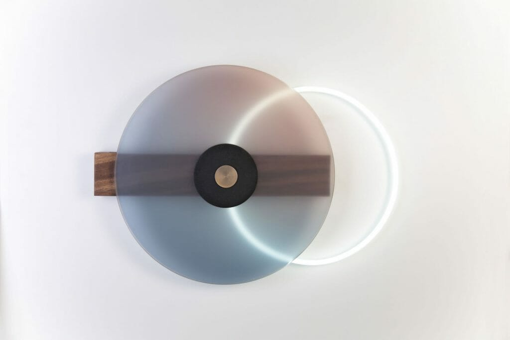
Design’s power is revealed when users become fully engaged with their surroundings. Much like a phone, a simple swipe of the neon ring illuminates the wall lamp by Comité de Proyectos. Ombre, solid wood, and coated metal layer together for a solidly striking light source.
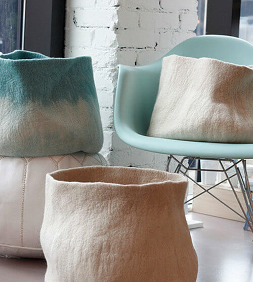
The ephemeral look of ombre is never limited to flooring or wall covering. Through a few simple accents such as the hand dyed canvas totes above, offer an instant Bohemian chic dynamic.
Design shows breathe new life to the world of interior design. Inspired by pieces featured in this month’s Milan Furniture Show, our Decorilla interior designers are ready to infuse your space with these picks, creating spaces that marvel. Start a project to begin your design transformation.
Written by Decorilla interior designer, Devin S.
[Images: 1, 2, 3, 4, 5, 6, 7, 8, 9, 10, 11, 12, 13, 14, 15, 16, 17, 18, 19, 20, 21, 22 ]


Comments
1 Comment
Most Voted
8 years ago
[…] a close eye on the latest and most exciting design trends that is is bringing along! Last year Salone del Mobil gave us some hints about what to expect. The one thing we always want to change or update is our […]
[…] a close eye on the latest and most exciting design trends that is is bringing along! Last year Salone del Mobil gave us some hints about what to expect. The one thing we always want to change or update is our […]