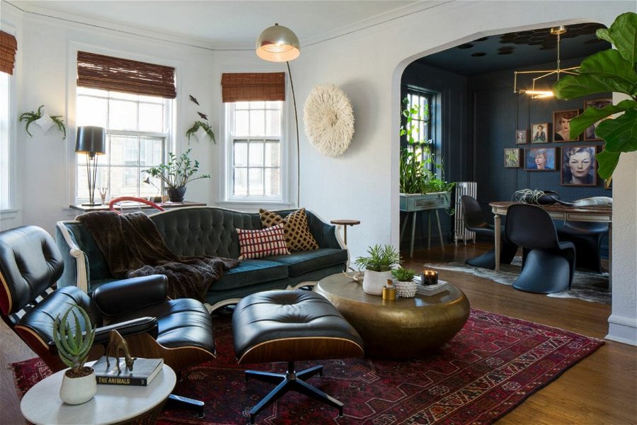
How do you spice up a dull studio apartment? Edgy, playful and eclectic were the client’s indications on how to decorate his, and thanks to Decorilla online interior design services he could easily get his studio apartment design and achieve the style he always wanted to come home to.
THE CHALLENGE
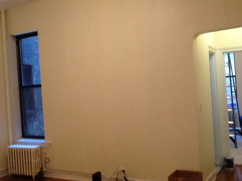
The living room of this NYC studio apartment presented two major challenges that the design had to take into account:
- Give character to an overall dull space
- Balance for very little sunlight, coming only from two narrow windows at the back of the room
THE INSPIRATION
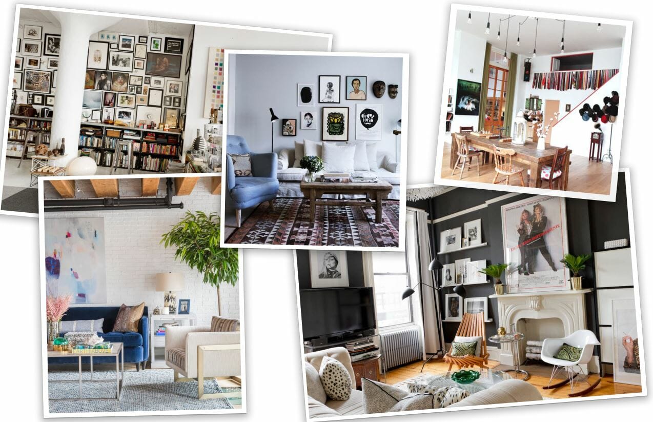
The client clearly asked for an edgy and playful style, with preference for bold pieces of furniture that make a statement. The artwork pieces he already owned were the perfect starting point for the creation of an eclectic design. They brought in a mix of bold colors that inspired this studio apartment interior designer in selecting equally bold furniture and décor for the space.
THE DESIGN
Decorilla interior designer Anna T. literally transformed the dull blank walls of this studio apartment living room into an edgy space with plenty of personality and a bold color scheme. The walls are painted in a very light grey, creating the ideal neutral background for the vivid mix of colors and textures selected in both furniture and decor. One single dark grey accent wall is introduced to give character and ground the space without making it too dark.
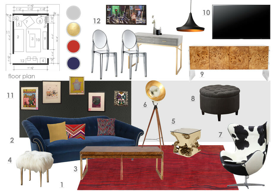
The client was given the choice between the proposals of two different designers. Both had some similarities in the furniture layout, but the client chose Anna’s striking mix of shapes and colors. Modern lines in the furniture and the juxtaposition of colorful patterns and bold textures caught the client’s eye, translating his edgy and playful concept perfectly.
THE RESULT
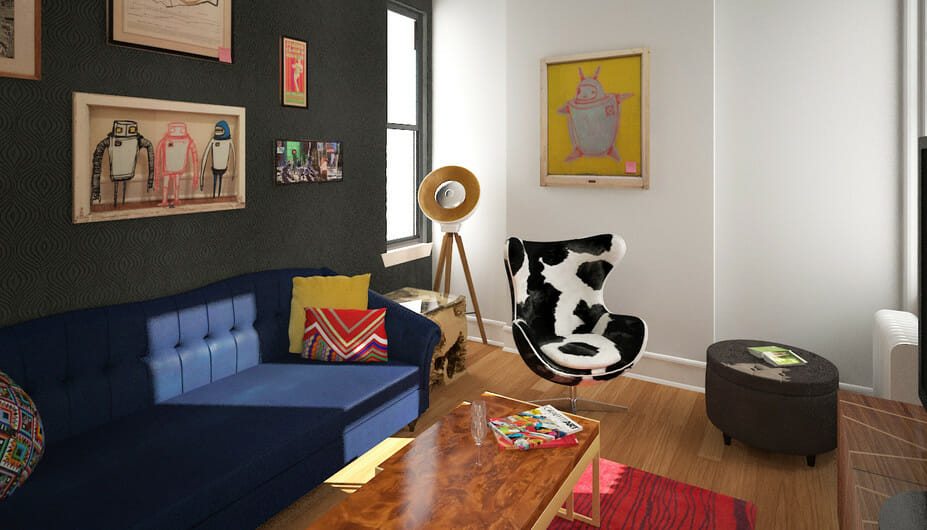
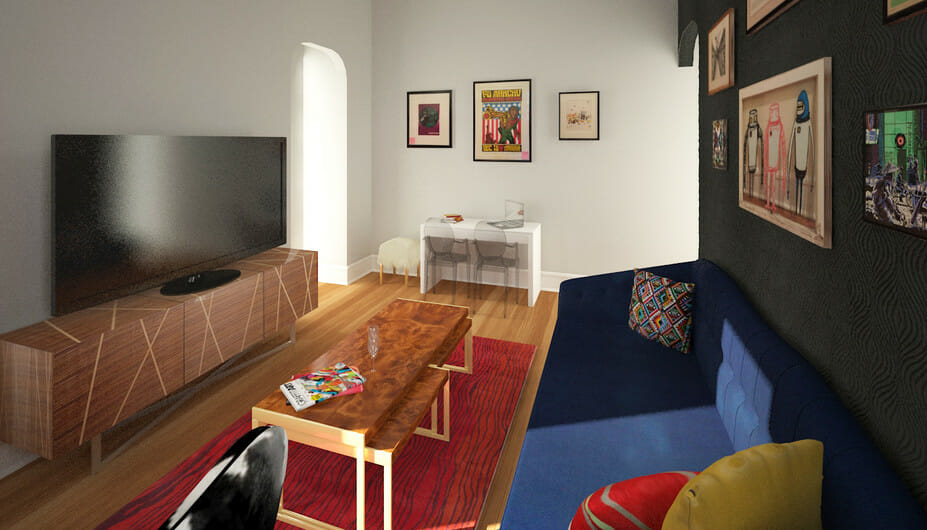
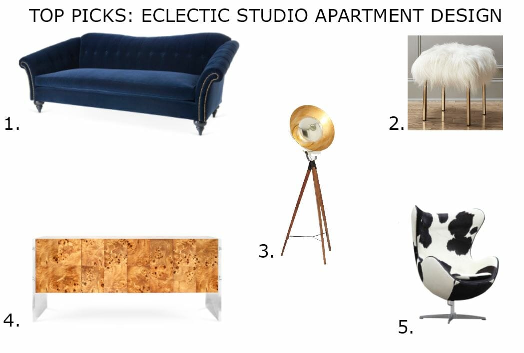
The final result is a fresh and playful space, that feels very personal to the client while being inviting for his guests. A linear navy blue sofa and a long TV console take advantage of the elongated shape of the floor plan and the addition of a cow-print armchair and a soft ottoman create an inviting conversation area. A red patterned area rug in the middle grounds the space and makes it even edgier. Two very different side tables introduce a touch of brass in the design and provide plenty of support for beverages and snacks.
The existing artworks – that were the initial inspiration for the whole project– are now part of a gallery wall that pops up onto the dark grey accent wall behind the sofa. To make the most of the limited size of this studio apartment, the living room also incorporates a dining/working area. A narrow desk and a couple of see-through chairs are added on one side of the room, giving some space for dining or working while leaving sufficient circulation and avoiding to clutter the space too much. Together with the choice of grey neutral walls, leaving the windows bare is another wise decision that doesn’t attract attention to the background of the room and lets the other elements of the design really shine.
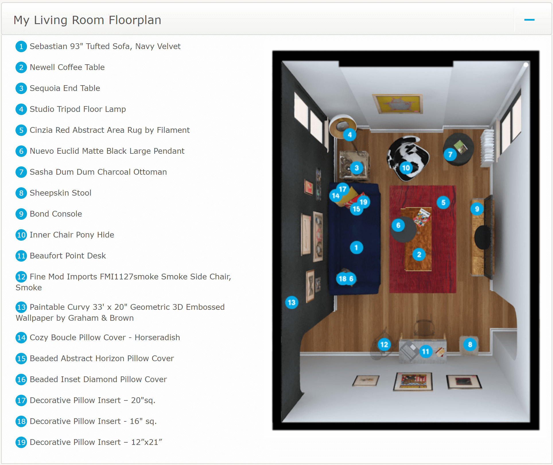
Realistic 3D renderings allowed the client to visualize the finished look of his studio apartment before committing to any purchases. After fine tuning the product selection with his designer, he moved onto the shopping phase with confidence that he loved how everything looked.
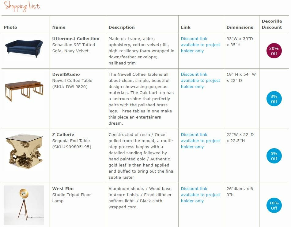
GET THE LOOK
Look no further for an easy and affordable way to design your home. Online interior design may just be the solution for you. Simply share how you’d love your home to look like and Decorilla’s designers will make it happen! The Decorilla team will also help with orders, tracking and eventual returns, making the whole decorating experience much more enjoyable.

So if your home needs some love, start your free interior design consultation with Decorilla today!
[images: 1, Decorilla Project, Decorilla Designer Anna T.]


Comments