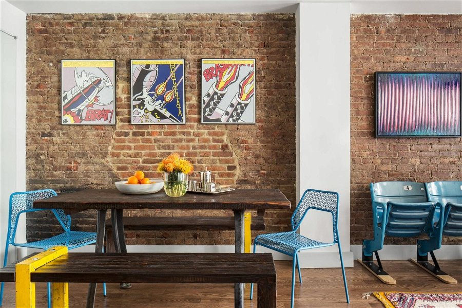
When living solo, sometimes style can get buried behind piles of dirty clothes and dishes…because nobody is seeing that after all, right? But actually, giving your bachelor pad an organized and stylish look is not that hard! Take a look at our strategies to make the most of your small space. And for a finishing touch, read through for our tips to select the right bachelor pad art!
Plan your bachelor pad art
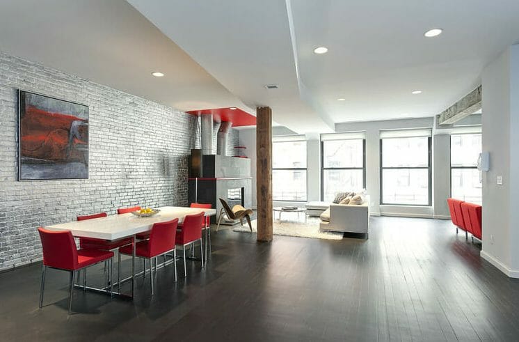
This is actually a general tip, that works both for bachelor pad design and for any other space. It sounds obvious, but planning before you go shopping is really key!
Start thinking at where you want your art to be. Will it be the focal point of the room? Or maybe just a subtle addition? Once you’ve chosen which wall you’re going to dress up, take your measurements. And while you are at it, make sure you note down eventual plugs and switches that your artwork shouldn’t cover. Another very practical point to consider upfront is how you’re going to hang your art. If making a hole is not an option, you can always use removable command hooks to hang a canvas or framed art.
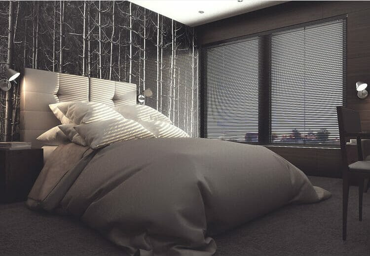
Bigger is better
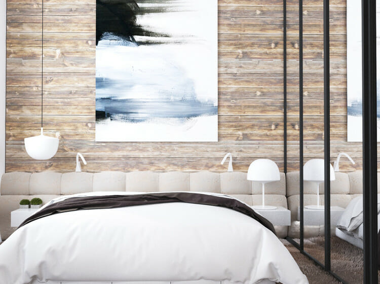
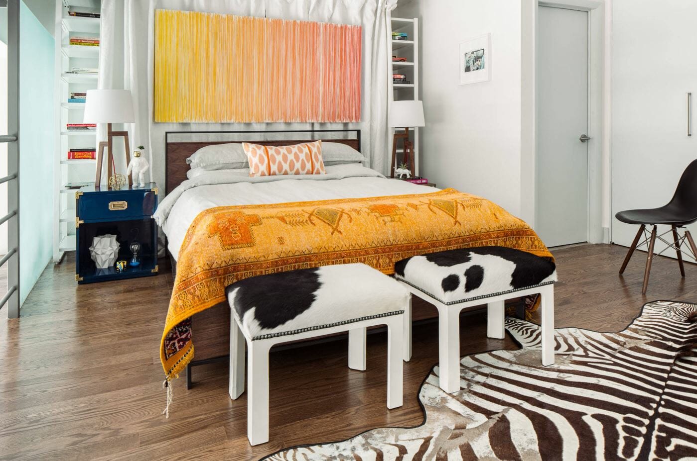
Art is always a great occasion to add character to a space, and bachelor pad design is no exception! In fact, it’s incredible how much a dull room can change by just adding an artwork on the wall! And going big will make the effect even more dramatic! In particular, there are a couple ways to get this effect. The first is clearly to choose one oversized artwork that alone makes a statement. Or alternatively, you can mix and match many smaller prints and create your own gallery wall! This is also a way to stretch your budget and give a whole new vibe to inexpensive prints!
Vintage bachelor pad art
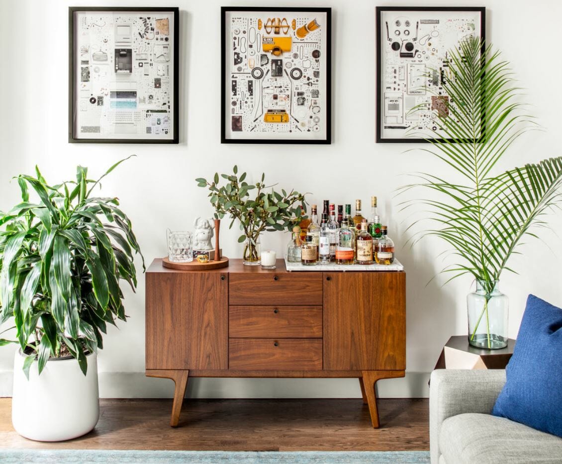
A vintage touch is definitely ideal in a bachelor pad design, as it gives that intriguing masculine vibe we like. And art is an easy and affordable way to get it. A great example of vintage art would be an original AD or movie poster from the Nineties. But a photo with a nostalgic feel will do the trick just as well!
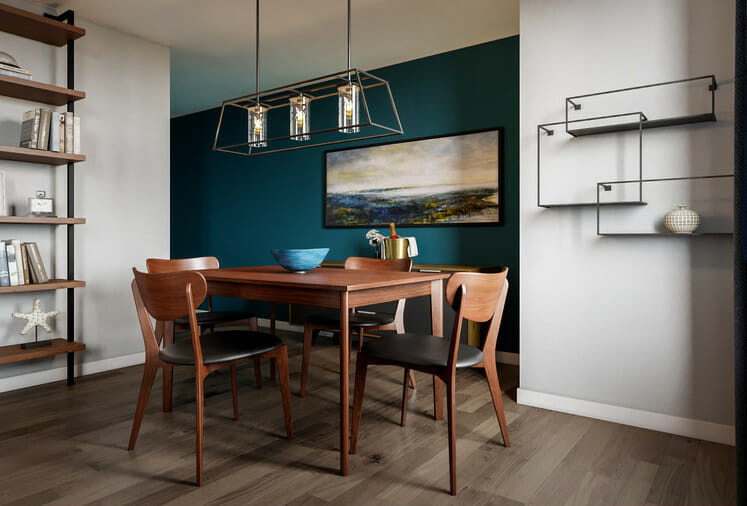
Black and white bachelor pad decor
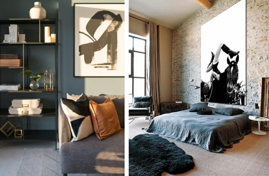
Let’s say you’ve already got plenty of colors going on in your space or you’re not sure which ones to choose for your bachelor pad art. The solution is simple: go black and white! The right black and white art is definitely going to add a masculine vibe to your space, and it can be just as dramatic as a colorful one! Hand-sketched silhouettes, black and white photos or graphic prints are all great options! And they will not clash with your existing decor!
Mix styles
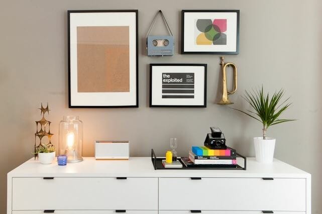
Interior design styles are there as a guidance, not a cage. So, if that’s something you like, feel free to mix styles! Add vintage art in a contemporary furnished space or pair a modern poster with a more traditional room design. This alone will add tons of character to your home and make your bachelor pad design unique to you! Plus, we bet it will become a great conversation starter!
Add texture
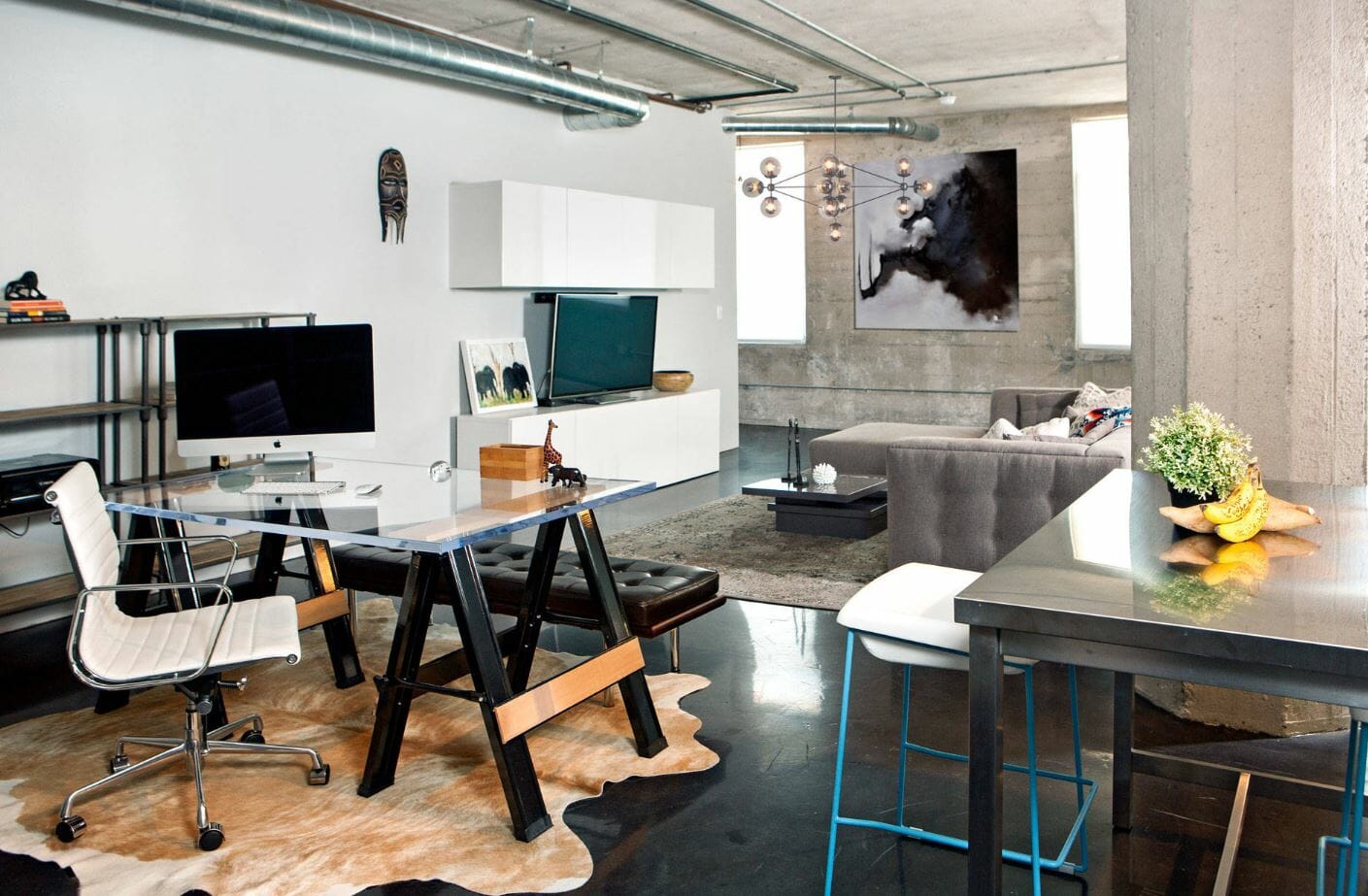
Art doesn’t necessarily have to be 2D, and you’ve got plenty of 3D options to choose from! To start with, a few relief details on a 2D artwork will immediately add an extra something to it. Alternatively, you may want to choose a 3D wall decor like a road sign or a wood decor. Or, you can go for a visual texture, like brick wallpaper, that will give your bachelor pad design a totally new vibe!
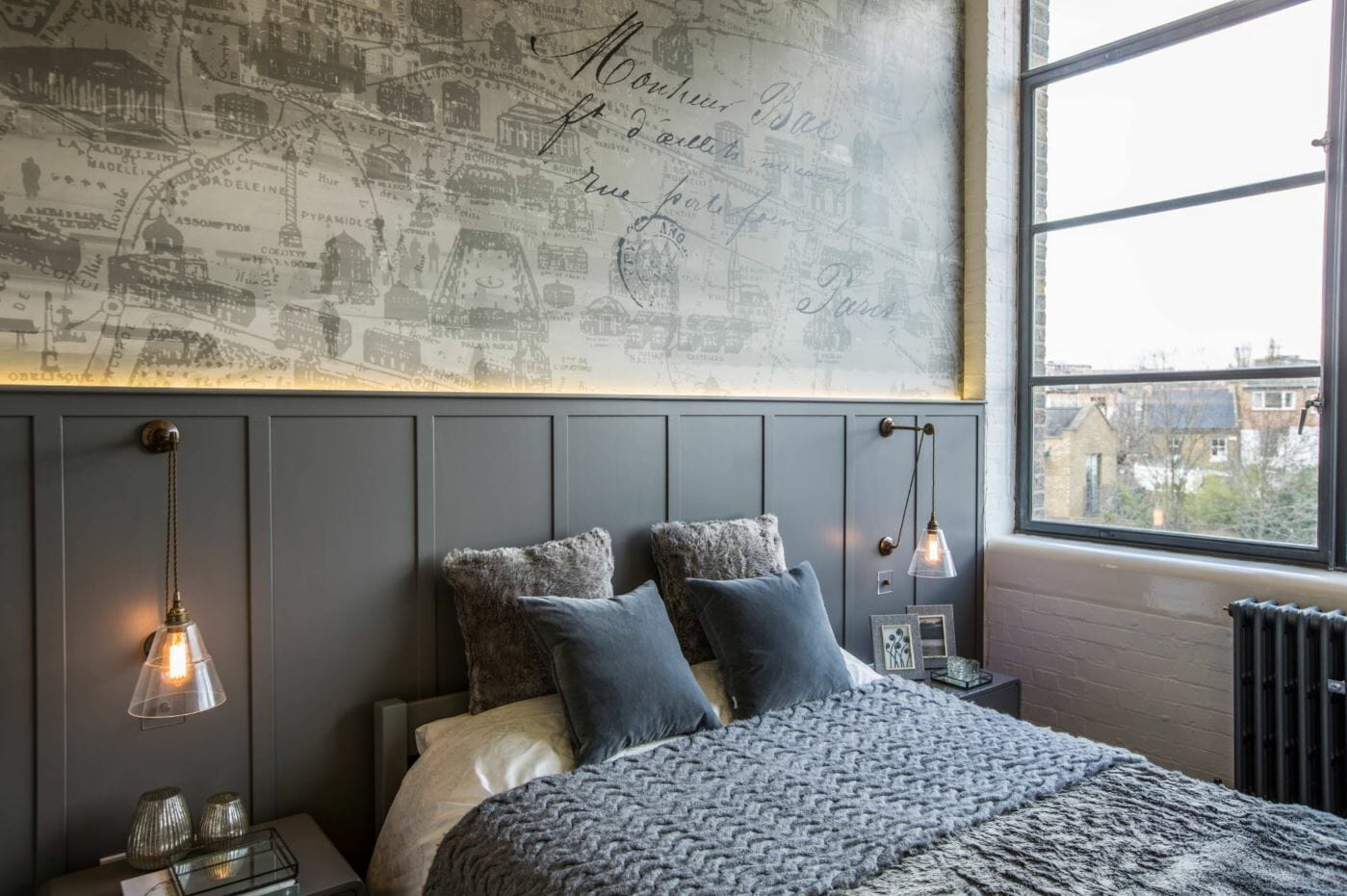
Now that you know exactly how to choose your bachelor pad art, you may be tempted to go one step further and give your space a complete makeover. Well, Decorilla is here to help!

Schedule a Free Interior Design Consultation with one of our talented designers today and get the design you’ve always wanted without breaking the bank!
Written by Decorilla designer Silvia C.



Comments