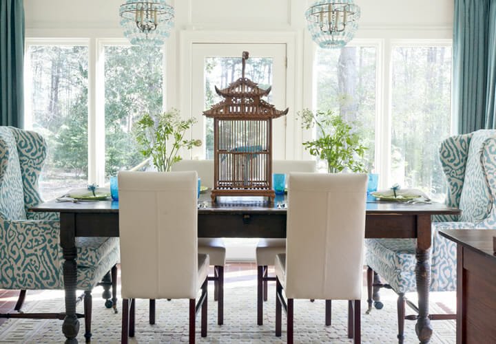
Ahh summer time! The season to be a bit more carefree, to take risks; and what better place to start than your personal home?
Gone are the days where you had to follow design rules to make your home be style worthy. Beautiful things happen when you step outside of the box, when you bend or even break the rules from time to time.
So don’t be afraid to challenge the interior design rule book and add a splash of bold and fun this summer. Here are 10 rules to ignore and interior design tips to consider as well.
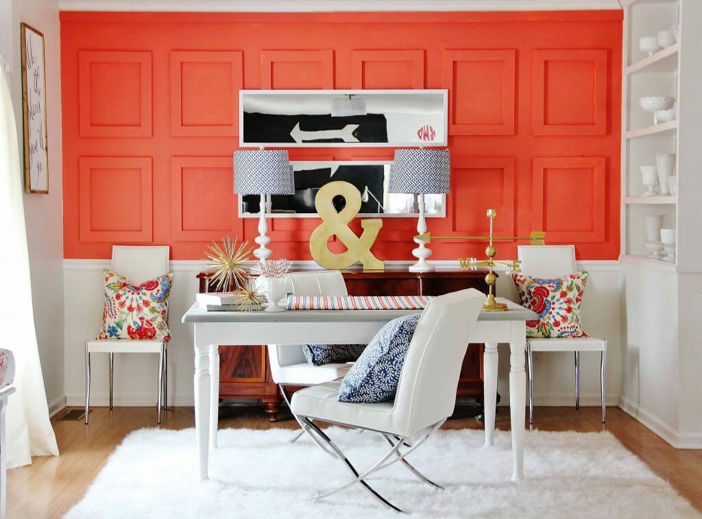
1. Don’t mix patterns
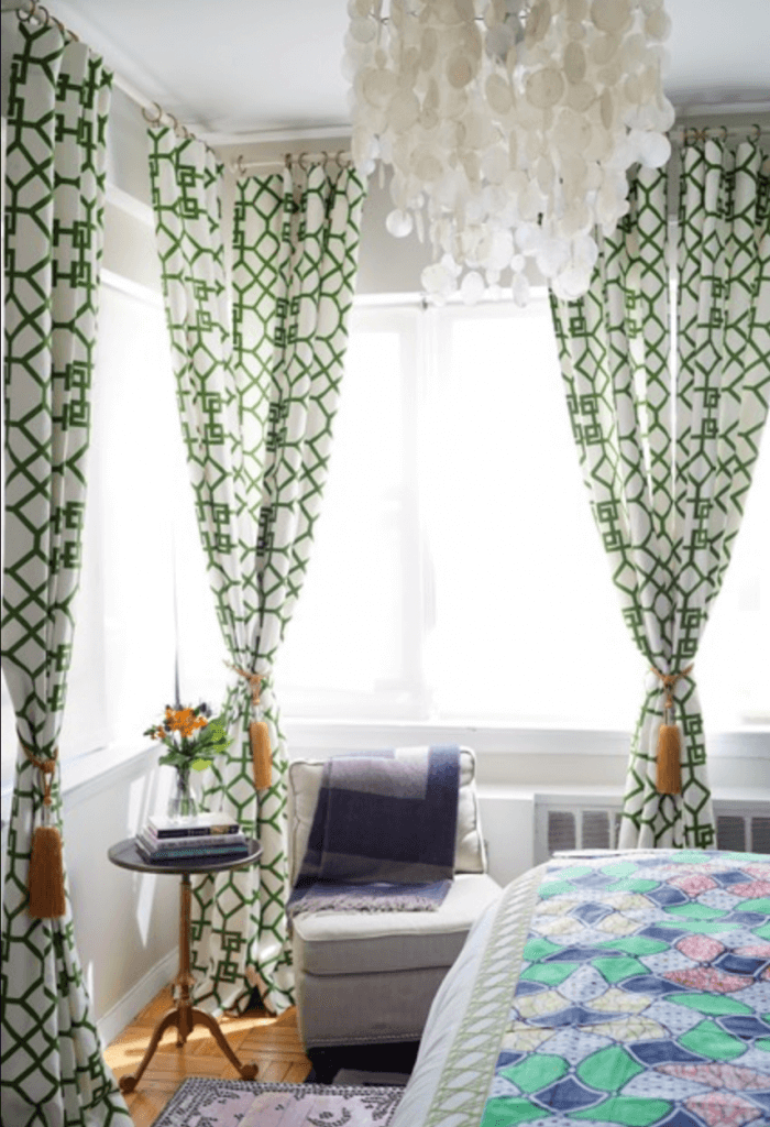
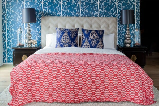
Why not? Polka dots and chevron. Paisley and stripes. Feel free to bend conventional interior design rules if you feel like it! After all, when done right, mixing patterns is the perfect bold accent in any space. The trick to mastering this broken interior design rule is staying in the same color family and changing the scale between the different patterns. Mixing patterns shows your sense of style and personality in a space!
2. Keep knick-knacks to a minimum
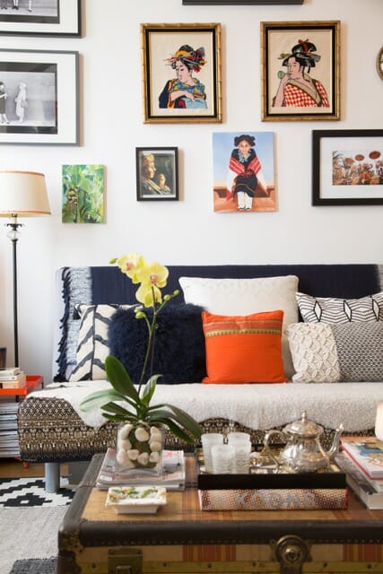
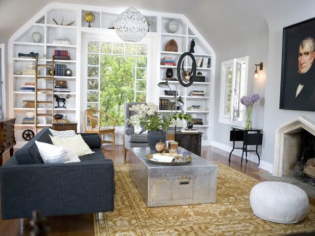
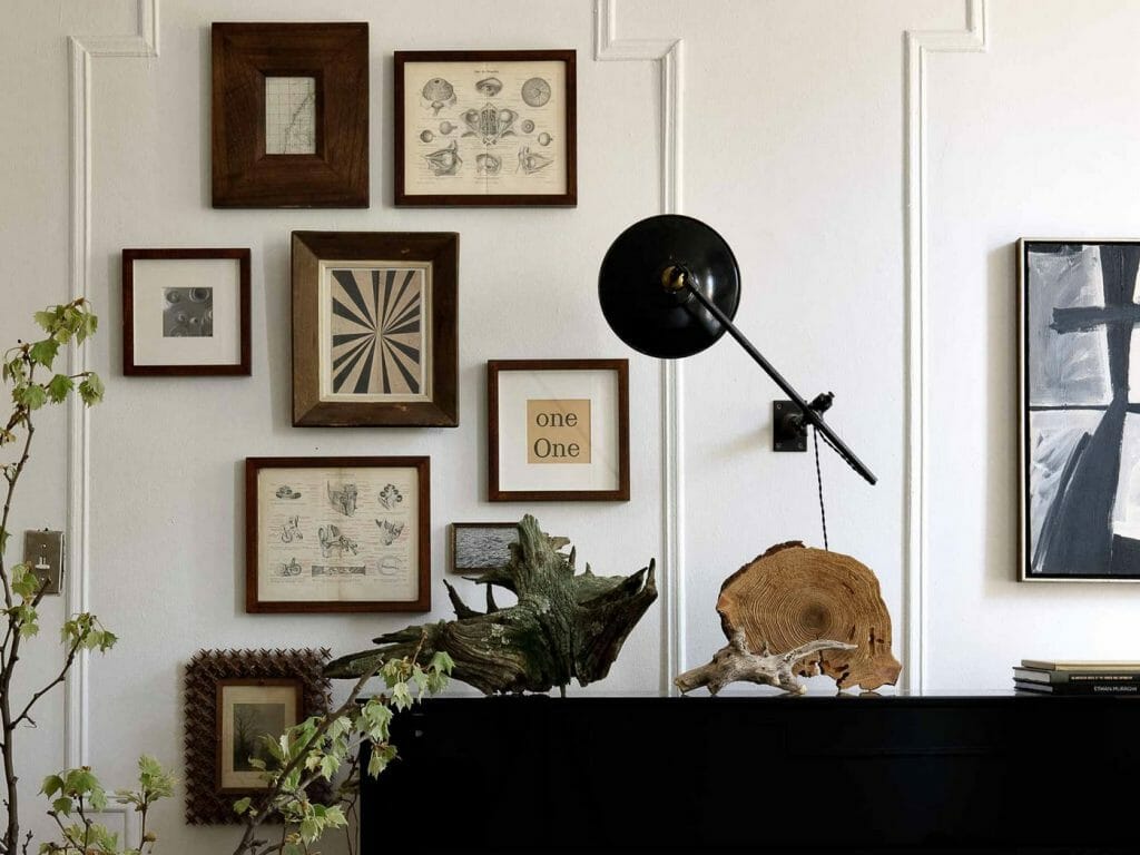
The famous saying is that less is more. But when it comes to your home, don’t be afraid to do the opposite! Show case your favorite objects and items and be proud. It is all about the right placement (like a large grouping or gallery wall) to add something special to your home. Need help with the right arrangement? Your online interior design services can assist with curating the best accent decor scheme.
3. Strive for perfect symmetry
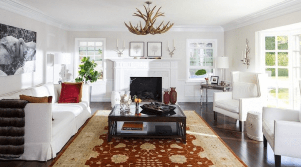
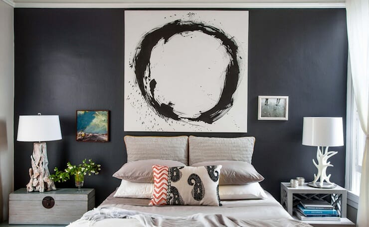
We aren’t going to lie; sometimes perfect symmetry is gorgeous! It’s one of the golden interior design tips, after all. But sometimes it gets a little mundane and shouldn’t be a mandatory interior design rule to follow! When it comes to furniture placement it is all about balance. Have a lamp? On the opposite side use a plant of the same height to ditch the perfect symmetry look and add interest!
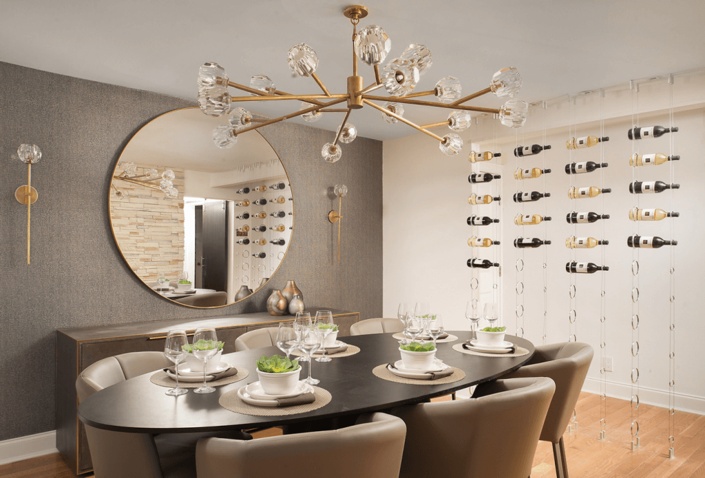
4. Have a matching dining room set
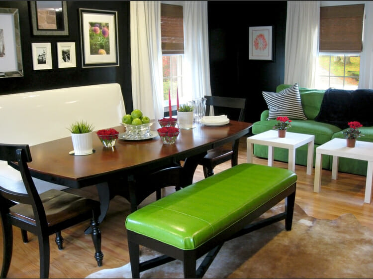
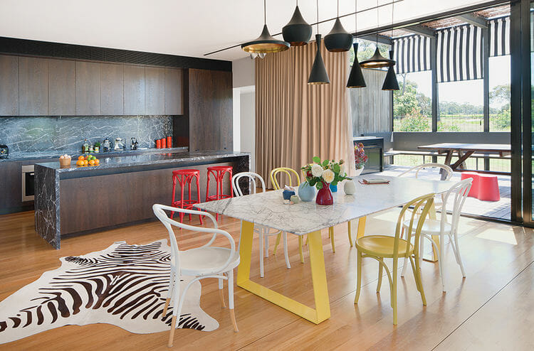
Mixing different style pieces in your dining room brings personality and diversity to the table (pun intended!). It turns an average dining room into a fun, festive space that can be a great conversation starter.
5. Kitchens can only have tiled or painted walls
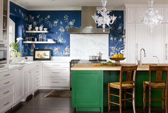
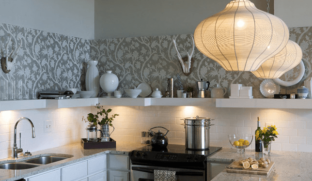
The kitchen is always called the heart of the home, so it should definitely feel that way! Tie your kitchen into the rest of your home by stripping away the tile and adding a fun wallpaper! Want to make your kitchen feel more lived in than just a functional space? Have a little bit of tile for the food splatter, and let the wallpaper be the star of the show!
6. All windows need treatments
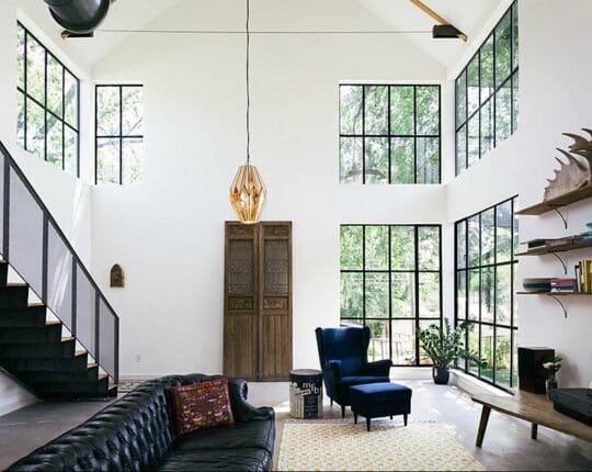
During summer, it’s a perfect time to let the natural light illuminate your space. Being blessed with gorgeous windows should be highlighted, not covered up! Having a naked window will showcase your space and most importantly your views. It is like a piece of art that you don’t even have to pay for!
7. Ceilings should be white
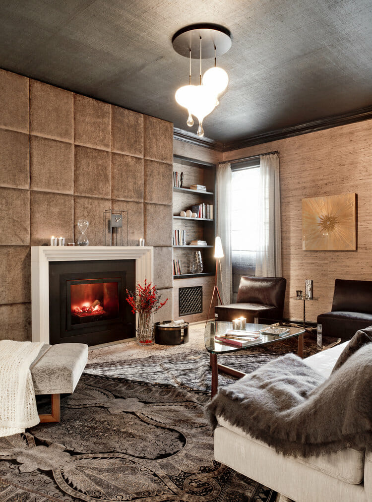
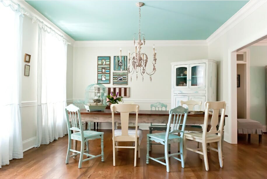
We are all guilty of forgetting about the space above our heads when designing a room, so we automatically leave them white. No more! This daring statement can do so much for your room. It draws your eyes upward, adding more height to you spaces. Also if you have a vaulted ceiling, throwing some color up there will highlight that amazing architectural feature!
8. Don’t mix old and new
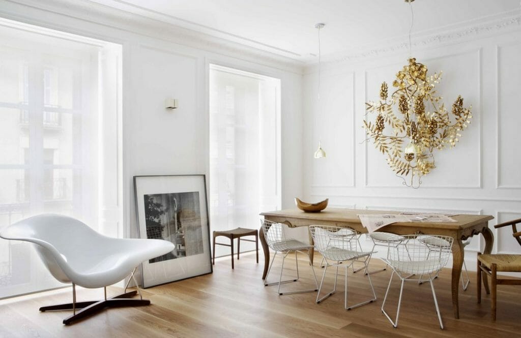
Nobody ever wants a boring space; especially in the warm and active season of summer! When you mix the old and the new it gives your space a story and vitality. Staying in the same style wheelhouse takes away from the personality of a room. By breaking this interior design rule, it makes a space feel lived in and comfortable, which is something we all strive for in our homes!
9. Every room needs a pop of color
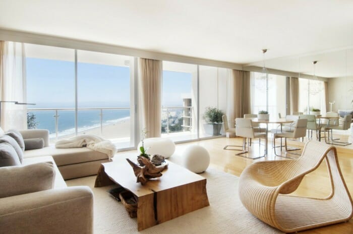
We are so quick to throw an accent color in a room that is a neutral palette. Many times leaving it as is is the better answer! Crisp, clean and soothing, a neutral space is just as much of a statement as a room with bright colors. Neutral doesn’t automatically mean tan and beige! Buttery creams and breath taking grays are all heavily influenced in this color palette.
10. Small rooms need to be painted a light color
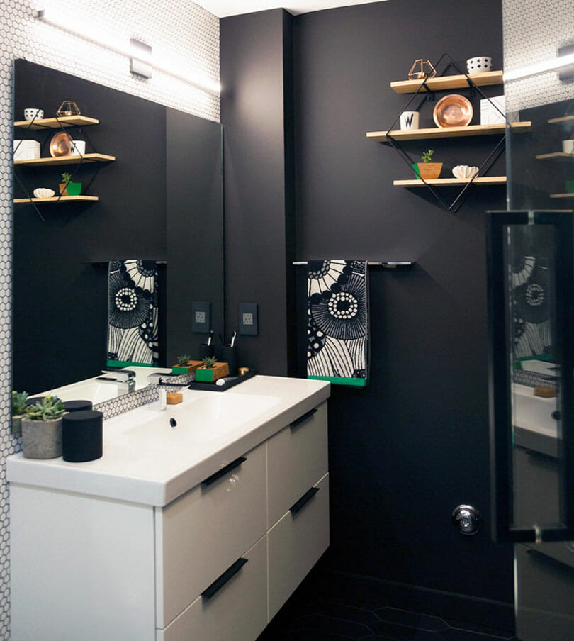
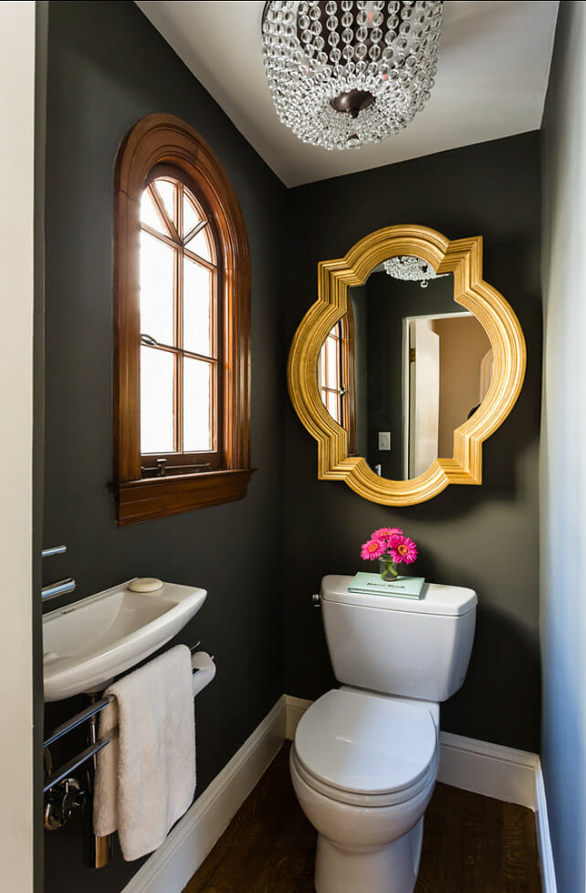
It is one of the truest interior design tips: light colors make a small space feel airy but that doesn’t mean you can’t go to the other side of the spectrum and paint it a dramatic deep hue. Painting a small room dark adds a sense of depth because you don’t know when the room begins or ends. Adding these dark colors to your walls can make your space feel intimate and cozy such as a hall bathroom.
When dabbling in this broken rule, make sure you balance the dark colors with light features and accessories to really make them stand out.
Afraid to be a design rebel on your own? Get the help of professional interior design services and start your summer design project today!
Written by Decorilla designer, Linnea T.
[images: 1, 2, 3, 4, 5, 6, 7, 8, 9, 10, 11, 12, 13, 14, 15, 16]




Comments