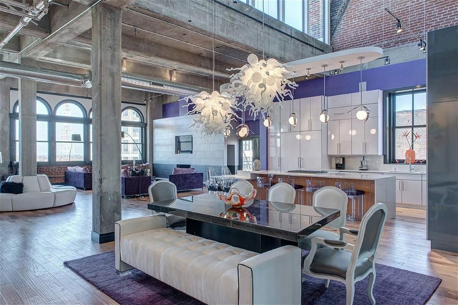
Renewed pastels and calming neutrals are ringing in the new year as the hottest color trends. From all over color, to furniture and decor these hues are sure to find their way into homes across the country. So read on for our design experts’ tips for giving your home an upgrade with the stunning colors of the year 2022!
Pantone Color of the Year 2022
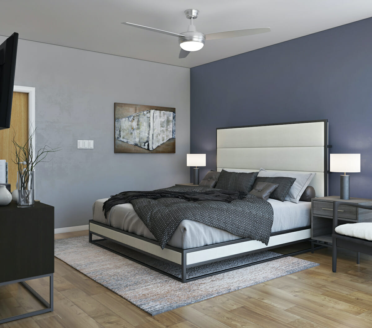
In 2021, Pantone’s Ultimate Gray and Illuminating, a bright yellow, shared the spotlight. But for their 2022 color of the year, Pantone’s going back to its roots with a sole focus on one striking hue, Veri Peri. The periwinkle blue is versatile and bold. The natural chameleon, Veri Peri, can adapt to any of the year’s hottest interior design trends.
Additionally, Pantone goes the extra mile with complementary color schemes and harmonies. These include Balancing Act, Wellspring, The Star of The Show, and Amusement.
Pantone’s Veri Peri Color Palettes
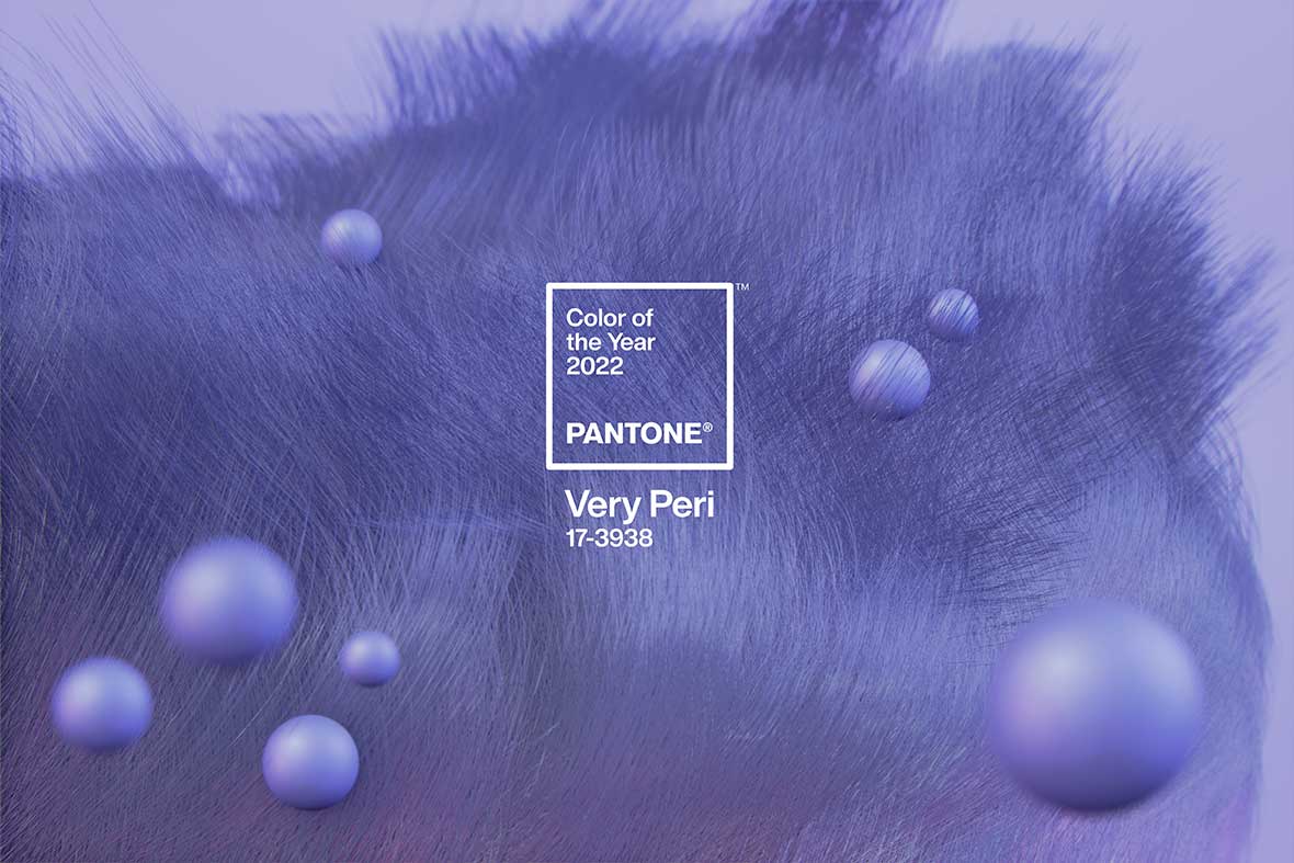
Pantone’s color exploration suggests complementary hues for the color of the year 2022. The wonderful thing about this is you can use the palette options to guide the mood of your room. Color psychology in interior design is to thank for these harmonious schemes.
1. Balancing Act
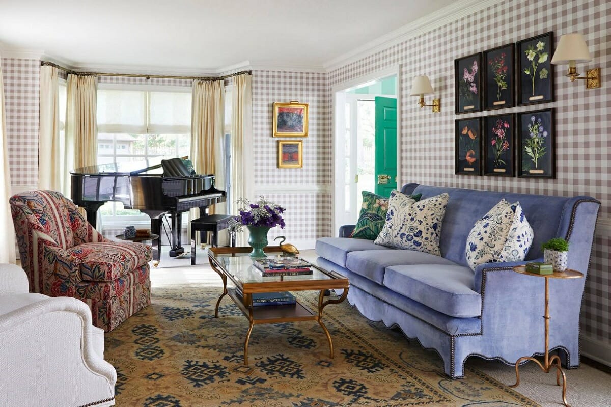
Pantone’s Balancing Act palette is a mix of warm and cool tones that emphasize and balance each other. The addition of the blueish-purple Veri Peri injects liveliness into the scheme.
Use Balance as Inspiration
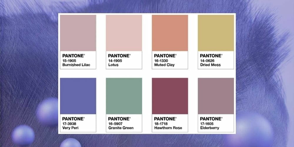
With warm complementary shades to balance Veri Peri, this scheme will be a great all-rounder – fit for the whole house. Of course, you can adjust the amount of each color per room. Still, the color harmonies can work in anything, from living rooms to studies to bedrooms.
These colors can also be exceptional in design styles like traditional, bohemian, and Japandi. Incorporate Pantone’s feature color of the year 2022 through accents. Think block-color cushions, a modern console table or pedestal, ceramics, or wall art.
Want to refresh your home with 2022 colors of the year, but not sure where to start? Then, schedule a Free Interior Design Consultation for help from the finest interior designers today!
2. Wellspring
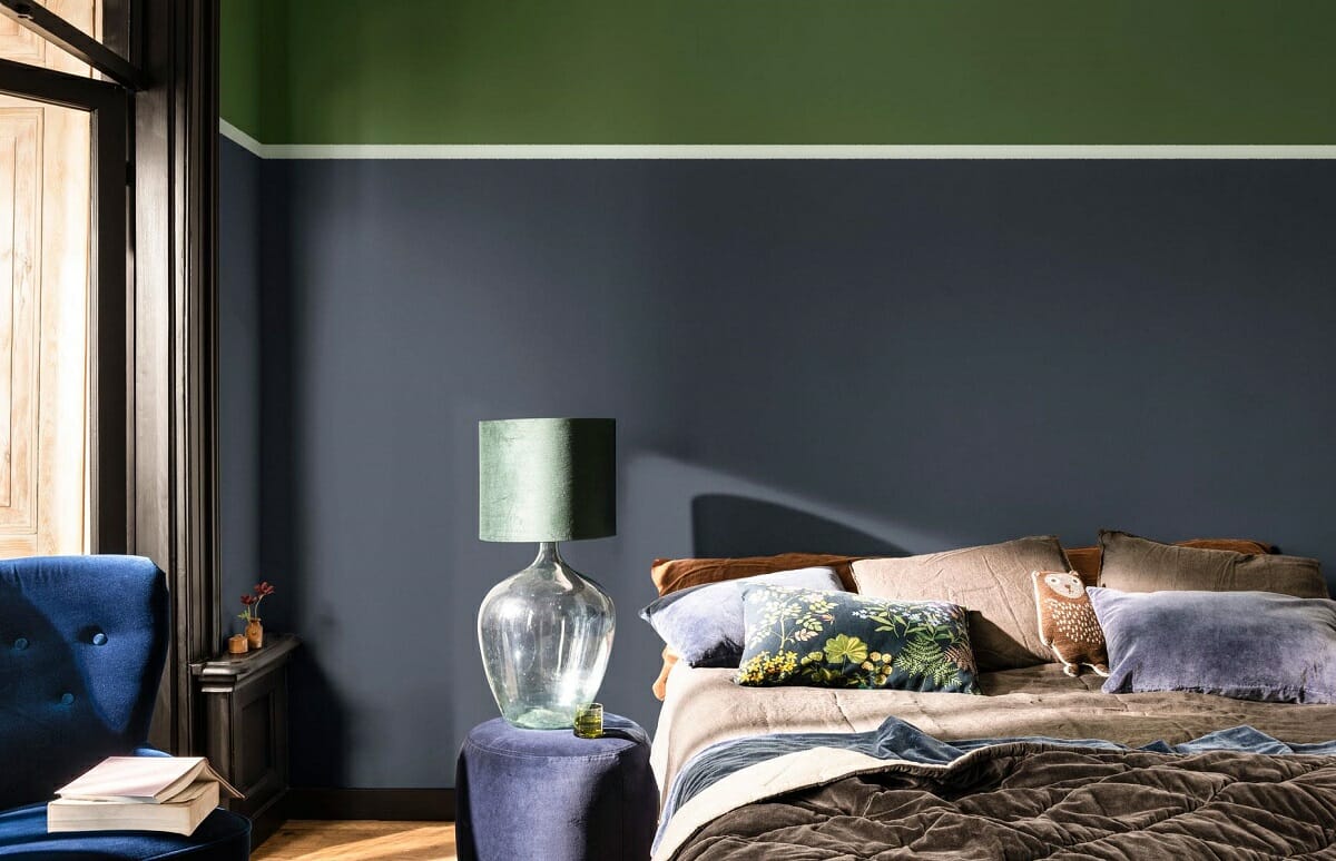
The vibrant periwinkle blue can be subtle and nourishing next to nature-inspired tones. Pantone’s Wellspring is a balanced scheme that sets a peaceful and calm environment.
Use Tranquility as Inspiration
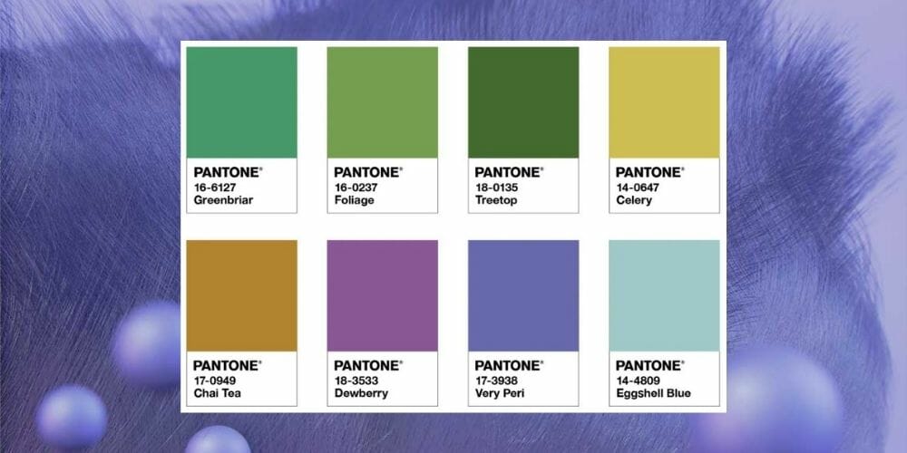
The Wellspring palette is ideal for creating calming spaces. These can include a home office, meditation room, or bedrooms. The moody aspect of the scheme can also suit an intimate lounge.
Eclectic, mid-century modern, and contemporary styles are among the many that could fit these hues. You can include Pantone’s color of the year Veri Peri in a rug, vases, decorative beads, or on the walls.
3. The Star of the Show
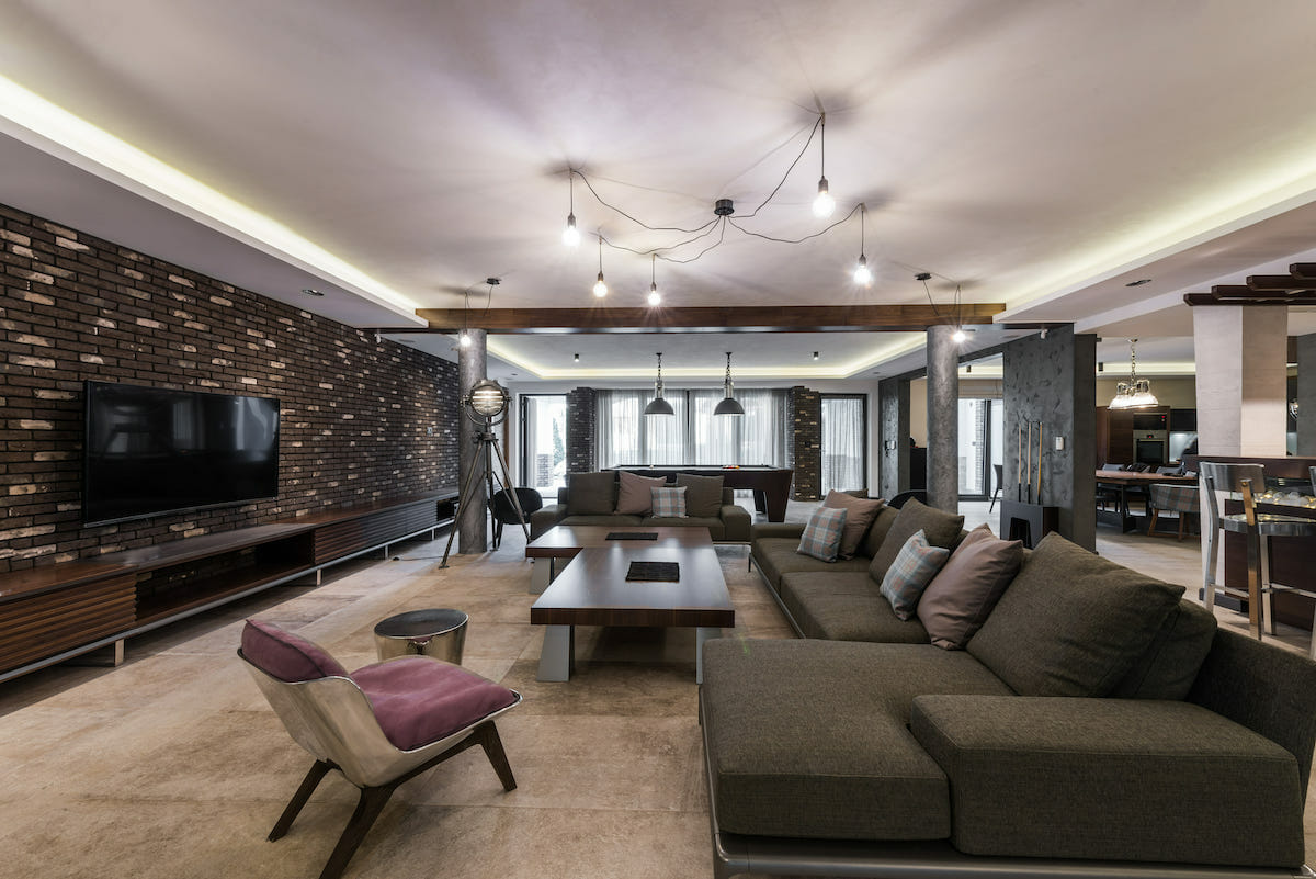
Veri Peri is also great in timeless and luxurious interiors. Its subtle warm undertone pairs well with classic neutrals. The combination makes both a striking and sophisticated display.
Use Bold Elegance as Inspiration
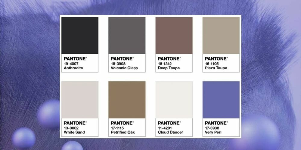
Warm neutrals form a stylish base for this color scheme. As a result, the palette is ideal for high-end lounges, home bars, family rooms, and dining rooms. A transitional, contemporary, or minimalist style will work best.
Keep most elements in the room neutral for Veri Peri to pop even more. Incorporate the hue in velvet upholstery, scatter pillows or floor-to-ceiling drapes.
4. Amusement
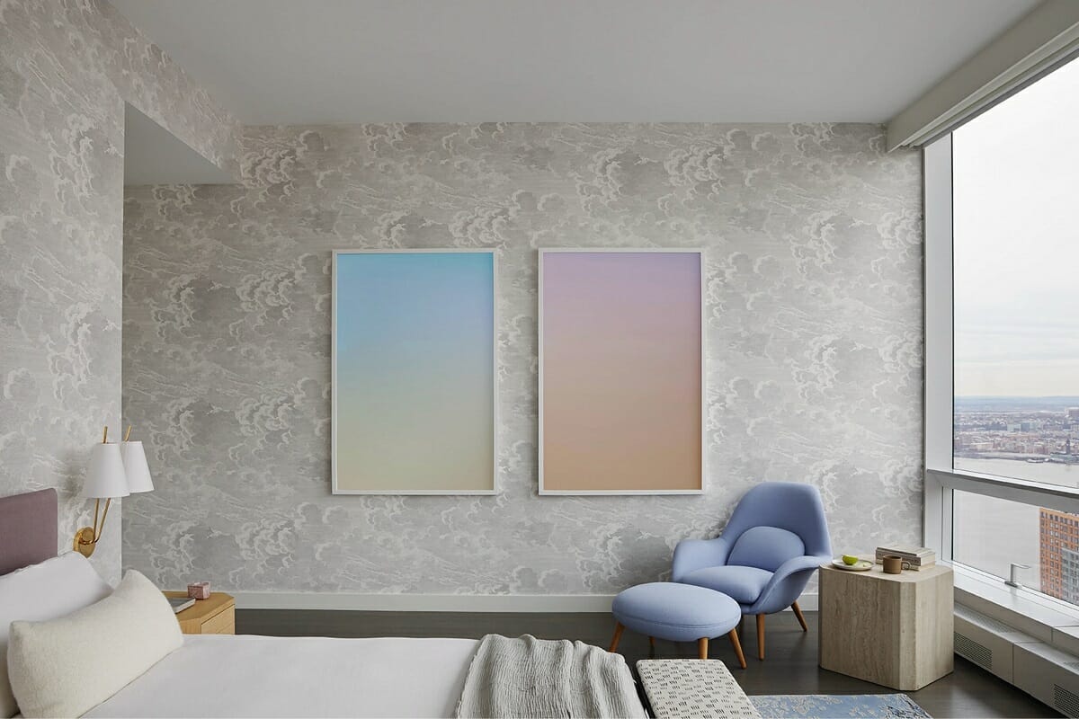
Pantone’s final scheme captures the essence of fun and spontaneity. The mix of warm and cool shades is playful and carefree – perfect for a bold expression of style or youth.
Use Fun as Inspiration
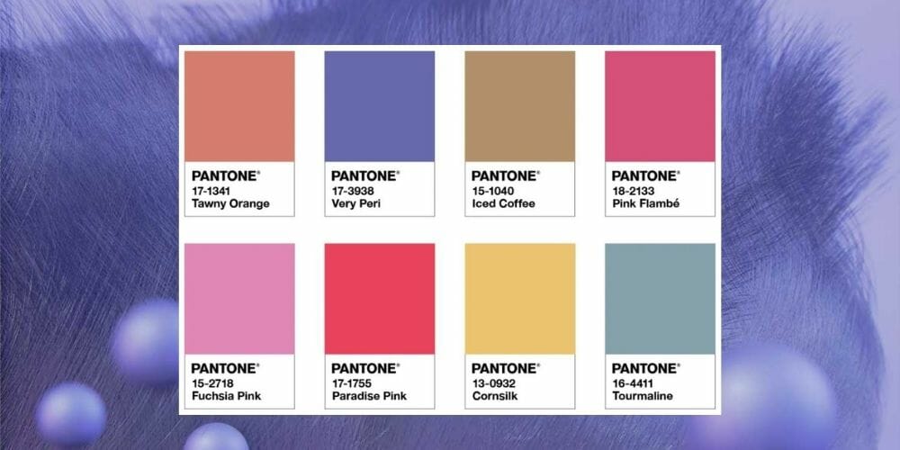
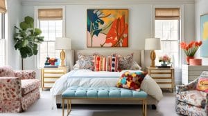
The whimsical palette is made for an experimental interior, overflowing in color or creating a youthful look and feel. Maximalist, eclectic, bohemian, and contemporary design styles are perfect for the cheery hues.
Depending on your style choice, the scheme can work in a kitchen, bedroom, nursery, or for sprucing up your playroom ideas. Include Veri Peri in unique wall décor, fun objects (like kid’s toys), kitchen cupboards, walls, or soft furnishings.
Sherwin Williams Color of the Year 2022
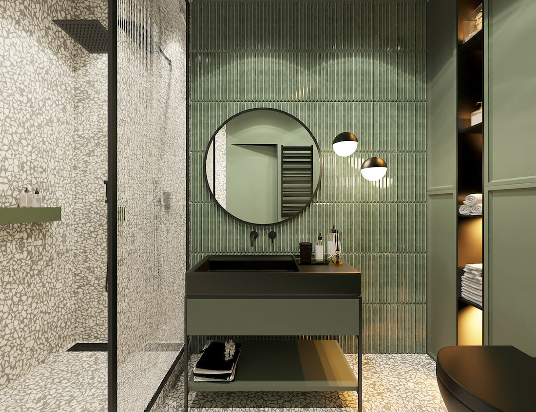
Serenity still reigns as a firm favorite in interiors. As such, the colors of the year are soft, subtle, and soothing. Sherwin Williams’s color of the year 2022 certainly follows suit with Evergreen Fog.
The green-meets-gray hue has an organic feel as well as a cool undertone. As a result, it feels refreshing and restorative – perfect for a fresh start in the new year. In fact, this calming hue can even grace the front door.
How to Use Evergreen Fog Color in Your Home
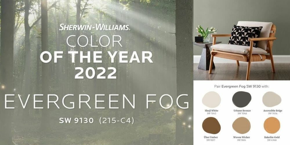
Sherwin Williams suggests a nature-inspired palette to complement the Evergreen Fog color. The combinations are sure to feel organic and modern. The other hues include Shoji White, Urbane Bronze, Accessible Beige, Uber Umber, Woven Wicker, and Bakelite Gold.
Wrapped Around Walls
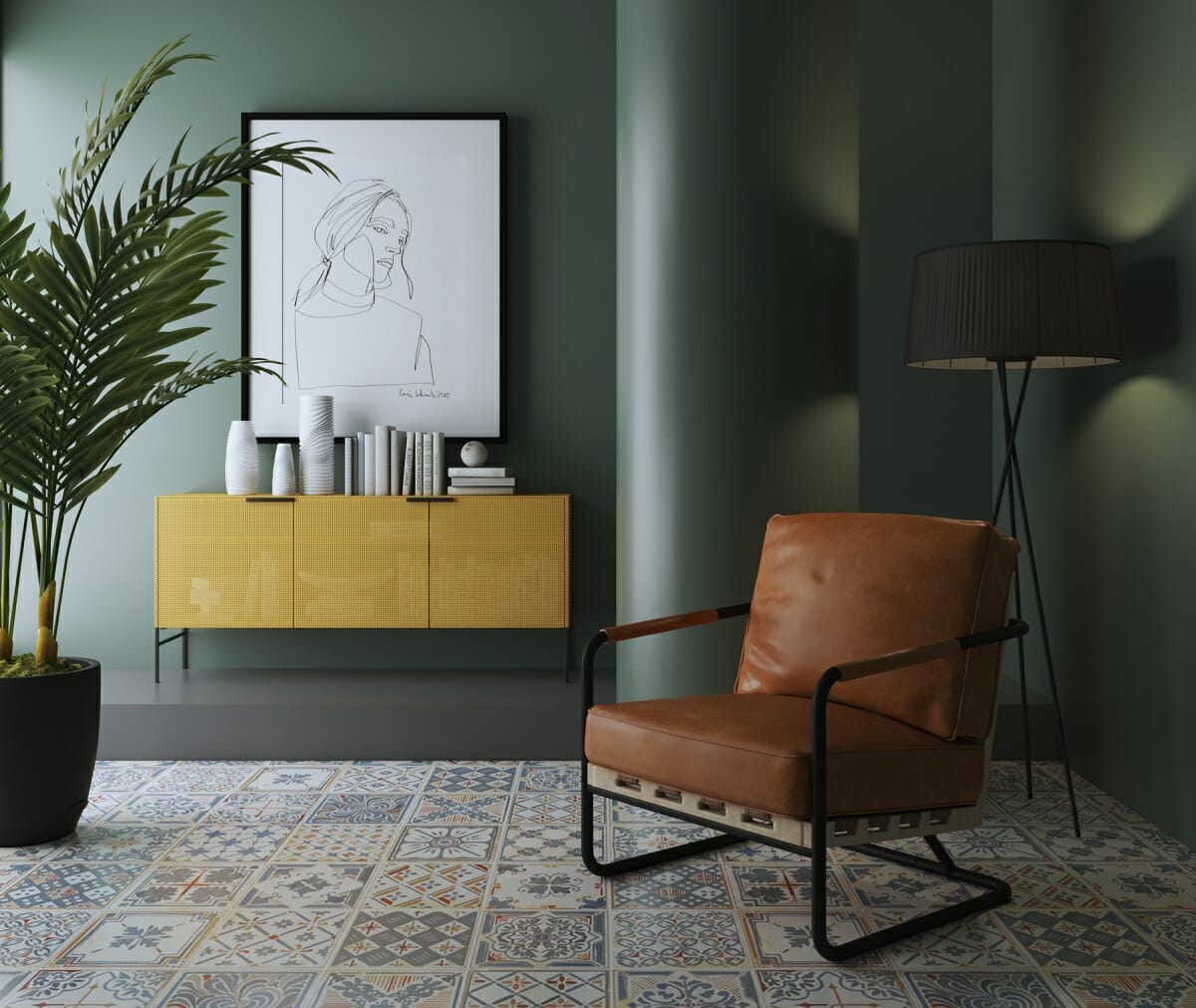
Let Sherwin Williams’ paint color of the year 2022 sing on your walls. Wrapped around an interior, Evergreen Fog creates a relaxing atmosphere as well as a beautiful canvas for furniture. Natural browns and golds will look extra pretty alongside the green shade. These lovely walls are also perfect for prints in black frames or contrasting white décor.
A Canvas for a Vertical Indoor Forest
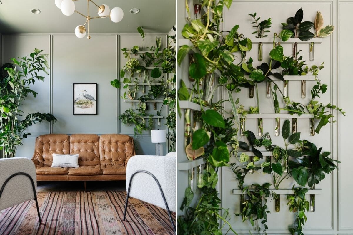
The Evergreen Fog color takes on a lively gray tone next to thriving, living plants. It lets greenery pop while still making a vibrant statement. Whether in planters, ceramics, or wall mounts, Sherwin’s color of the year is ideal next to plants. Consider a gallery of air plants or an oversized indoor palm tree to show off one of the year’s best.
Soft Touch of Green with an Accent Throw
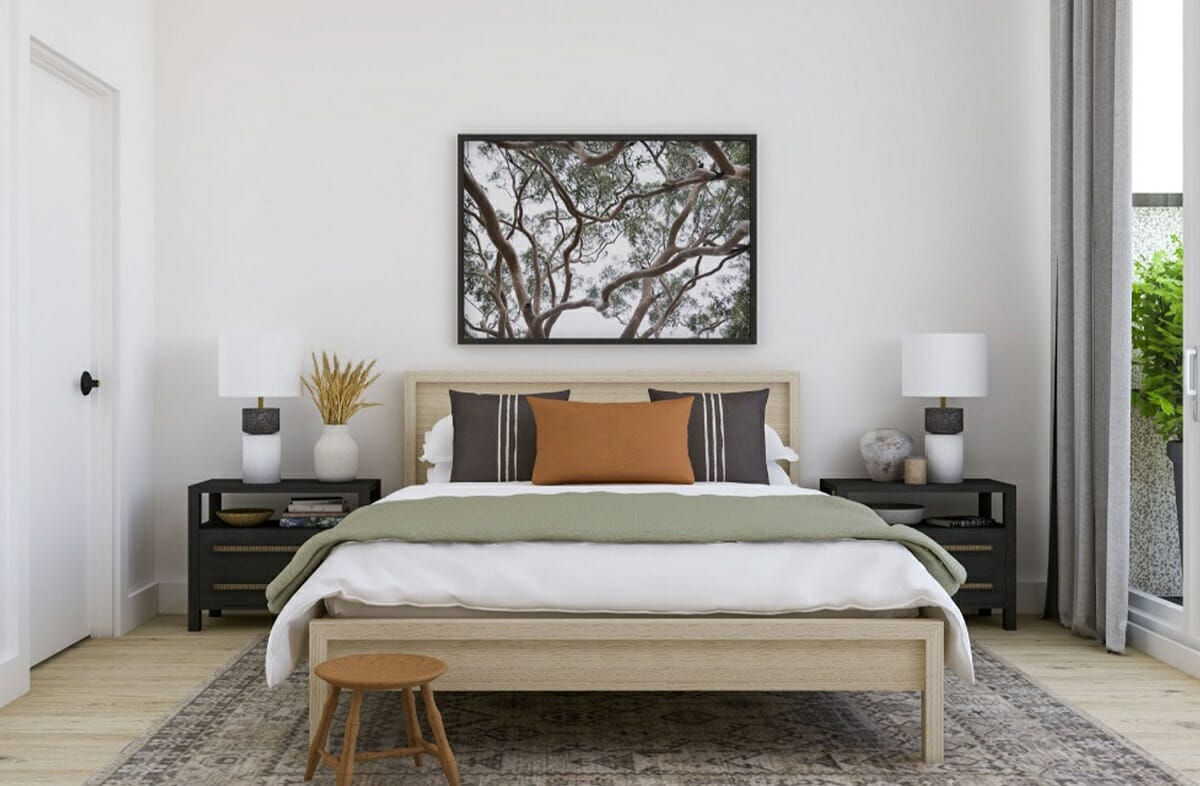
The 2022 color of the year can come through in bursts of color here and there. A complete home revamp isn’t necessary. Instead, add Evergreen Fog in beautiful soft furnishings, like a throw or linen.
Benjamin Moore Color of the Year 2022
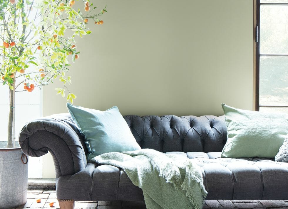
October Mist 1495, the botanical-inspired and gentle shade, is Benjamin Moore’s color of the year 2022. The brand also includes a complete 2022 trends palette to complement the sage shade. The hues on the color palette are complementary and diverse.
In essence, any colors you pick from the trends palette will complement each other and suit any style. Benjamin Moore’s color of the year is whimsical yet reliable, a canvas for different colors to bloom.
How to Add October Mist 1495 to Your Home
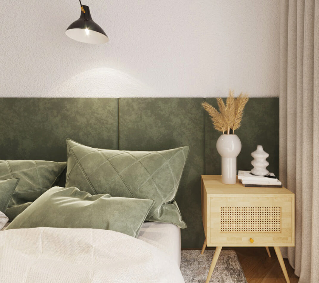
Benjamin Moore’s color of the year 2022 can adapt to many settings. October Mist is whimsical yet reliable – a canvas for different tones to bloom. Versatility makes it fitting to a spritely minimalist home and a stately French Country home alike. All in all, October Mist can be a subtle statement hue as well as a supportive role.
Shabby Chic Furniture
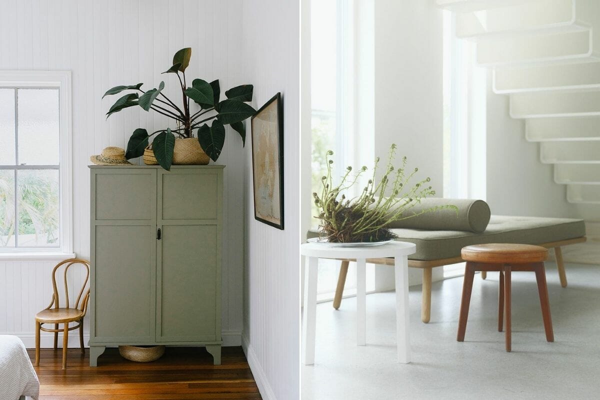
October Mist has a decidedly old-world feel. As such, the pastel green-gray hue is a good option for iconic furniture or weathered finishes on cupboards and mirrors. It is romantic yet natural, perfect for an array of styles. In this way, October Mist can also support other home décor color trends of 2022.
Farm-style Kitchen Cabinets and Crockery
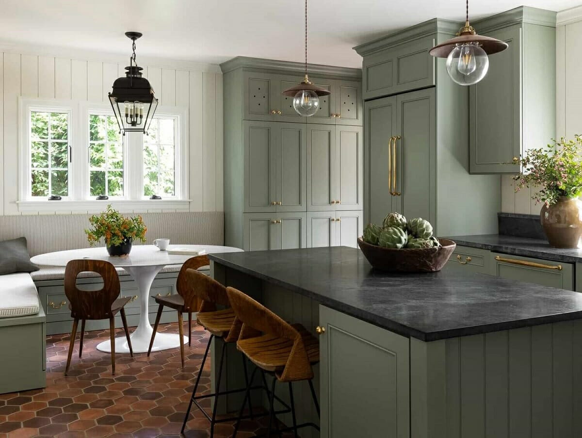
Light kitchen cabinet fronts and drawers can be so uplifting. It makes a space feel roomy and bright – great for opening a small and dim-lit kitchen interior. If light-colored cabinets are not an option, October Mist is also a good shade for crockery. A dining table will see a fresh pop of green with beautiful plates, bowls, and platters.
Valspar Colors of the Year 2022
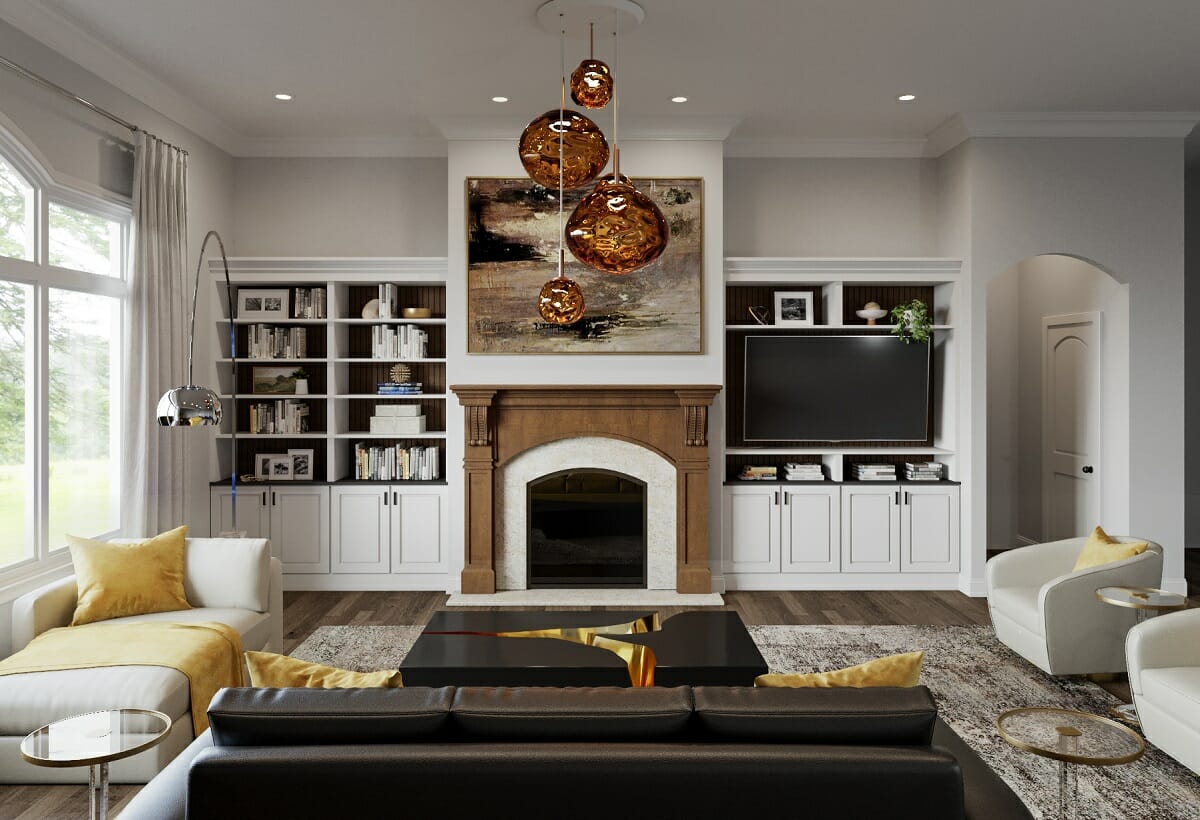
Not one but twelve trendy shades make Valspar’s colors of the year 2022. The brand chose timeless colors true to nature. Not only are these shades trendy, but they’ll also be relevant for years to come.
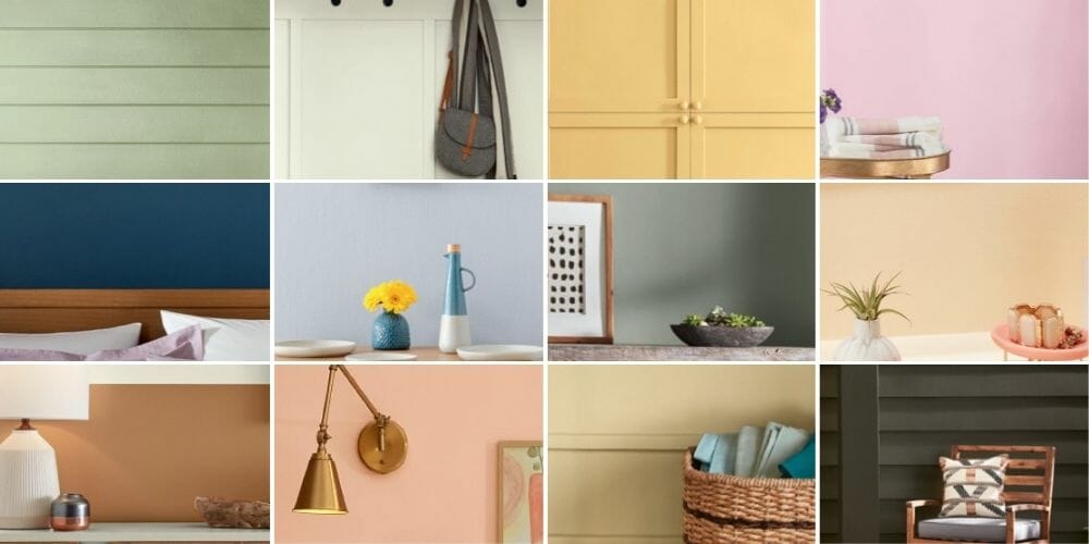
Valspar colors of the year 2022 include:
- Blanched Thyme: A soft pastel green
- Gilded Linen: A creamy shade of off white
- Delighted Moon: A sunny yellow with hints of orange
- Lilac Lane: A romantic gentle pink
- Mountain River: A dark blue reaching to navy
- Orchid Ash: A versatile pale blue
- Grey Suit: A warm gray with a refreshing green undertone
- Subtle Peach: A velvety light version of peach
- Rustic Oak: A rich umber hue
- Sunset Curtains: A pastel take on salmon pink
- Country Charm: A welcoming beige with a golden touch
- Fired Earth: A luxurious charcoal color
The Versatility of Valspar’s Colors of the Year
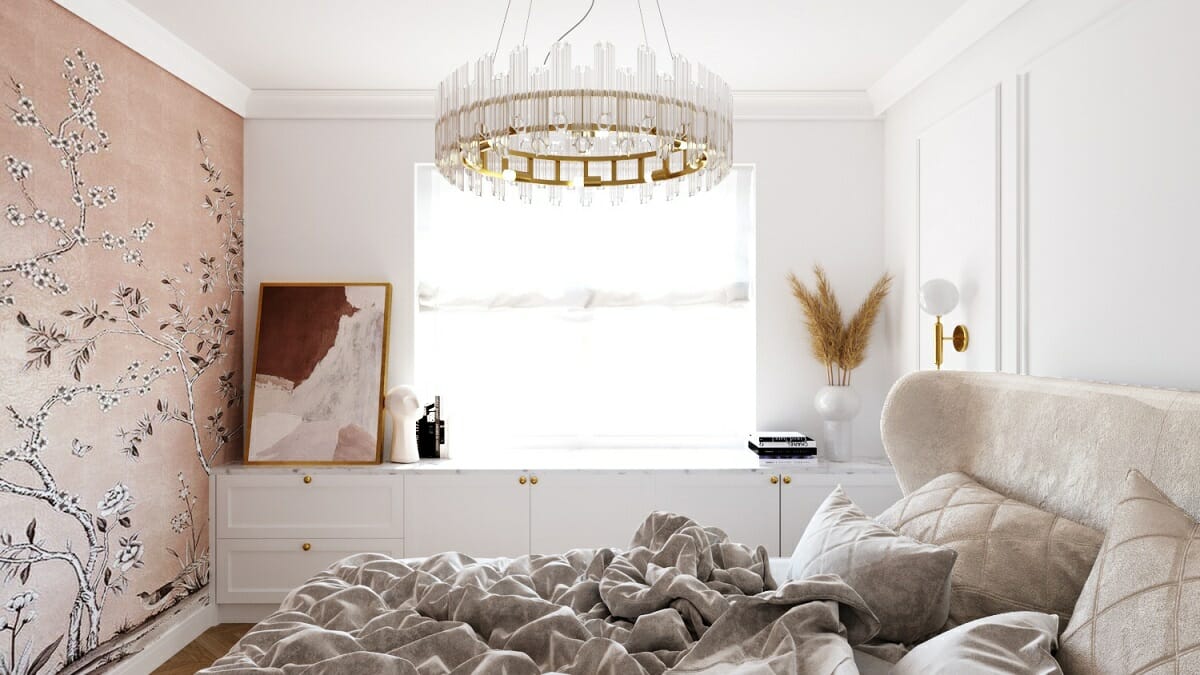
Like Benjamin Moore’s harmonious color palette, Valspar’s hues work well together or as a standalone feature. The options can guide you to picking a cohesive color scheme for your interior. They are muted enough to work in any design style yet bold enough to create a memorable focal point.
Valspar’s Pinkish Colors of the Year 2022
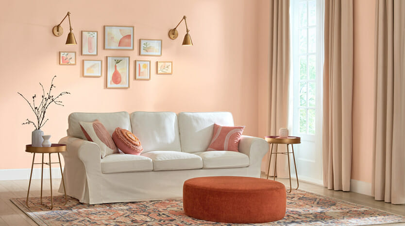
A variety of sunny and warming delicate hues can certainly invigorate an interior. What’s more, each shade of pink can give different vibes. And these soft shades can be neutral too. Sunset Curtains, for instance, can make a lovely base color for a modern interior. Alternatively, Lilac Lane can feel plush in luxurious fabrics, like velvet or suede.
Valspar’s Neutral Colors of the Year 2022
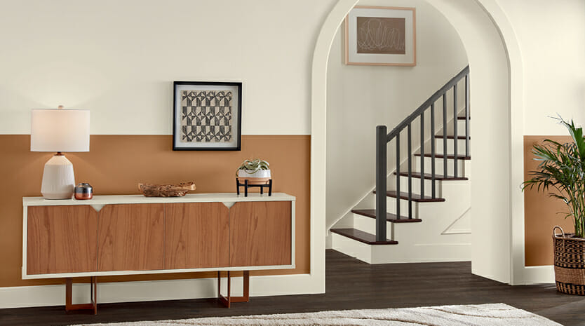
Subtle peach, pastel yellow, and a gold-tinted beige make beautiful neutrals. Any of these can set a quiet atmosphere for a home or business space. Whether minimal or transitional, a neutral space benefits from layering a careful selection of décor and furnishings. Opt for a matte finish and pastel decor for a modern boho look.
Valspar’s Botanical Color Trends of the Year 2022
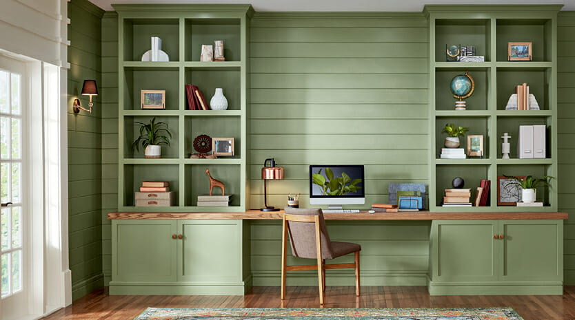
Interiors overflow with more and more greenery every year. The same goes for home décor color trends of 2022. Valspar’s botanical-inspired hues include pastel green, a gray-green, and a rich brown reminiscent of earthy bark and soil.
Together, these colors are great in a contemporary space with leather, organic fabrics, and artisanal crafts. Include these hues in planters and your favorite organic materials.
Valspar’s Cool Colors of the Year 2022
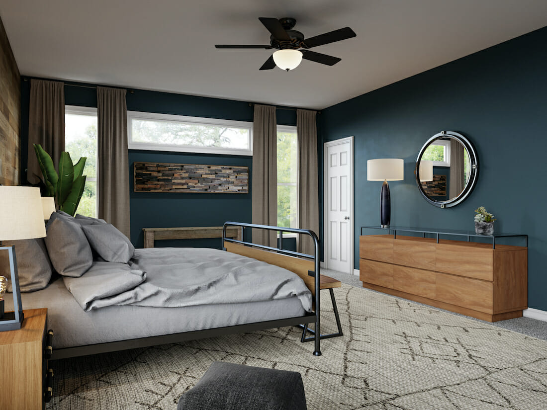
Cold colors can be dramatic, even in a relaxed and casual interior. Valspar’s cool colors of the year 2022 are deep and vibrant without being overpowering. They looks good on walls, furniture, artwork, and large grounding rugs. Similarly, a close relative of charcoal, Fired Earth, can make a big impact.
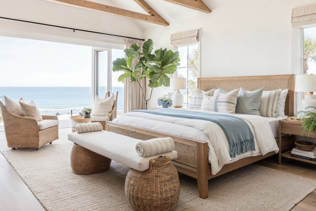
And lastly, Orchid Ash, a pale blue can make a space feel breezy and light. It’s ideal for kitchens, offices, and coastal designs. Together, these color trends of 2022 can create an inviting and balanced interior.
Behr color of the Year 2022
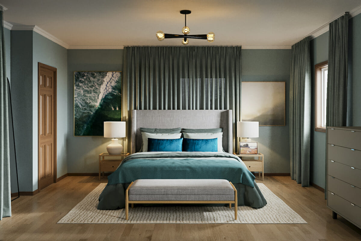
Behr might just have captured the shade of optimism with their color of the year for 2022. Breezeway is uplifting and inspiring indeed. According to Behr, sea glass onshore inspired the silvery blue-green hue. The brand hopes for Breezeway to evoke “feelings of coolness and peace and a desire to move forward and discover new passions.”
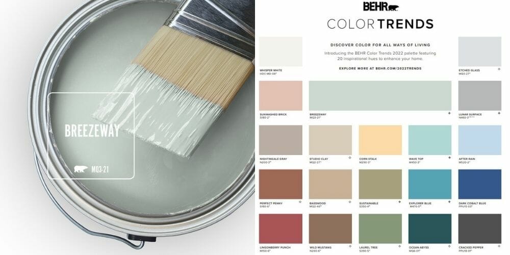
Behr also includes color trends to match their primary hue of 2022. The palette features 20 inspirational colors, keeping to nature-inspired paint color trends. Grays, blues, greens, peachy tones, and one buttery pastel complete their forecast.
How to Use Breezeway in Your Home
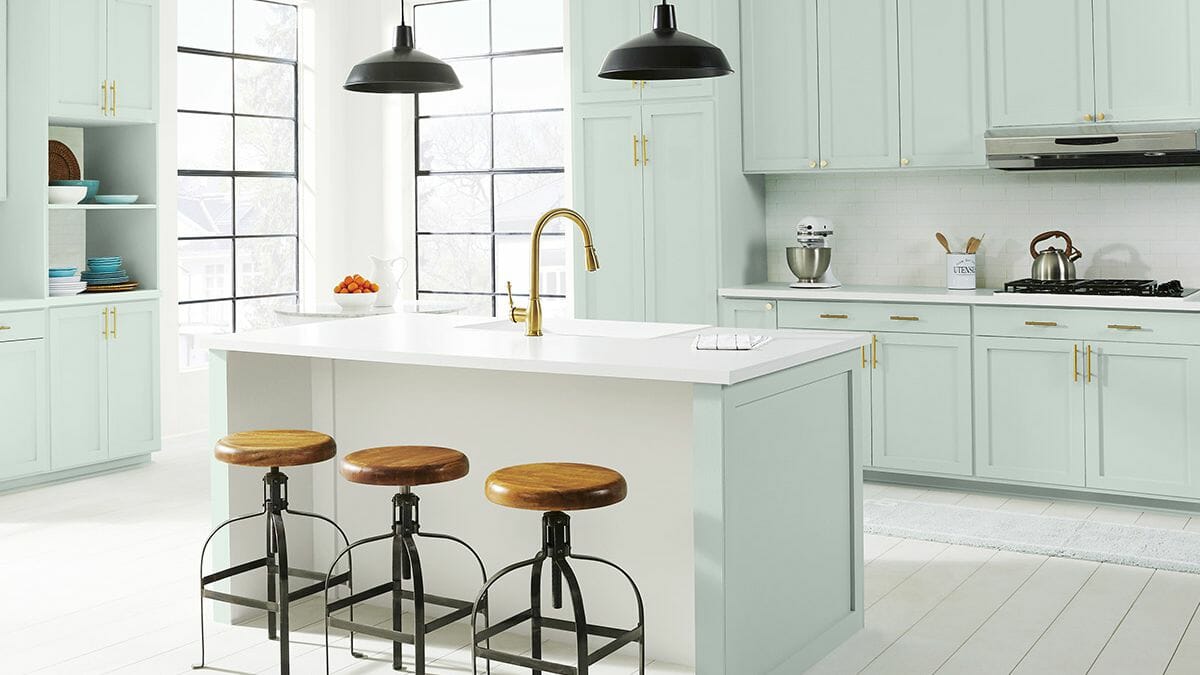
Behr’s paint color of the year 2022 consists of gray, blue, and green. The result is an organic yet shimmery hue. In the spirit of embracing all things new, Breezeway can inspire creativity and encourage renewal. So, why not get creative?
Experiment with Breezeway Patterns
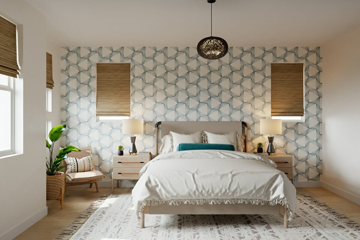
The shimmery quality of Behr’s 2022 color of the year means it can adapt to both organic and glam interiors. And one way to make a classy statement is through patterns. The more detailed, the more luxe the interior will feel.
On the other hand, abstract shapes, waves, or gradient colors can suit Scandi and contemporary interiors alike. If a large print or wallpaper is too much, experiment with large artwork to find your favorite look.
Channel an Oasis at Home
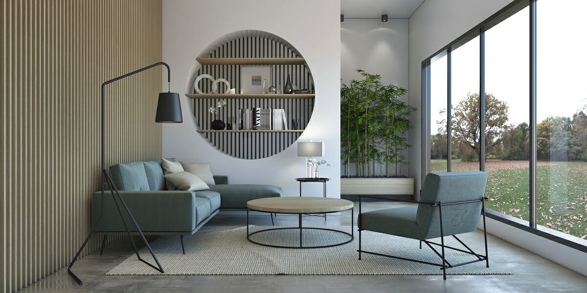
Mimic the calm of a flowing river with a soothing palette of Breezeway and earthy browns. In a lounge, colored upholstery will draw the eye to the comfy seating and amplify relaxation.
You can also maximize water’s rejuvenating properties in a bathroom with hints of Breezeway-colored décor. Towels, matte faucets, or light tiles can make a big difference.
Ready to try colors of the year this 2022?
With all of these stunning color palettes to choose from deciding on which to use in your home can be overwhelming. So, schedule a Free Interior Design Consultation for expert assistance getting started today!

[images: 1, 2, 3, 4, 5, 6, 7, 8, 9, 10, 11, 12, 13, 14, 15, 16, 17, 18, 19, 20, 21, 22, 23, 24, 25, 26, 27, 28, 29, 30, 31, 32, 33, 34, 35]


Comments