Despite being often overlooked, the design of an office space can make a big difference on the mood of the people who work in it, making them feel more at ease and ultimately more productive. The clients of this project understood it well and decided to go for an online office design to improve their working space.
THE CHALLENGE: CREATE A COZY AND PROFESSIONAL OFFICE INTERIOR DESIGN
The project concerned the communal area of the office and the main objectives were:
- Give the office a homey feeling while keeping it professional
- Design a space that can serve both as a dining area and as conference/workroom
- Combine different office interior design ideas from inspiration photos
- Create a wall feature with a temporary finish
THE INSPIRATION: ONLINE OFFICE DESIGN IDEAS
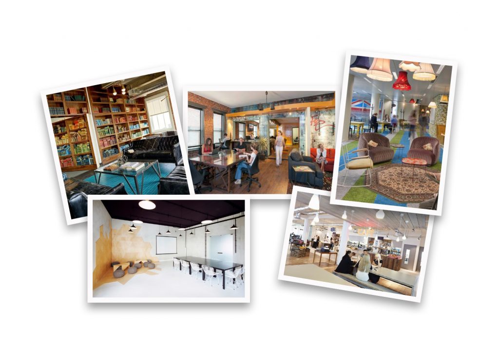
The clients’ top priority for their online office design was creating an overall homey feeling in the space. The office doubles as living space for some of the team members, so it was essential to make the atmosphere inviting. The inputs of the clients were several modern office design ideas, with sofas and relaxed lounging areas. This gave the designers a starting point to develop an appropriate solution. Online office interior design services have been a great choice for the clients. With multiple different tastes to accommodate and limited time to think about the design, following the entire project online has been a huge time saver and has made communication with the designer efficient and concise.
SOPHISTICATED AND TRENDY ONLINE OFFICE DESIGN
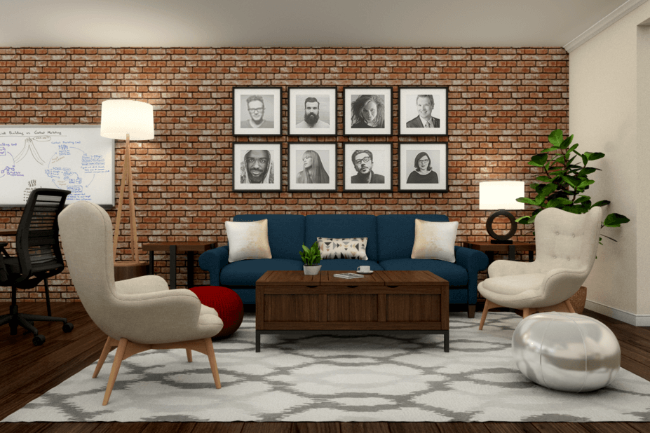
Looking at how the design turned out, one wouldn’t even say it’s an office! The homey feel is definitely there and the choice of a contemporary-masculine style makes the space still feel professional. One of the features of the design is certainly the faux-brick wall, that adds warmth and character to the lounge area. Realized with a sticky removable wallpaper, it’s the best solution for the clients, that are renters and expressly asked to avoid any permanent finish. A coffee table with hidden storage is another very practical solution. Allowing to hide cables and other work-related supplies, helps to make the space feel less like an office.
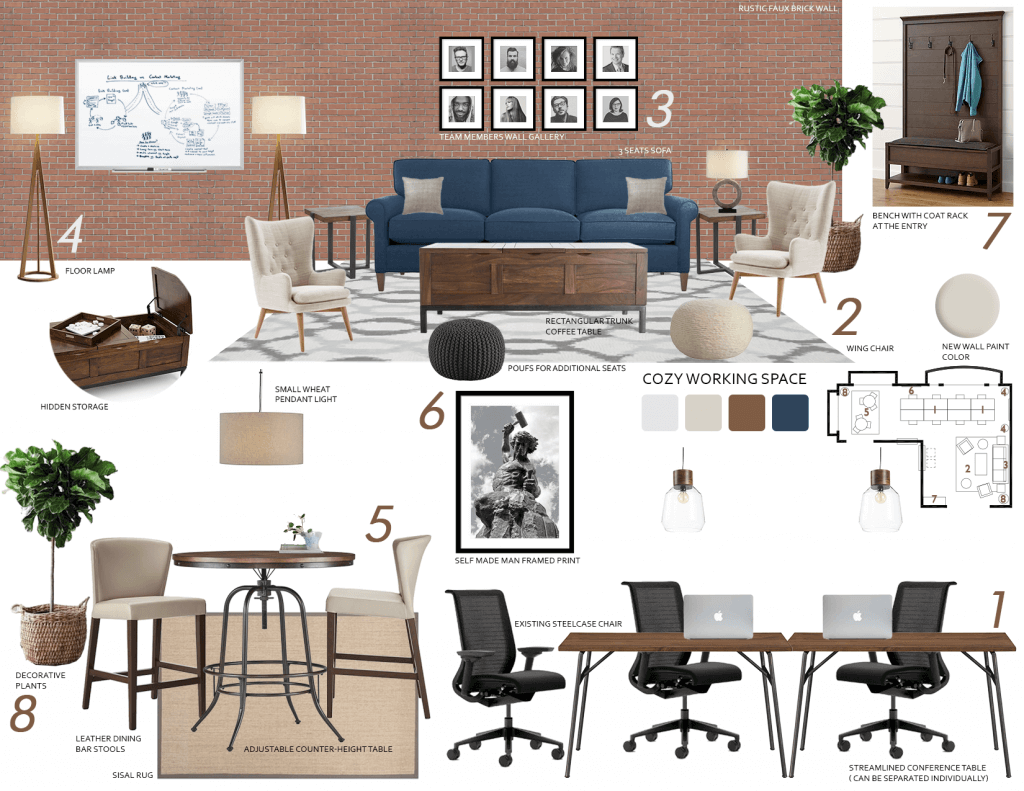
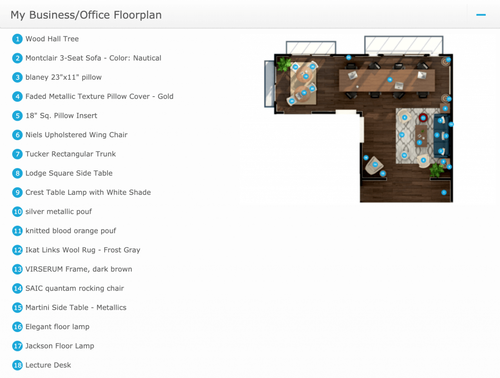
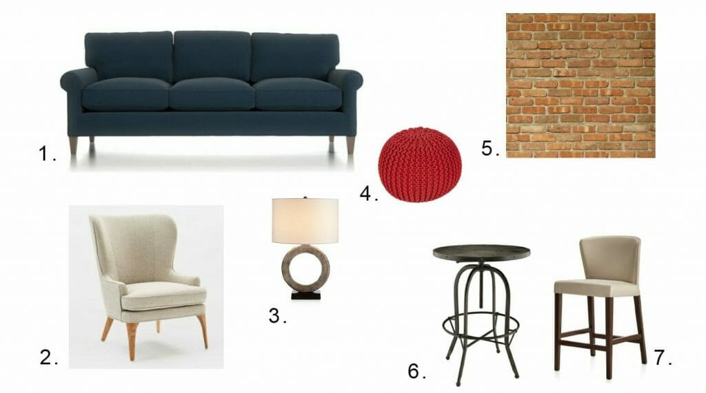
The initial proposal of Decorilla designer Narathas P. is identifying three separate areas. First is the conference area, with a long wooden table that complements beautifully the office chairs the clients already had. Then is the bar area: a small space with tall tables and comfortable bar-stools. And lastly is the proper lounge area, with sofa and armchairs.
The color scheme is left neutral, with one single touch of blue on the sofa. The faux-brick wall is with no doubt the focal feature in the space and really finishes it off.
THE ONLINE OFFICE DESIGN RESULT
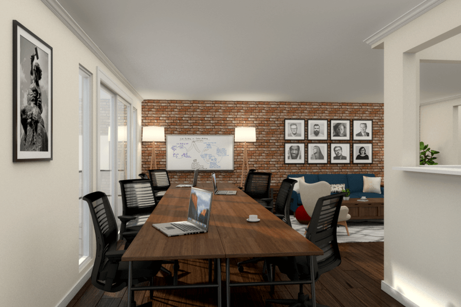
When entering the space, one is greeted by the welcoming lounge area. A sofa, two armchairs and a couple of poufs create plenty of seating to discuss work or just take a break. Behind the sofa, the photos of all team members make for a unique gallery wall that adds a distinctive personal touch to the space. On the corner of the lounge area, there is even a rocking chair with its own side table and lamp. This reading corner is a somehow separate area that will make it more comfortable to live and work from this space, finding some moments of privacy as well.
At the back of the room is the conference area. The big conference table is in reality made up of 8 smaller tables aligned. Whenever needed, it is therefore very easy to split it up and get individual desks.
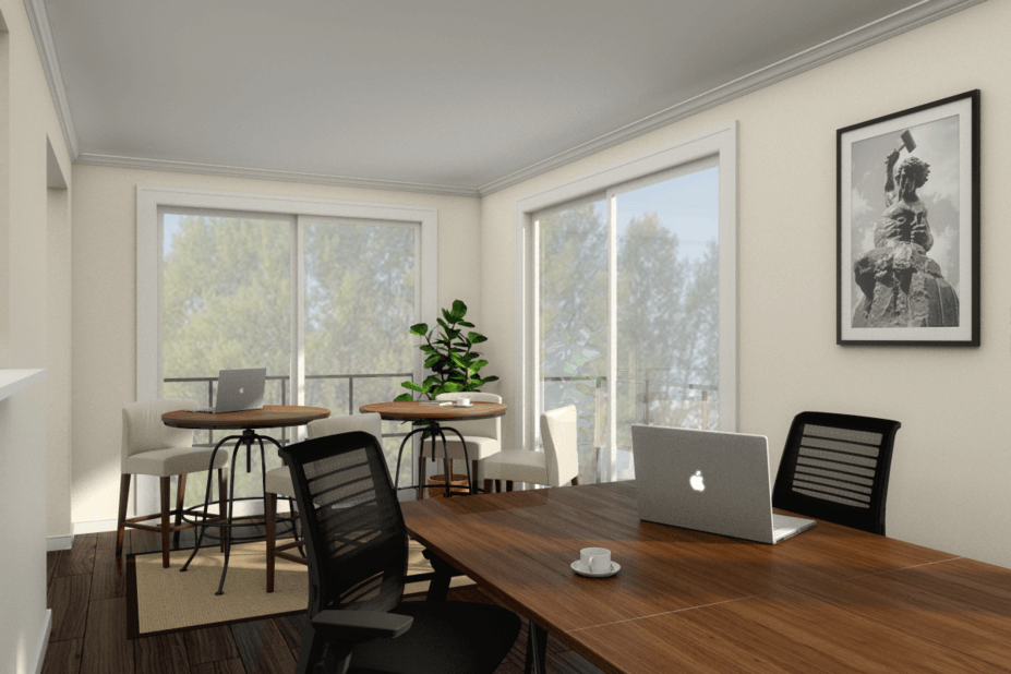
Next to it is the bar area. Tucked in the corner of the room, this is the ideal space to find some privacy for some individual work. At the same time, it is also the perfect spot to enjoy a coffee or lunch, being right next to the kitchen area. Two big windows make this corner very bright and also open to a small terrace. Last but certainly not least, the entire space is flooded with natural light, which makes it even more of an inviting place to be in.
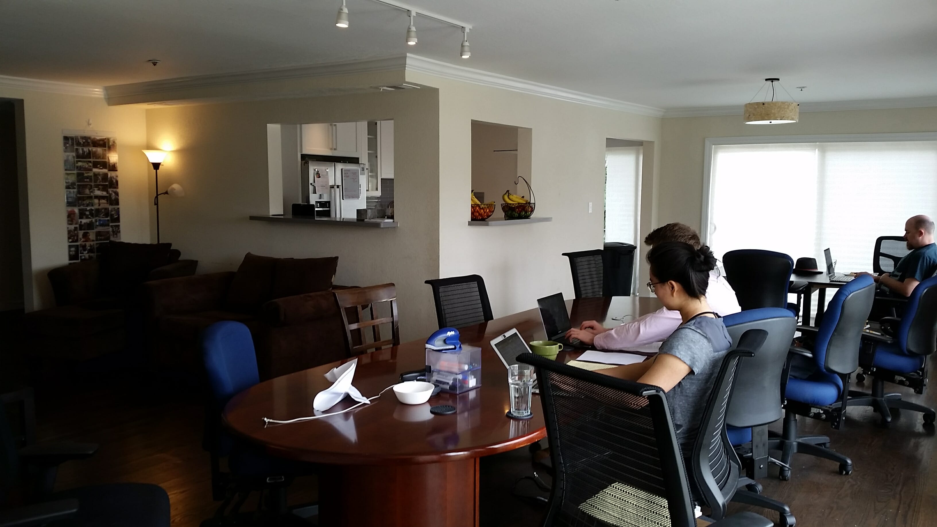
The final result of this office online design feels homey while also being professional and definitely practical. The three areas: lounge, conference, and bar communicate with one another seamlessly, making it easy to talk with colleagues at any time and allowing for more informal conference setups.
DESIGN YOUR OWN MODERN OFFICE
This before & after is a great example to show that an office space can be beautiful and inviting while still remaining professional and practical. If you also have a space that needs to merge beauty and functionality, then online interior design may be the solution for you!
With Decorilla you can start with a Free Interior Design Consultation. You will then receive proposals from two different designers and choose your favorite to continue the project. And when designing is done, Decorilla team will also help with orders and tracking, making the whole process even more enjoyable!
[Images: 1 – Decorilla images]
Written by Decorilla designer Silvia C.


Comments