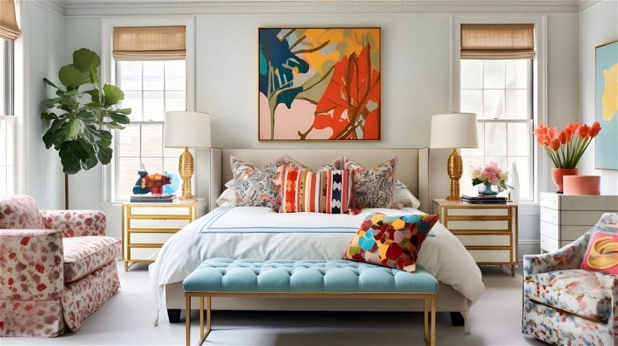
Wondering what the official 2024 colors of the year are? This year’s palette is set to transform your living spaces into a haven of style and comfort. Read on for our in-depth guide on the most fashionable hues of 2024 and how to incorporate them into your home!
Pantone Color of the Year 2024: Peach Fuzz
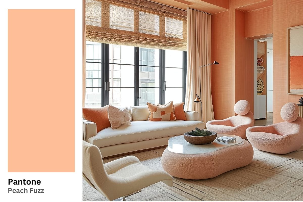
Pantone’s Peach Fuzz, their Color of the Year for 2024, is a gentle blend of pink and orange tones. Compared to its predecessor, Viva Magenta, it dials down the intensity, celebrating coziness and connection. Peach Fuzz is a captivating choice for interior design, offering a unique blend of warmth, softness, and delicate versatility.
Tips for Best Uses of Pantone Peach Fuzz in Your Home
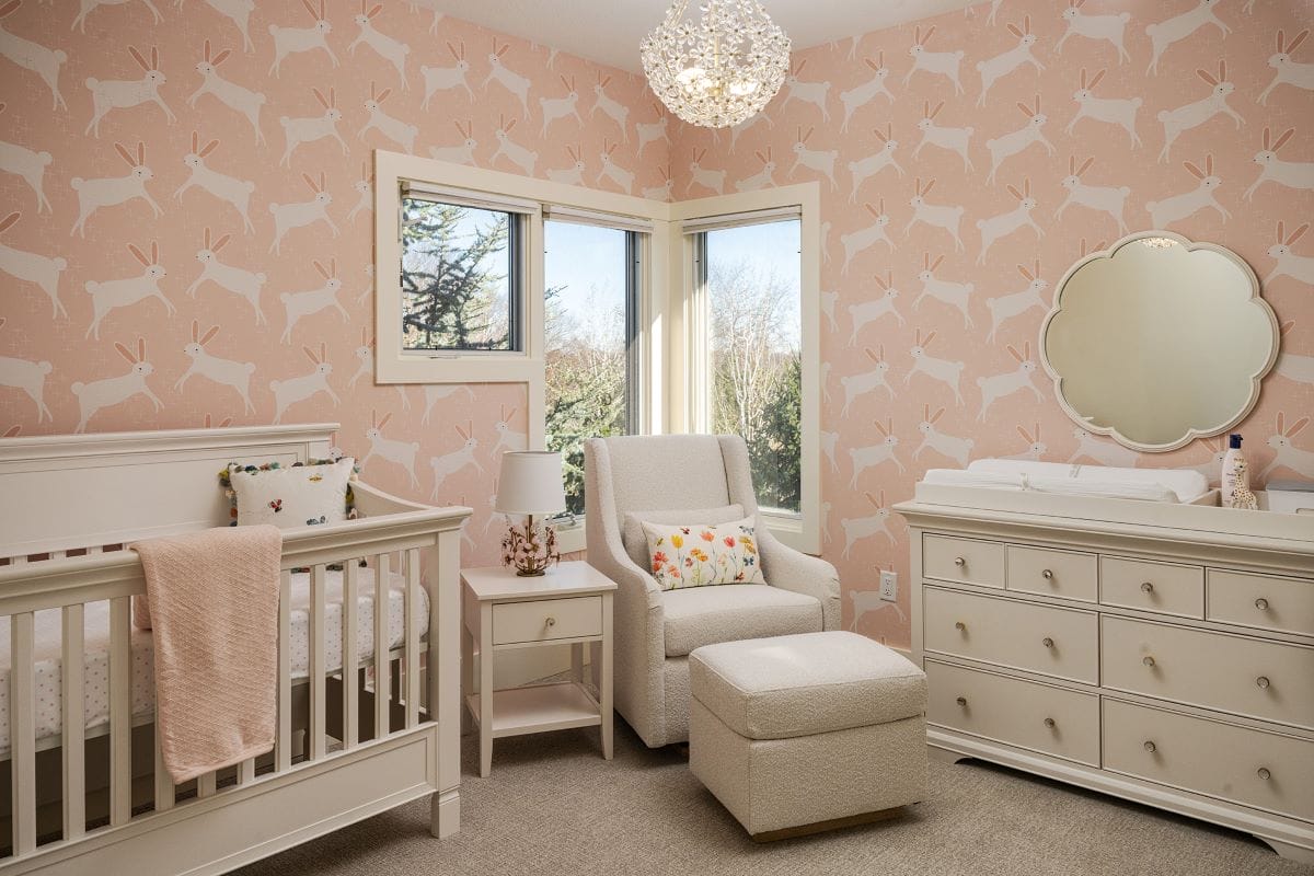
- Peach Fuzz pairs well with neutrals like whites, creams, and light browns for a soft, earthy palette. It also complements greens and blues for a more vibrant contrast, ideal for trendy interior schemes.
- Merge this 2024 Color of the Year with plush textures like velvet, wool, or soft cotton to enhance its coziness. Moreover, natural materials like wood and stone will make a match made in heaven with its earthy undertones.
A Seriously Stylish Living Room
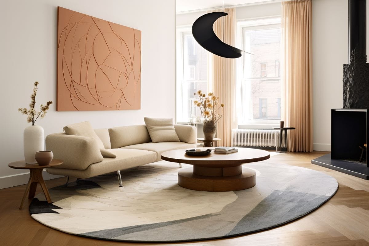
As a living room color, Peach Fuzz can be used almost anywhere—its sophisticated warmth makes it ideal for convivial areas. Apply it as an accent to walls, upholstery, or decor. You can also experiment with different saturations to create a monochrome space that feels super-comforting yet elaborate.
Pro Tip: The colors of the year can fit many design styles. Unsure what yours is? Then, take our quick Interior Design Style Quiz to find your preferred style today!
Soothing Bedroom Accessories
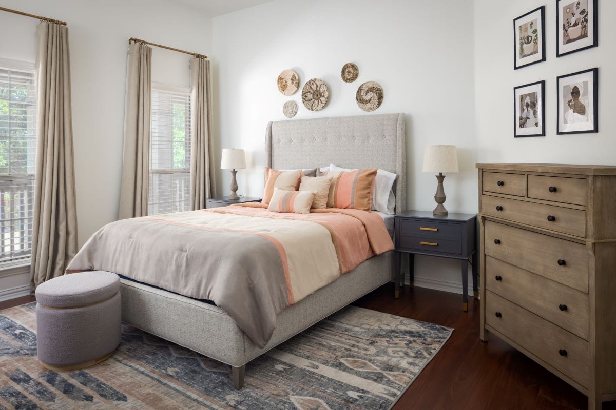
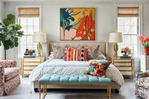
Peach Fuzz works wonderfully in smaller doses, too. In a bedroom, this color can promote a sense of gentle tranquility and softness. Use it in bedding, curtains, or accessories to create a peaceful retreat. Lamps, artwork, and other decorative items in this color can also add a touch of warmth without overwhelming the space.
Ultra-Chic Bathroom
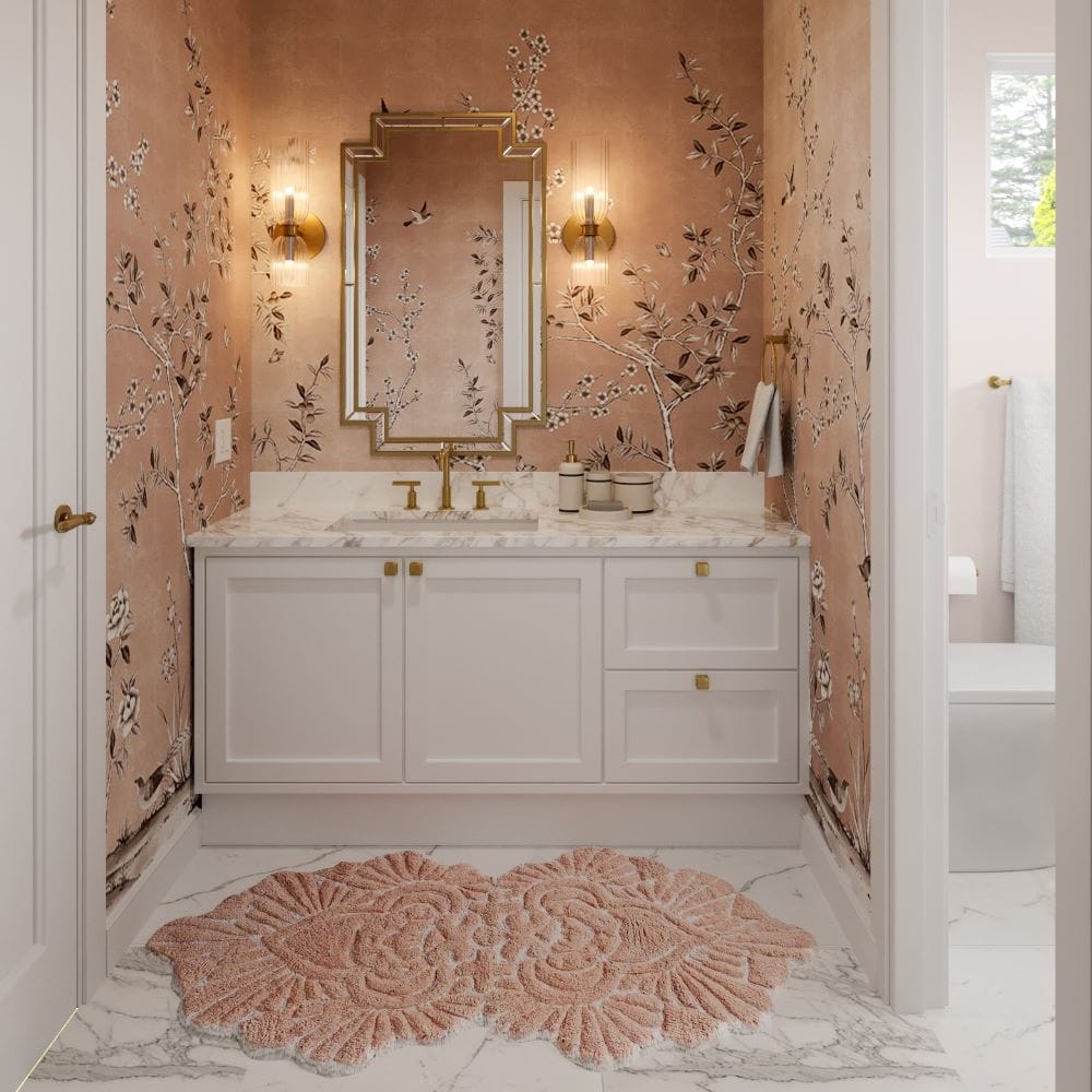
Peach Fuzz can do a great job as a pop of color on accent cabinetry for a refreshing and soothing ambiance. You may also consider it for wall paint, or install a memorable chintz wallpaper. Meanwhile, Peach Fuzz mats, towels, or a shower curtain can bring a spa-like feel to an otherwise neutral bathroom scheme.
Sherwin Williams Color of the Year 2024: Upward
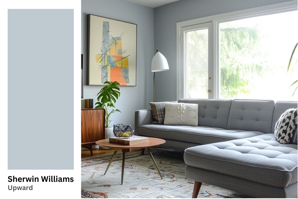
Upward is a serene blue with undertones of greay. This calming, slightly muted hue feels exceptionally delicate, embodying positive energy and contentment. Described as a universal shade, Upward has a broad appeal, fitting into various design styles and settings, from traditional to avant-garde.
Tips for Best Uses of Sherwin Williams’s Upward in Your Home
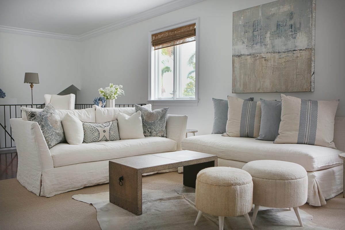
- Sherwin Williams’s Color of the Year 2024 complements neutral tones like whites and grays. It also matches with natural greens, soft pinks, or earthy browns for a more dynamic, colorful interior design. In addition, Upward works wonders in coastal-inspired design schemes.
- To enhance this shade’s tranquil nature, merge it with textures like linen, soft wool, or cotton. It also harmonizes well with wood and stone.
Bright & Inspiring Kitchen
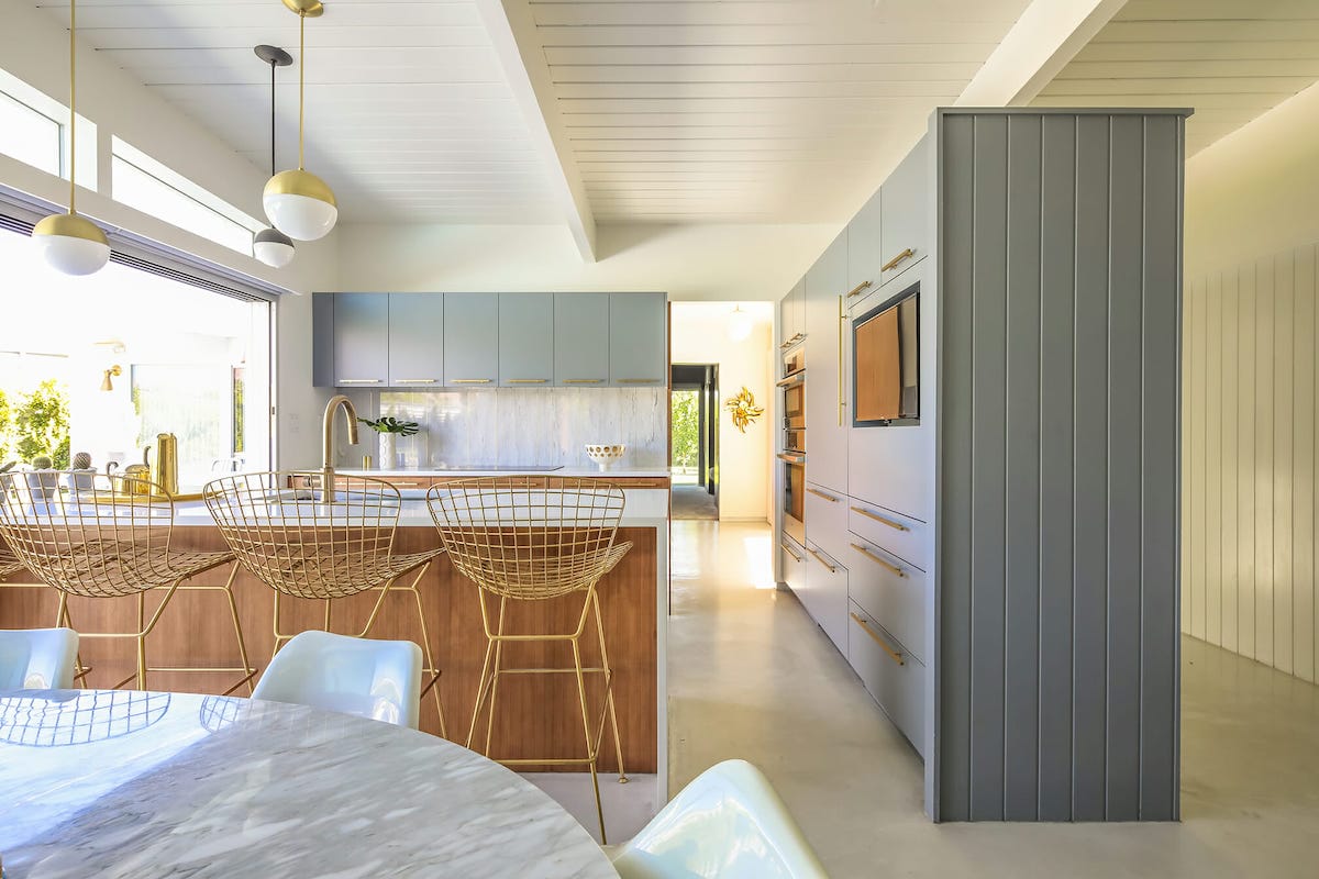
Upward can bring a serene and clean look to kitchens and dining spaces. Whether on cabinets, walls or as an accent in dining chairs or tableware, it conveys an other-worldly refreshing vibe. If you plan on remodeling your kitchen this year, use Upward and indulge in a brand-new cooking experience.
An Exceptionally Calming Bedroom
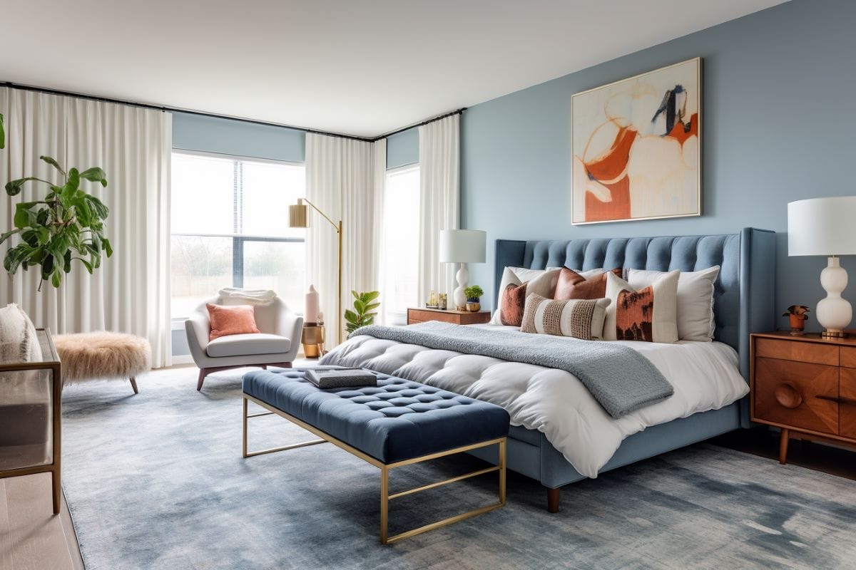
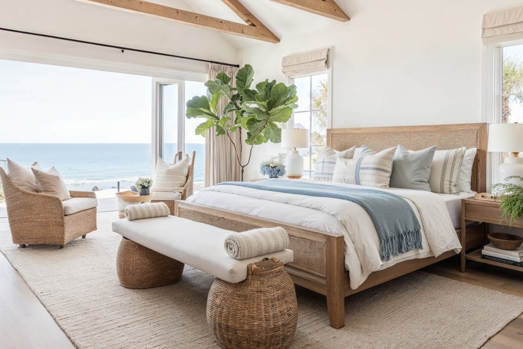
In bedrooms, Sherwin Williams’s Color of the Year 2024 offers a serene setting that promotes restful sleep. Whether applied on walls or as an accent color in bedding or decorative pillows, Upward adds a subtle, calming touch. This versatile hue blends well with various textures and complementary colors, enhancing the bedroom’s overall comfort and atmosphere.
A Memorably Charming Powder Room
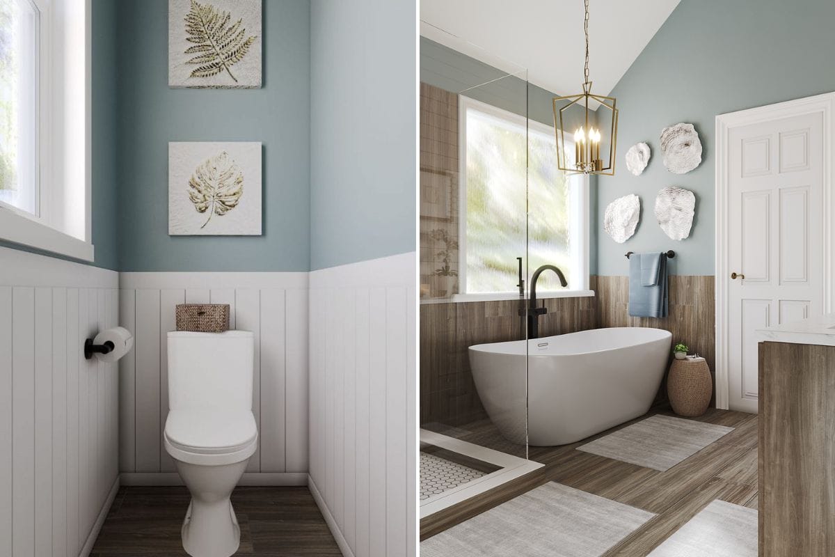
Upward’s refined serenity makes it an excellent choice for sprucing up a powder room. This color can be used on walls or as an accent in towels and accessories, creating a refreshing and inviting experience for guests. It also elevates creative pairings with decorative elements, such as elaborate mirrors and artwork.
Benjamin Moore Color of the Year 2024: Blue Nova
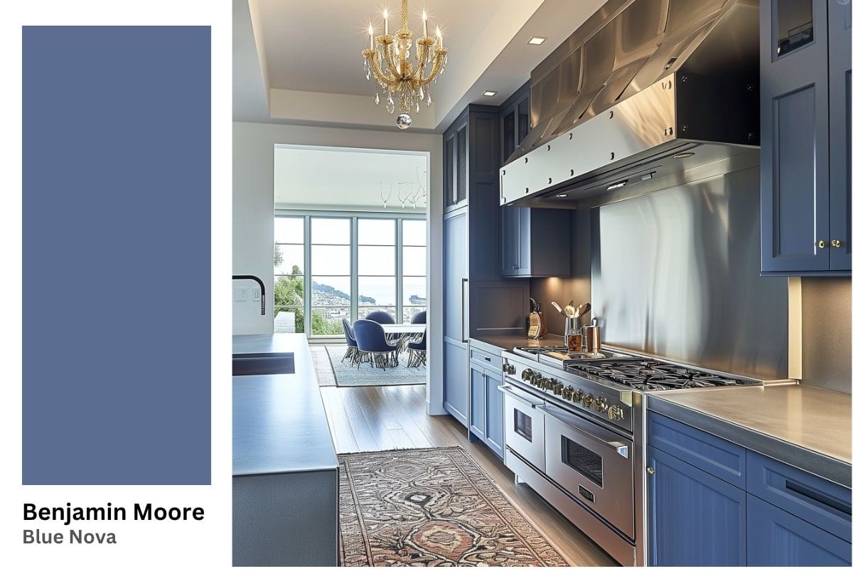
Benjamin Moore’s 2024 Color of the Year, Blue Nova, offers a transformative potential for interior design. Described as both elevating and horizon-expanding, this blend of electric blue and violet is inspired by the brilliance of a new star formed in space. Its ability to add a touch of elegance and depth makes it fit for creating sophisticated and luxurious interiors.
Tips for Best Uses of Benjamin Moore’s Blue Nova in Your Home
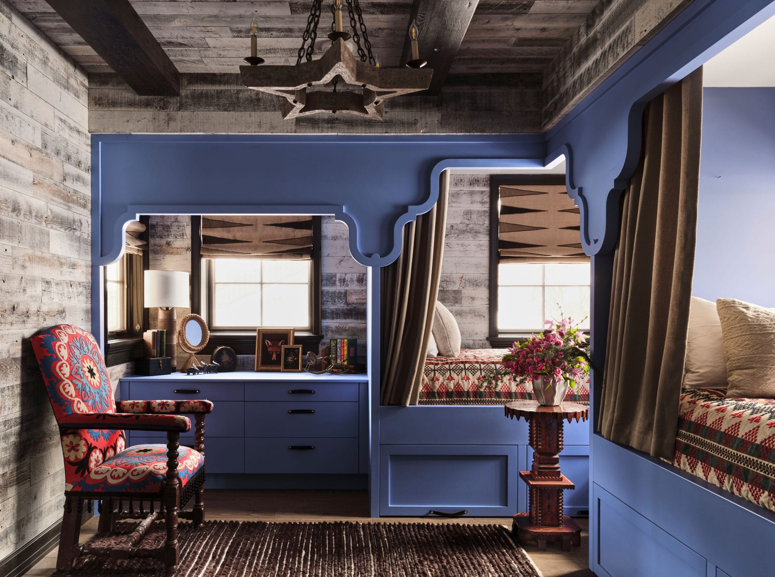
- Blue Nova makes a natural match to neutral tones like grays and whites. At the same time, it can significantly boost the impact of warmer hues like mustard or terracotta.
- Combining Blue Nova with luxurious textures like velvet or silk can amplify their elegance. Metallic accents and translucent glass can also complement its depth.
A Timeless Dining Room With An Upscale Flair
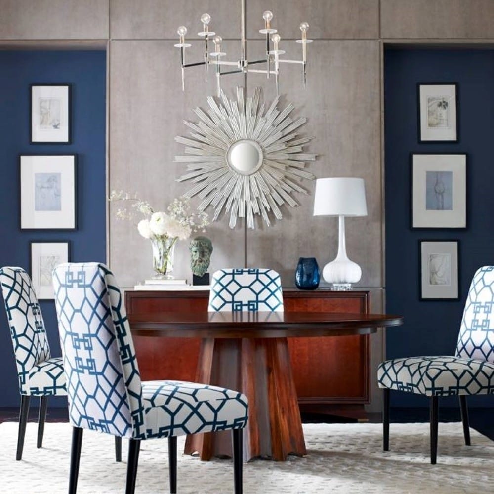
Benjamin Moore’s Color of the Year 2024 can make a bold statement in dining spaces. It adds a regal touch, whether as an accent wall or in dining chair upholstery, making it a perfect choice for formal dining experiences. Moreover, using Blue Nova in accessories and diningware can make the space even more inviting and elegant.
Statement Cabinetry
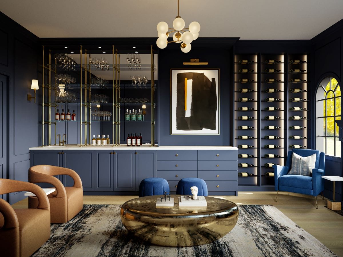
Blue Nova’s rich and dynamic blend of undertones can transform cabinetry into a striking design statement, turning the feature into a focal point of the space. When applied to surfaces, this deep blue-violet shade introduces an element of sophistication and luxury, elevating the room’s aesthetic appeal. Its ability to blend with both modern and traditional designs makes it a versatile option for diverse layouts.
Bold Yet Classy Accents
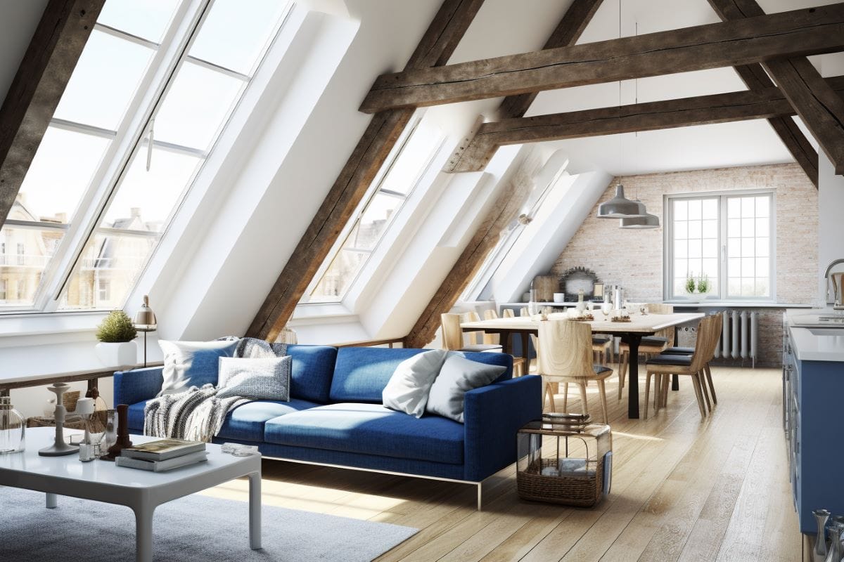
As an accent hue, Blue Nova’s versatility shines through. Benjamin Moore’s 2024 Color of the Year can be effortlessly used in smaller elements like throw pillows, vases, or artwork to add depth and intrigue. The color’s intensity conveys visual interest and enhances contrast, particularly effective in spaces dominated by neutral or muted tones.
Valspar Color of the Year 2024: Renew Blue
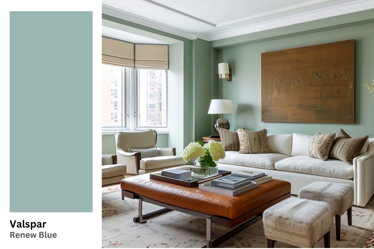
Renew Blue, Valspar’s 2024 Color of the Year, brings to the table a fresh and restorative perspective to interior design. This balanced blue with a dash of grayed sea green encapsulates an organic, harmonious, almost lyrical essence. Its nourishing character creates a sense of peace wherever placed.
Tips for Best Uses of Valspar’s Renew Blue in Your Home
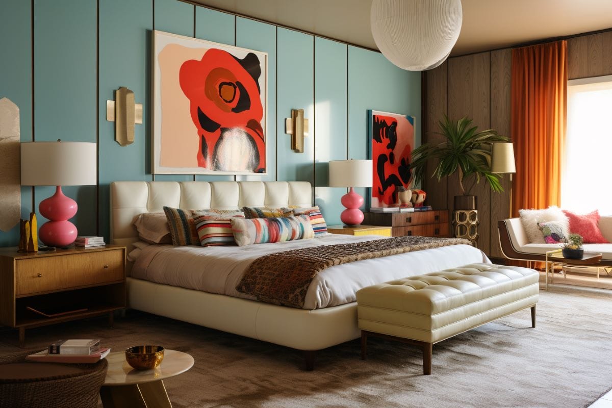
- Renew Blue pairs well with bright shades such as white or cream for a subdued effect. It also complements earthy tones and natural greens for a more vibrant contrast.
- Combining Renew Blue with natural textures like wood, stone, or linen can emphasize its appeal and tactile qualities.
Calming Flair in Bathrooms & Laundry Rooms
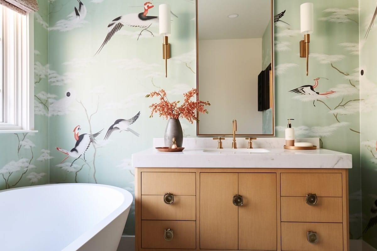
As a bathroom color, Renew Blue can transform the space into a spa-like retreat. Its soothing tones work beautifully on walls, tiles, or bath linens, offering a serene backdrop for relaxation. Moreover, consider using Renew Blue in utilitarian spaces to infuse a sense of calm and orderliness. Pairing it with functional storage and organizational solutions can enhance their aesthetic, making it a visually appealing part of the home.
Vacation-Reminiscent Bedroom Decor
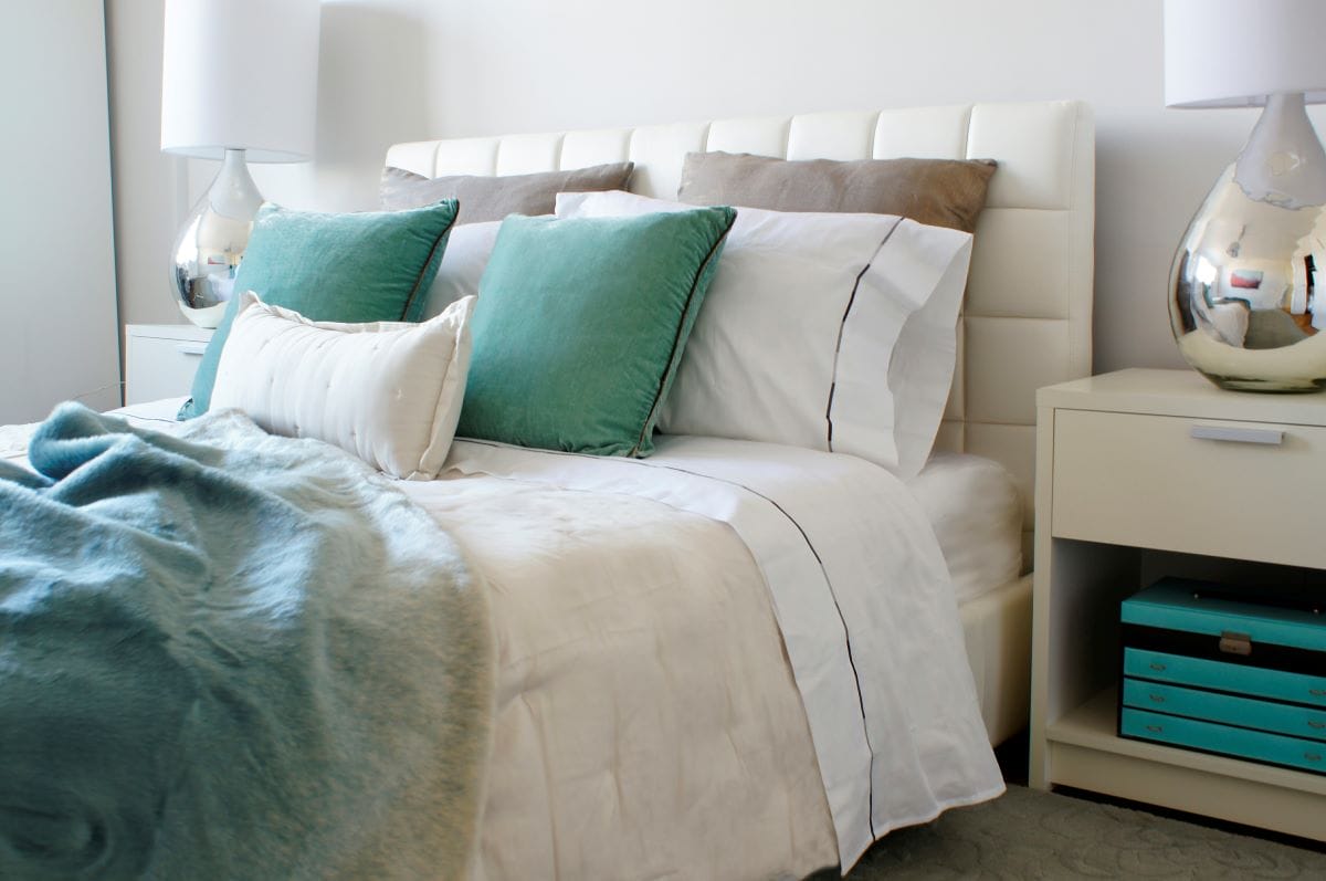
In bedrooms, Renew Blue can foster a rejuvenating environment. Often a signature element of coastal design schemes, this blend of hues is consequently draws on color psychology to trigger an emotional response. Use it in bedding, wall paint, or curtains to transform the space into a haven of relaxation.
Chic Accent Wall
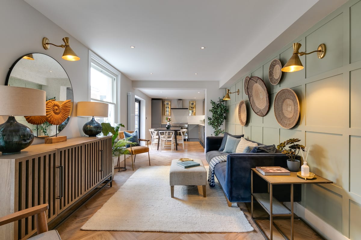
In living areas, this color can be used on accent walls or statement drapery, promoting a calm and cohesive look. Incorporate it in rugs or cushions for a tranquil living space. Alternatively, pick one signature piece of furniture and use it as a functional decor element.
Behr Color of the Year 2024: Cracked Pepper
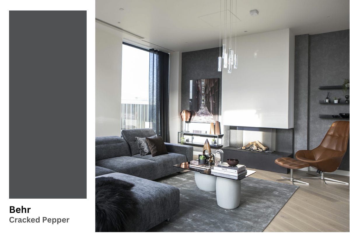
Somewhat unexpectedly, Behr singled out Cracked Pepper as their Color of the Year 2024. This hue feels sleek and grounding, offering a sophisticated palette suitable for various spaces. Described as a color that can awaken the senses, Cracked Pepper brings a unique sensory depth to interiors, making it more than just a visual element.
Tips for Best Uses of Behr’s Cracked Pepper in Your Home
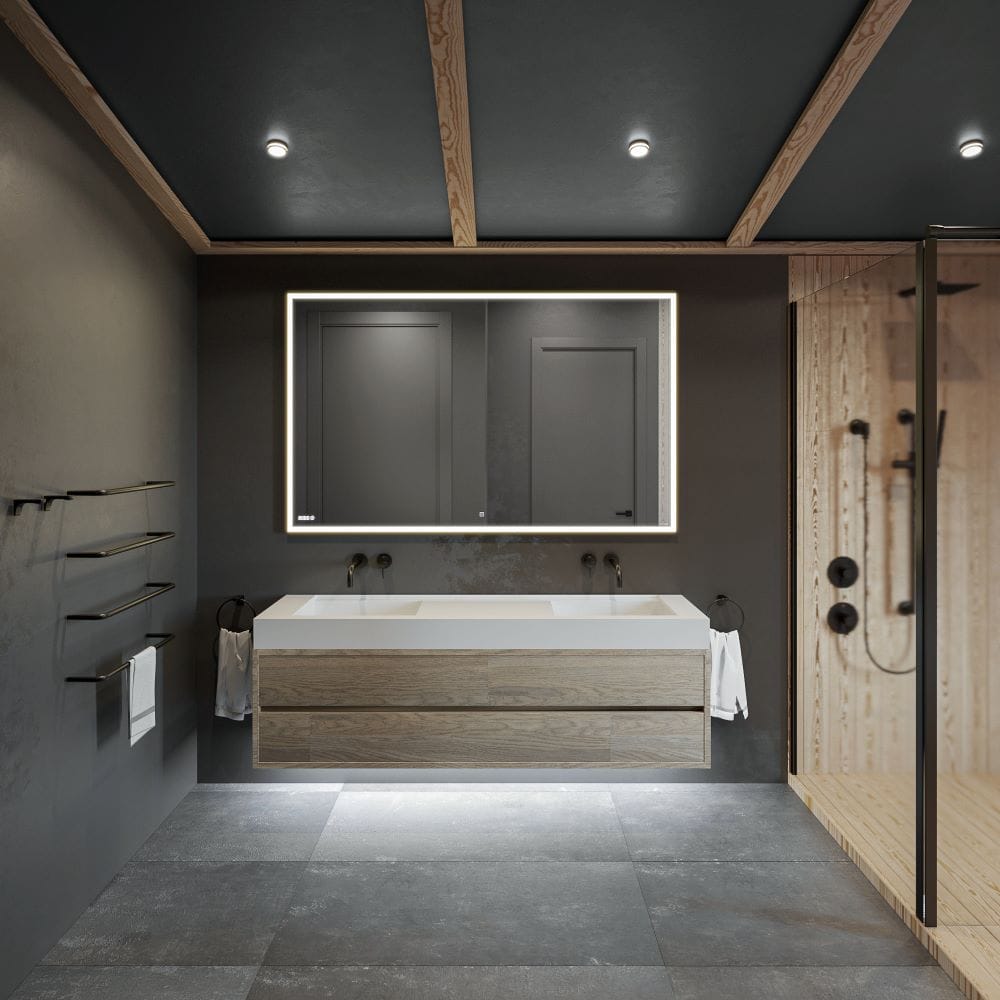
- Cracked Pepper makes an excellent backdrop for a wide range of colors, from soft pastels to bold hues, offering versatility in design choices.
- Combining this shade with various textures can add to its depth and richness. Cracked Pepper also provides a perfect backdrop for natural materials, creating a dramatic juxtaposition that emphasizes their organic character.
Suave Moody Walls
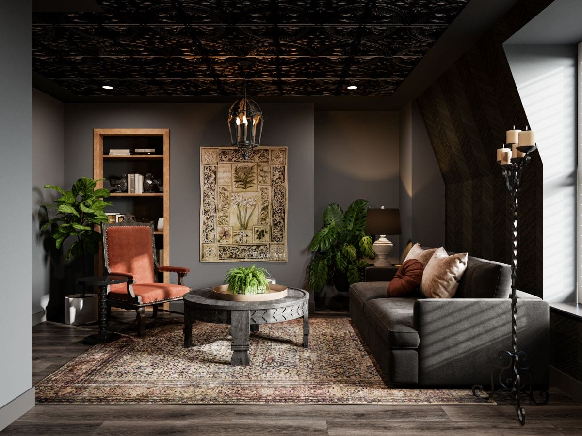
Cracked Pepper boasts the potential to turn any wall into a dramatic focal point. This bold hue commands attention while providing a rich background for decorative elements, enhancing their visual appeal. Cracked Pepper walls can also anchor lighter and brighter colors in the design scheme—an asset particularly effective in rooms with ample natural light.
Dapper Exterior Detailing
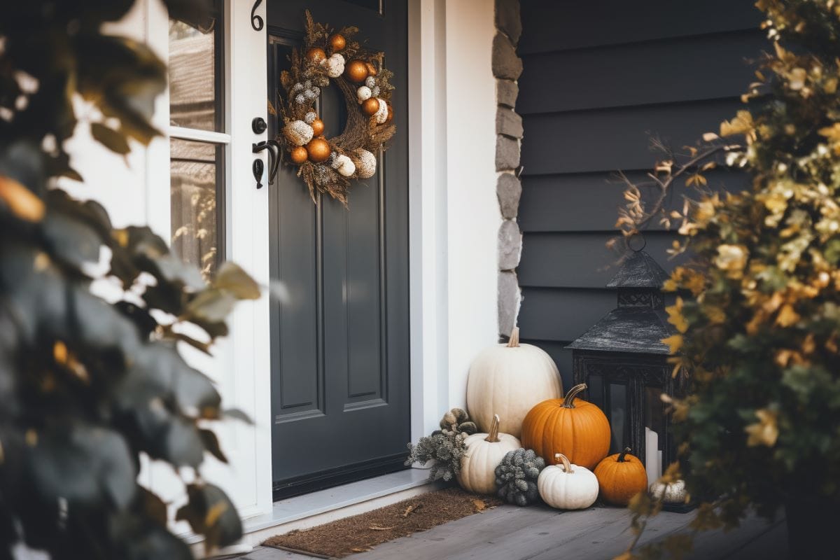
Cracked Pepper can look exquisite on exterior trims or shutters, significantly enhancing a home’s curb appeal. Its strong yet refined presence offers a striking contrast against lighter exterior colors. In addition, consider this bold choice for framing windows and doorways to convey a polished, sophisticated flair.
A Timeless Furniture Finish
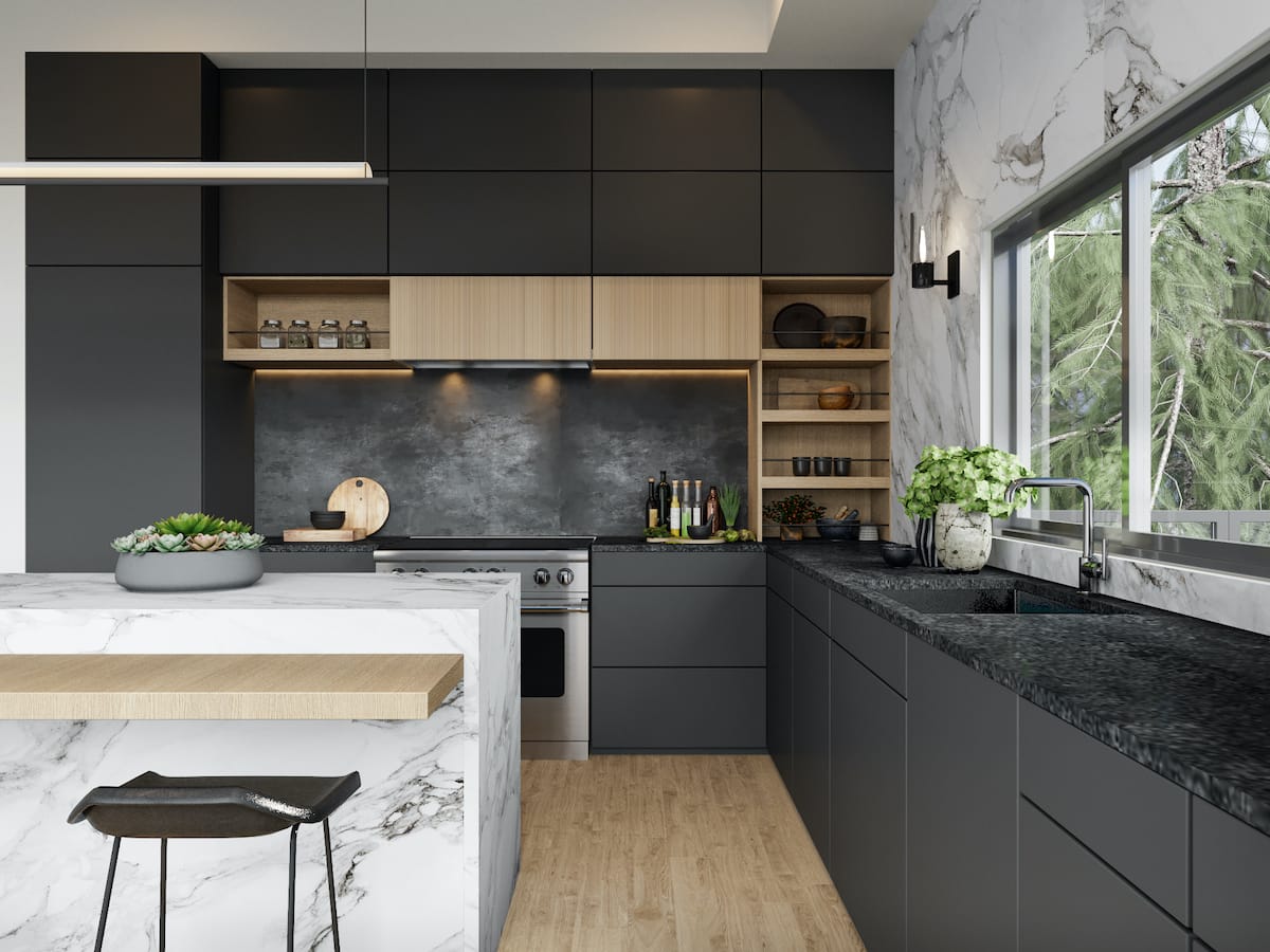
As a furniture finish, Behr’s 2024 Color of the Year oozes sleek chicness that speaks volumes. Its deep, soft character makes a striking statement on larger furniture items like cabinets, bookcases, or dining tables, instantly becoming the centerpiece of a room. On smaller accent pieces, such as side tables or chairs, Cracked Pepper adds a touch of dramatic luxury. This versatile shade also pairs beautifully with a variety of hardware finishes, from brushed nickel to brass, offering endless possibilities for customization.
Ready to dress up your home with a 2024 Color of the Year?
Our designers can masterfully harmonize a personalized palette for your stunning interior transformation. Schedule a Free Interior Design Consultation with our team to learn more today!


Comments