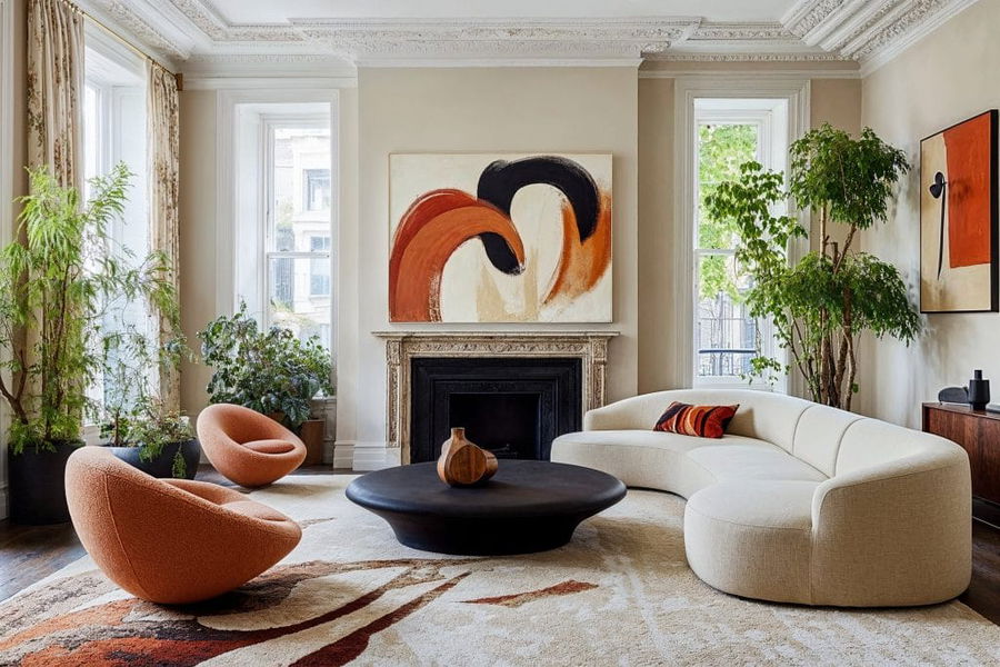
Are you ready to refresh your home with the hottest hues of the year? The colors of the year 2025 promise to bring fresh energy, calm sophistication, and bold statements to any space. Read on to learn how to seamlessly incorporate these trending colors into your home for a modern, stylish update.
Pantone Color of the Year 2025: Mocha Mousse
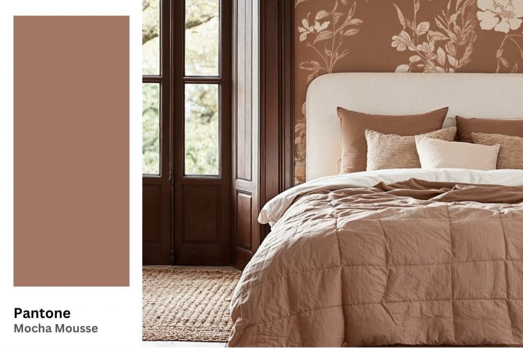
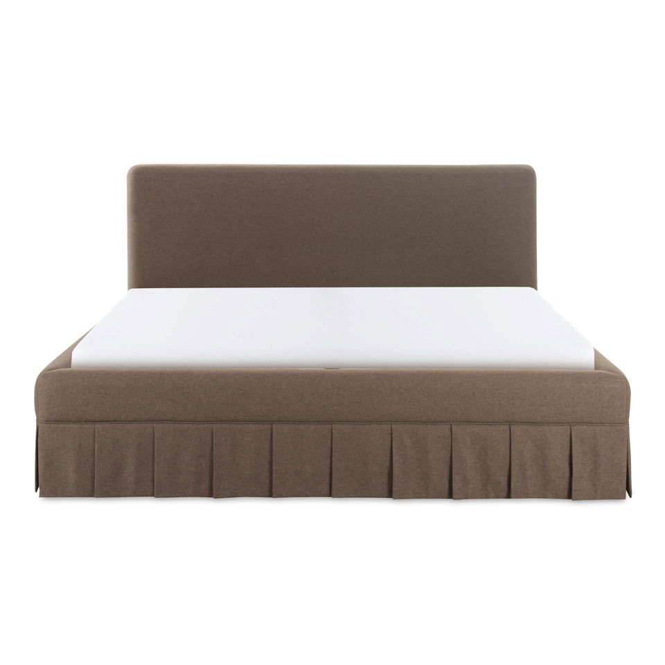
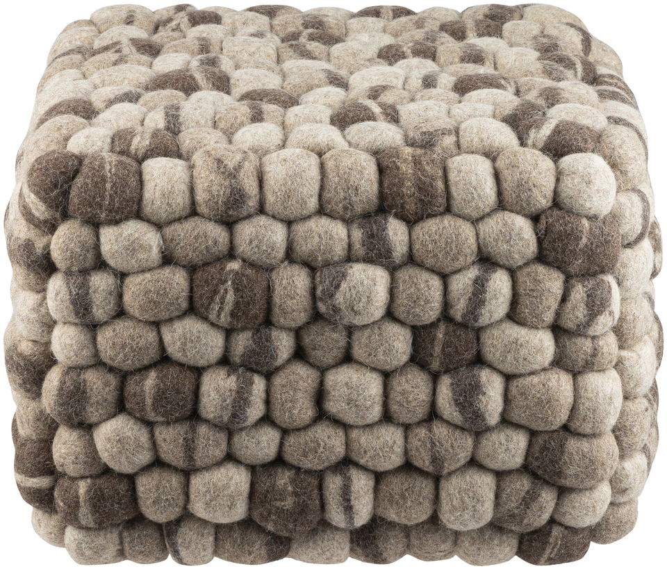
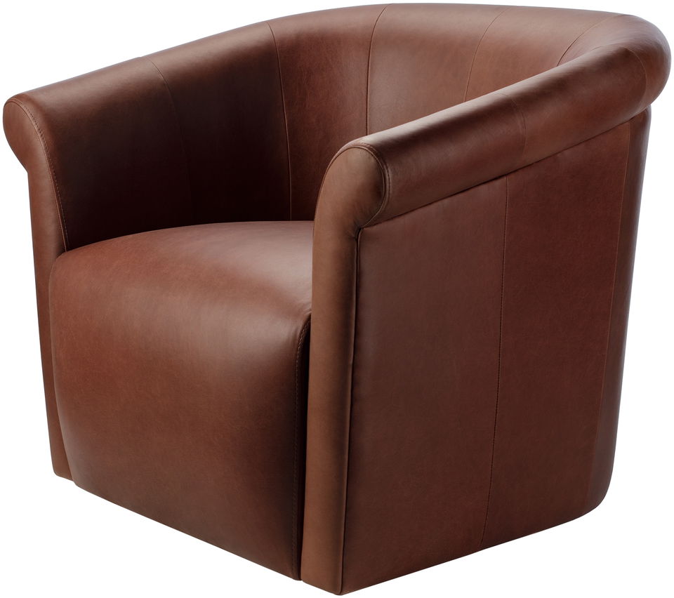
Pantone has chosen Mocha Mousse as the Color of the Year for 2025. This rich, warm shade brings an earthy vibe to any space, making it perfect for creating cozy, inviting interiors in your home. Ideal for spaces that need a grounding, timeless appeal, this color pairs beautifully with both neutral and vibrant accents.
Tips for Best Uses for Mocha Mousse in Your Home
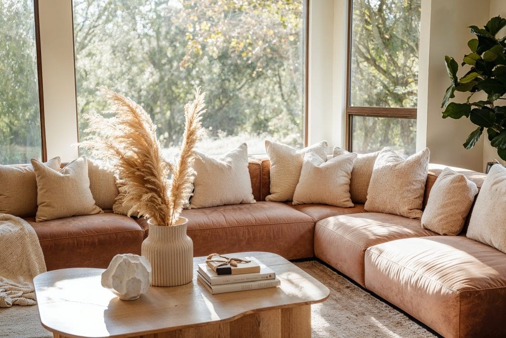
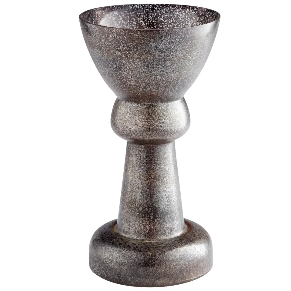
- Pair Mocha Mousse with metallic finishes to add sophistication. Metallic accents like gold, bronze, or copper will shine against the warm undertones of Mocha Mousse, creating an elegant and modern look.
- Drawing on the principles of interior design color psychology, use Mocha Mousse in spaces that benefit from a cozy, warm environment like living rooms and bedrooms. The earthy, muted tone helps create a comfortable space that feels relaxed and welcoming, ideal for areas where you unwind.
Pro Tip: The colors of the year complement many design styles. Not sure which is yours? Then, take our quick Interior Design Style Quiz to find out today!
Warm and Inviting Living Room
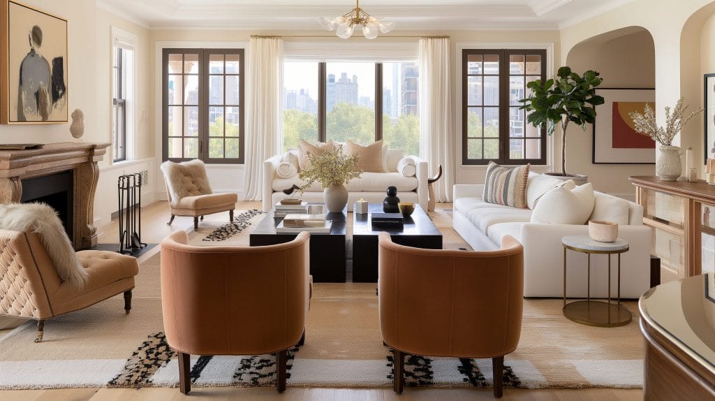
Mocha Mousse works wonders in curating the perfect living room ambiance. It can exude a warm, welcoming environment when used on the sofa, walls, or as a backdrop for your furniture. Pair it with soft whites, beige tones, or even deep jewel tones for added contrast. This lush color palette makes your living room feel like a sanctuary, perfect for relaxation and socializing with family and friends.
Luxury Bedroom with Statement Decor
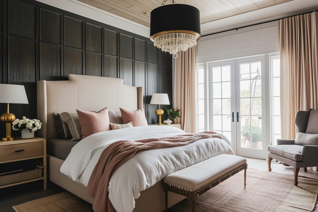
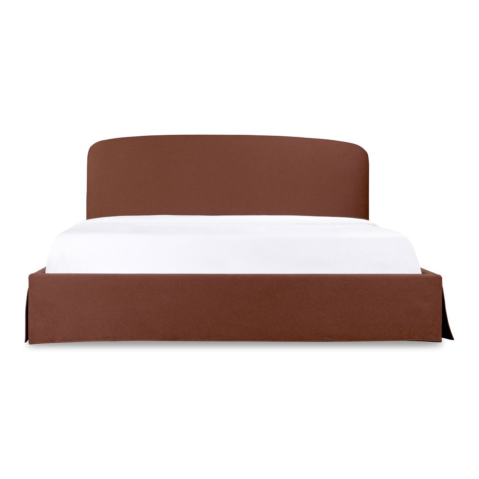
In the bedroom, Mocha Mousse creates a calming effect. Consider using it in your upholstery, decorative accents, or on a wall behind the bed to create a focal point. The richness of this color adds a luxurious touch while still feeling grounded and comforting. Incorporate Mocha Mousse in your curtains, pillows, throw blankets, and quilts. Pair it with soft bedding and neutral-toned furniture to maintain a soothing vibe while still making a bold statement.
A Cozy and Welcoming Hallway
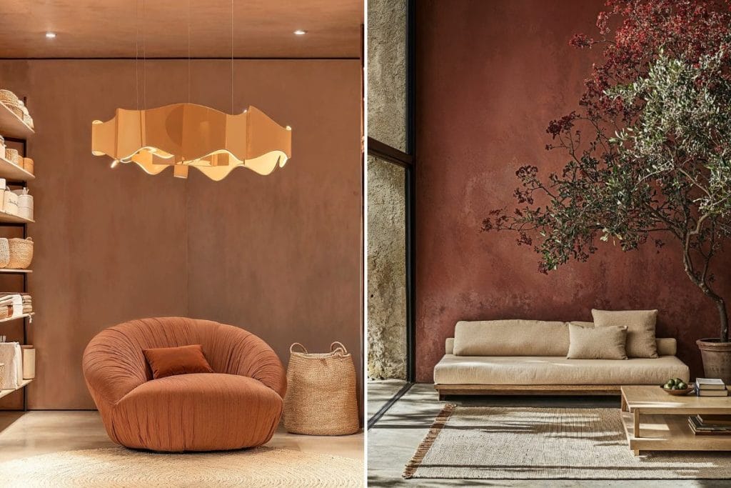
Hallways can often feel cold and uninviting, but with Mocha Mousse, you can change that. Use this color to make your entryway feel more warm and welcoming while also setting the tone for the rest of the home. Complement it with warm lighting and artwork to enhance the inviting atmosphere.
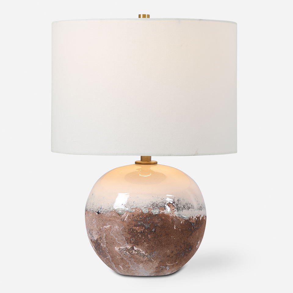
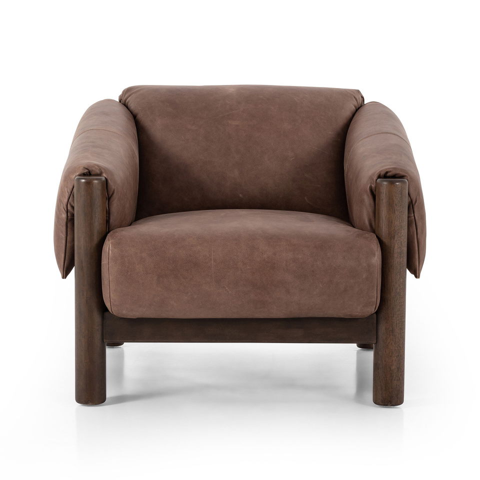
Designer Picks – Mocha Mousse
Sherwin Williams Color of the Year 2025: Chartreuse
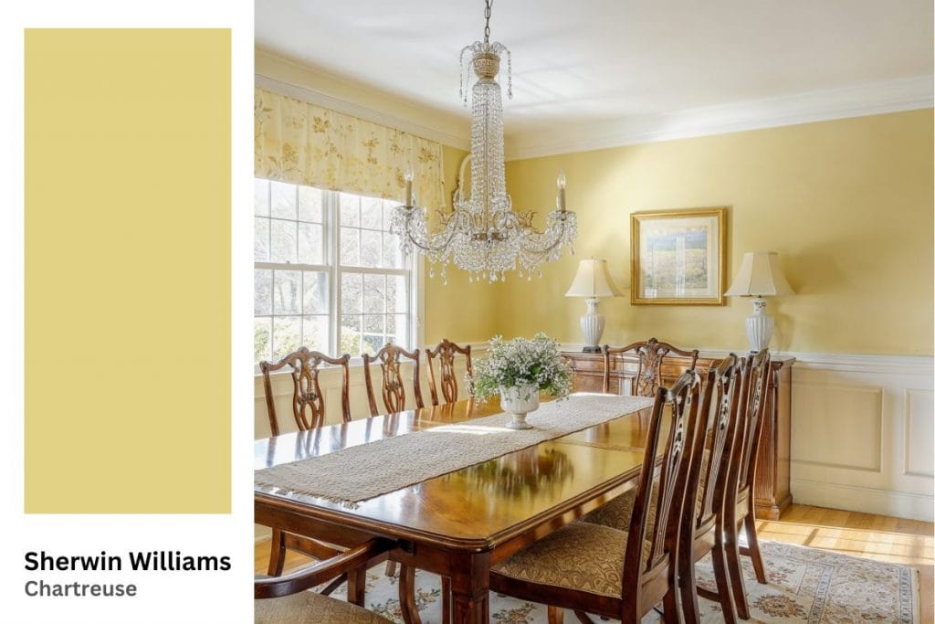
Chartreuse is one of Sherwin Williams’ vibrant and bold choices for their collection of 2025 colors of the year. This dynamic green-yellow shade brings energy and vibrancy to any room. A brighter alternative to the 2022 Color of the Year, Evergreen Fog, Chartreuse is a bold pick that can be used to liven up spaces or add pops of color in carefully chosen accents.
Tips for Best Uses for Chartreuse in Your Home
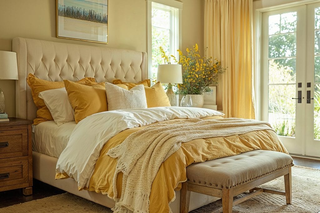
- Use Chartreuse in smaller accents to avoid overwhelming the space. Due to its intense vibrancy, using Chartreuse sparingly in your accessories can make the color stand out without dominating the room.
- Pair it with neutrals like gray or white for balance. Featured in the Sherwin Williams color of the year 2025 palette, Chartreuse pairs beautifully with neutral tones, providing a striking contrast that allows the color to pop while keeping the space pleasantly mellow.
A Lively Living Room with a Burst of Energy
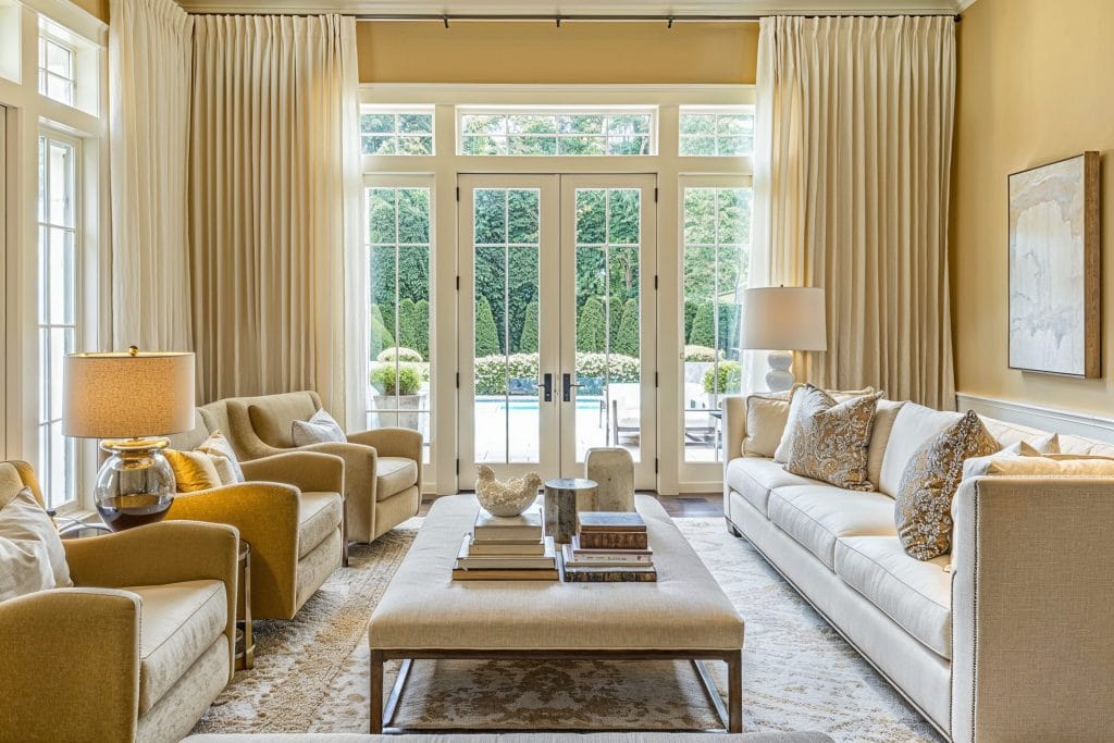
In the living room, Chartreuse is perfect for adding energy. Incorporate this lively hue into throw pillows, rugs, or even a painted feature wall to create a space that feels both exciting and fresh. You can mix it with light, neutral tones like white, beige, or gray to soften the boldness, allowing the color to shine without feeling overwhelming.
A Modern Kitchen with a Vibrant Twist
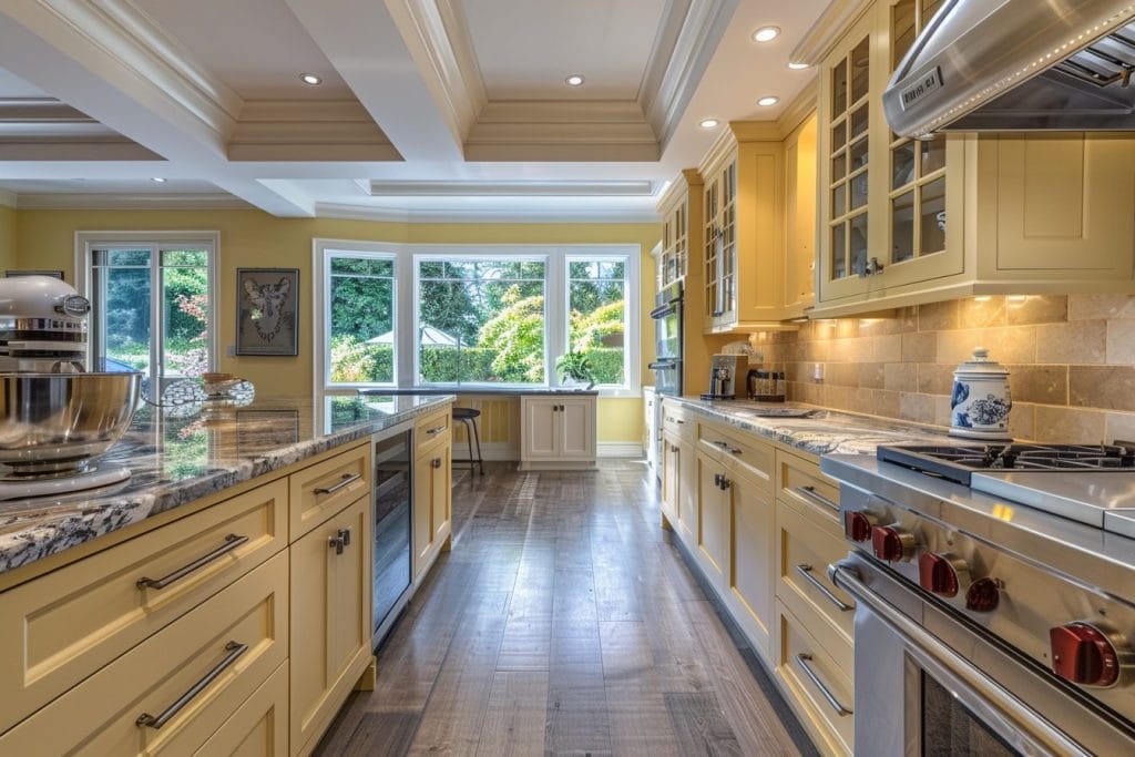
Chartreuse can brighten up your kitchen, especially when paired with contemporary, minimalist designs. Consider using it for bar stools, kitchen islands, or even cabinet accents to bring the room to life without overpowering it. Its brightness adds a modern flair that will make your kitchen feel vibrant and welcoming.
Playful and Refreshing Outdoor Décor

Sherwin Williams color of the year 2025, Chartreuse, can add a playful touch to your outdoor spaces. Whether through throws, cushions, or even rugs, this color can make your outdoor patios feel more fun and lighthearted. You can balance it with white, gray, or brown shades to keep the overall design fresh and modern while still having fun with the color.
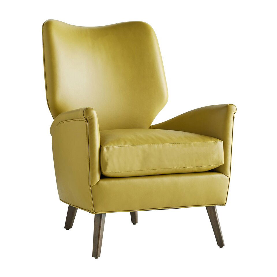
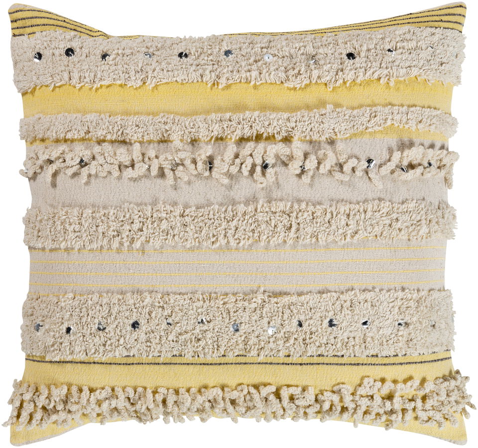
Designer Picks – Chartreuse
Benjamin Moore Color of the Year 2025: Cinnamon Slate
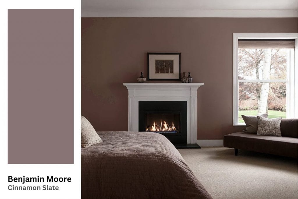
Benjamin Moore has selected Cinnamon Slate as its Color of the Year 2025. This earthy, warm color has a subtle spice to it, making it perfect for creating inviting spaces that feel both cozy and sophisticated.
Tips for Best Uses for Cinnamon Slate in Your Home
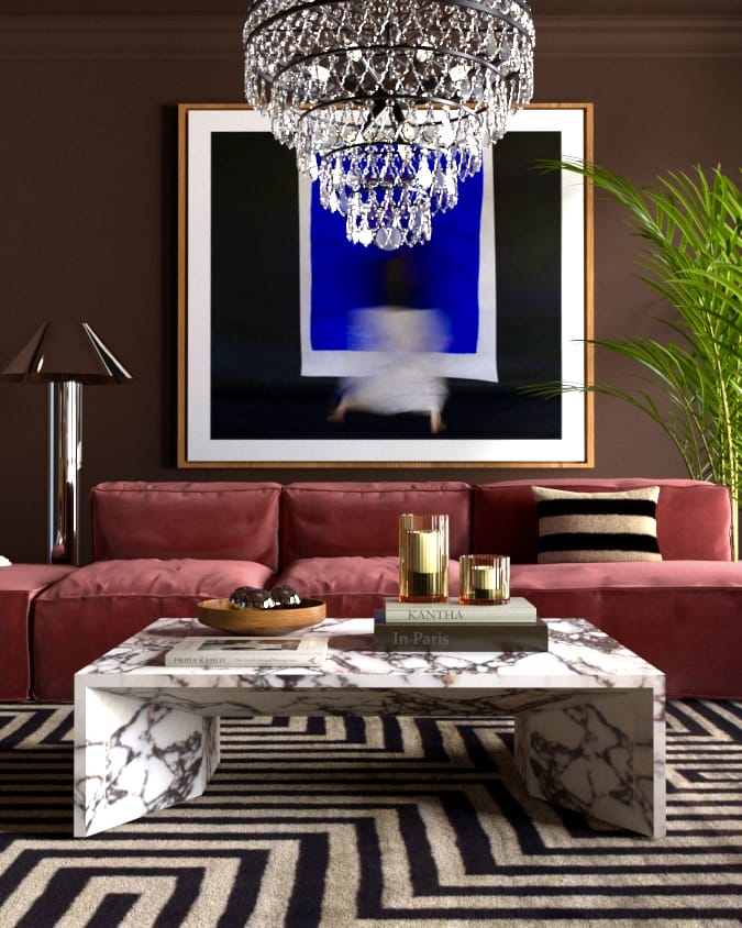
- Use Cinnamon Slate for walls or large statement furniture pieces to create a rich, warm atmosphere. The depth of this color works well as a primary shade, especially on larger surfaces, creating an elegant and calming atmosphere.
- Pair it with natural textures like wood and stone for an organic feel. Cinnamon Slate blends beautifully with organic elements like wooden furniture or stone accents, helping to enhance its earthy feel.
A Warm and Inviting Bedroom
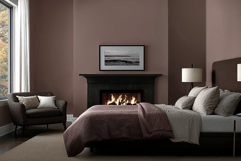
Cinnamon Slate makes a wonderful statement in the bedroom. Use it on the walls or as a backdrop to bed for a cozy, sophisticated setting that encourages relaxation. Pair it with gold or brass fixtures for a refined, elegant look.
A Calm and Serene Living Room
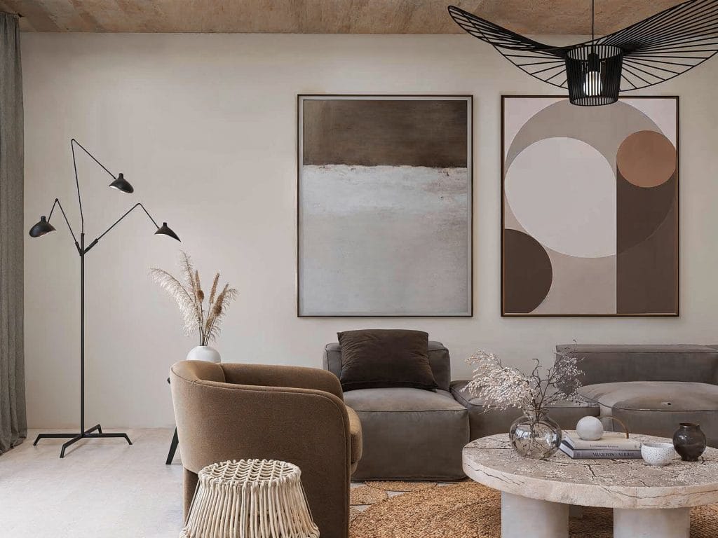
This rich color works wonders in the living room, adding a feeling of warmth and calmness to your space. Try incorporating it into the furniture, walls, artwork, and other accents. Add an element of softness with light-colored fabrics for a balanced look.
A Timeless Kitchen with Rich Accents

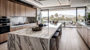
Incorporating Cinnamon Slate into the kitchen can be as simple as adding small accents. Think of Cinnamon Slate-painted cabinets, or perhaps in the backsplash tiles to give the room a cozy, timeless vibe. This color works beautifully with natural wood surfaces and light countertops, adding depth and richness without overwhelming the space.
Designer Picks – Cinnamon Slate
Valspar Color of the Year 2025: Encore

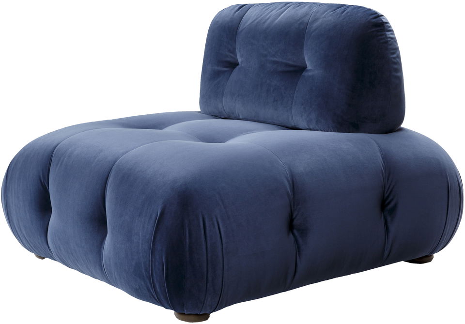
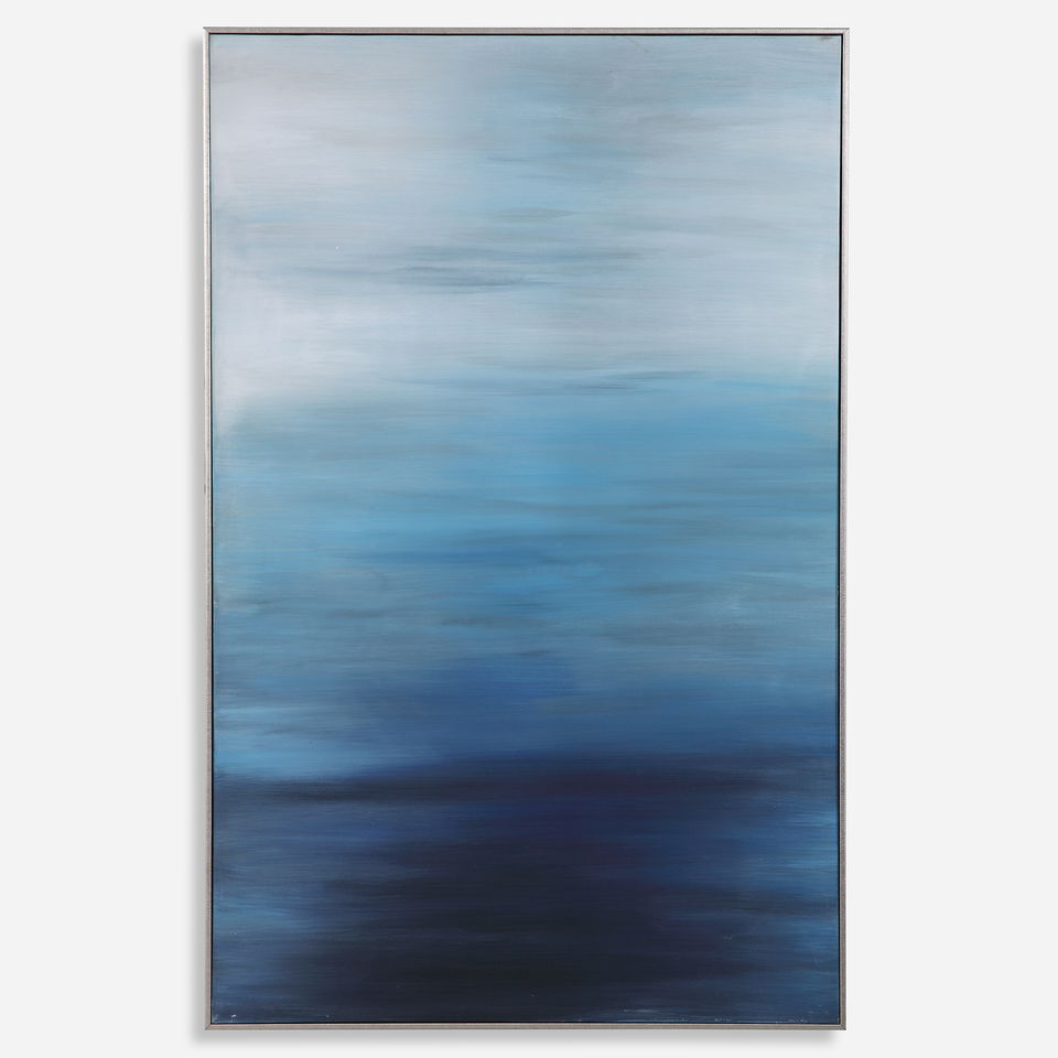
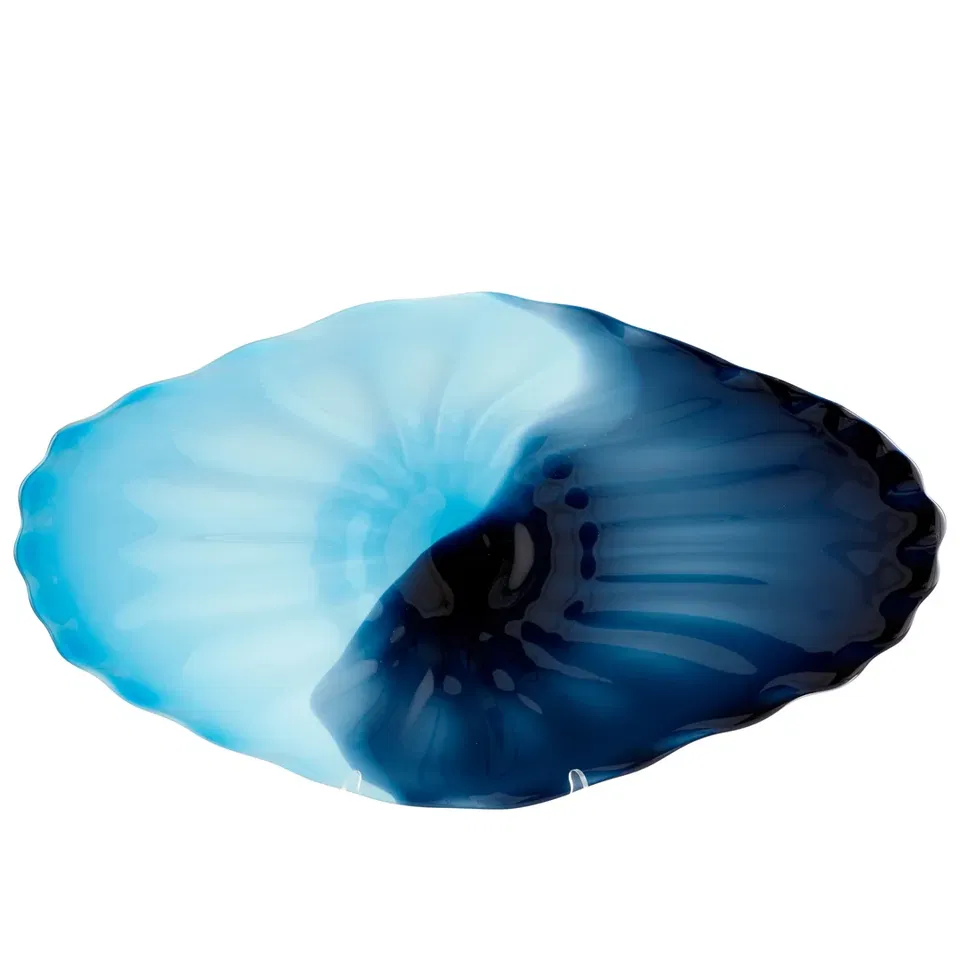
Valspar’s Encore is a deep, calming shade of blue that offers tranquility and balance. This color encourages relaxation, making it ideal for spaces where you want to unwind and recharge. Whether you are looking to make a bold statement or add subtle elegance, Encore is a versatile choice.
Tips for Best Uses for Encore in Your Home
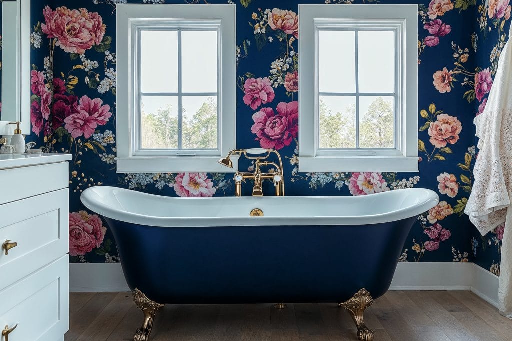
- Pair Encore with light-colored furniture for contrast. The deep, muted tones of Encore look striking when paired with lighter furniture or décor, allowing it to stand out without feeling too heavy.
- Use it in spaces like bedrooms, living rooms, or bathrooms where relaxation is key. Its calming nature makes it ideal for creating a soothing ambiance in areas dedicated to rest and relaxation.
A Peaceful and Restful Bedroom
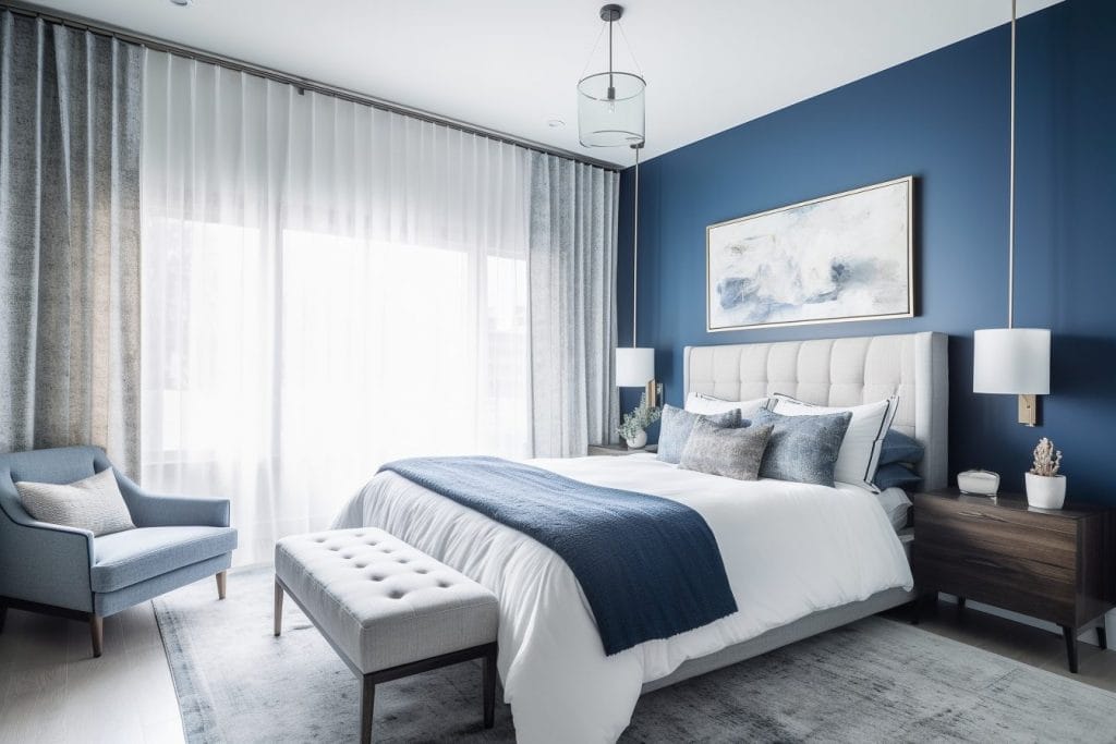
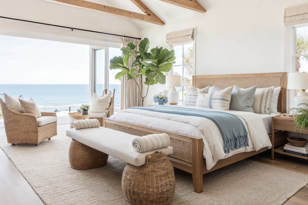
Valspar’s 2025 color of the year, Encore, is a wonderful choice for creating a serene bedroom retreat. Use it for upholstery, an accent wall behind your bed, or on all your walls to evoke a sense of calm and serenity. It pairs beautifully with soft, neutral bedding and natural textures to create a balanced, soothing space. Encore makes your bedroom the perfect place to unwind at the end of the day.
An Elegant Living Room with a Touch of Class
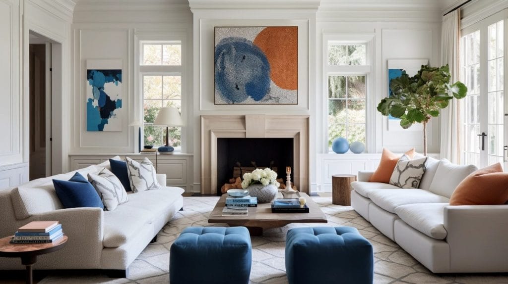
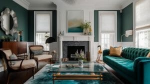
In the living room, Encore brings a subtle sophistication. Whether on the walls, as an accent color, or in the form of throw pillows and rugs, this shade can make your space feel elegant and serene. The calming effect of Encore works well in both modern and traditional settings, offering versatility without sacrificing style.
A Sophisticated Dining Room

Encore can transform your dining room into a sophisticated and enjoyable space for gathering and dining. The soft, muted tone sets a serene yet elegant atmosphere, perfect for intimate meals or entertaining guests. Pair it with refined, modern furniture to create a polished, inviting setting that enhances both comfort and style.
Designer Picks – Encore
Behr Color of the Year 2025: Rumors
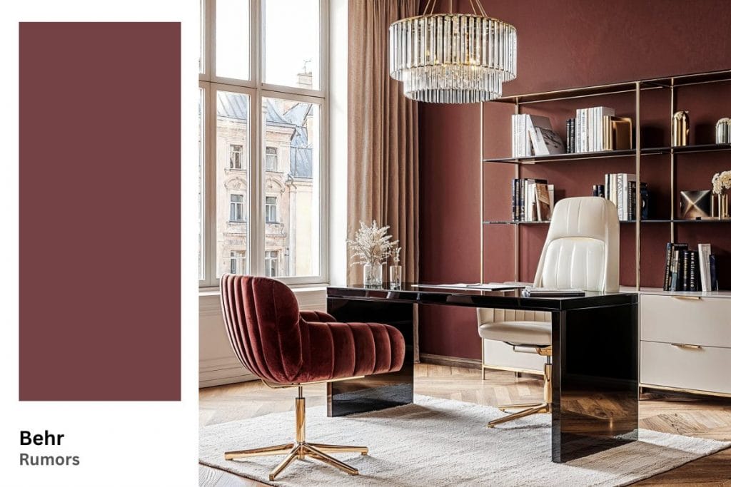
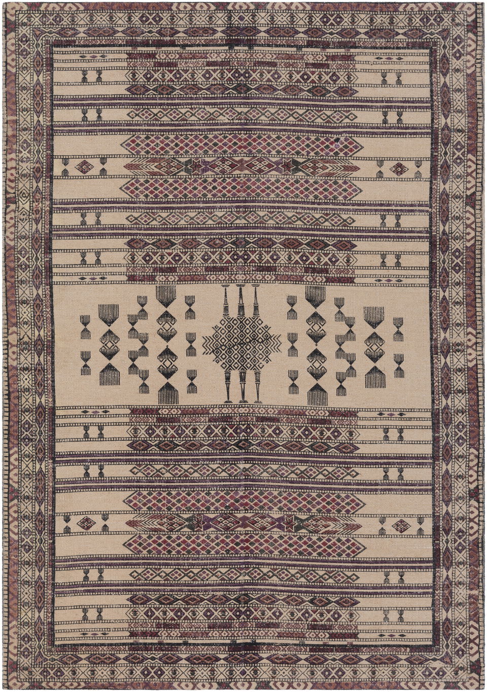
Rumors, Behr’s paint color of the year 2025, is a deep ruby red that brings warmth and richness to any space. This color offers a bold, dramatic flair that works perfectly in areas where you want to make a statement. It pairs well with both modern and traditional designs.
Tips for Best Uses for Rumors in Your Home

- Use Rumors for accent walls or accessories to add depth and richness to a room. It creates a bold focal point that adds drama without overwhelming the room.
- Color trends 2025 are all about embracing versatile hues that pair well with neutral tones, allowing the color to stand out without overpowering the space. Combining this deep ruby red with neutral colors like beige, gray, or white will balance out its intensity, making it more versatile and adaptable.
A Bold and Dramatic Living Room

Rumors is perfect for creating a statement in the living room. Use it on an accent wall or as a feature piece in furniture such as large couches or decorative chairs to give the room a rich, inviting feel. The color can also be complemented with soft, luxurious fabrics like velvet or silk for a truly opulent atmosphere.
A Chic and Stylish Dining Room

For a luxurious, dramatic feel, incorporate Rumors into your dining room. Consider using it for an accent wall or even on your dining chairs to create an intimate, warm ambiance perfect for hosting dinner parties. Pair it with metallic finishes, like gold or brass, to further enhance the rich, sophisticated tone.
A Striking Entryway That Leaves an Impression

A splash of Rumors in the entryway can create a stunning first impression. Try using this deep red paint color in your front door, hallway, or even on walls to make a bold statement. It is perfect for creating an atmosphere of warmth and richness as guests enter your space.
Designer Picks – Rumors
Ready to Refresh Your Home Design with the Colors of the Year 2025?
Hiring a professional interior designer can help you incorporate color trends that fit your style and taste. Schedule a Free Interior Design Consultation to get started today!




Comments