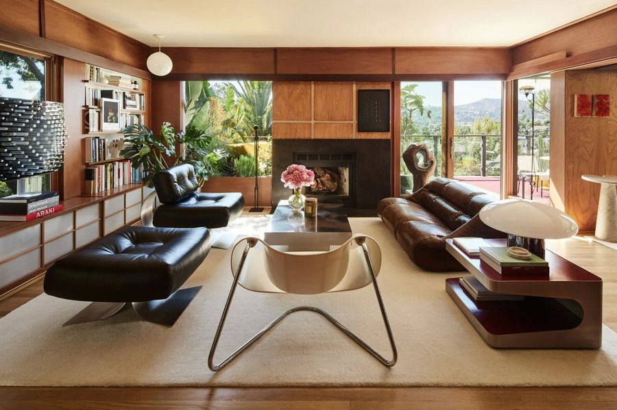
For every great design, there are a few pretty terrible ones. They all succumb to one or more of the worst interior design mistakes – and it shows. Fortunately, you can avoid the same fate by knowing what not to do. Read on as we explore common design blunders and how to fix them if you become the unfortunate victim of an interior design fail.
The 12 Worst Interior Design Mistakes
Some insight or help from top interior design apps or services will certainly help you conquer any interior faux pas. With these tips, you can dodge pitfalls and create a breathtaking space instead.
Do you have an interior design mistake that could use the help of a pro? Then, schedule a Free Interior Design Consultation to get started with a top designer today!
1. Choosing the Wrong Color
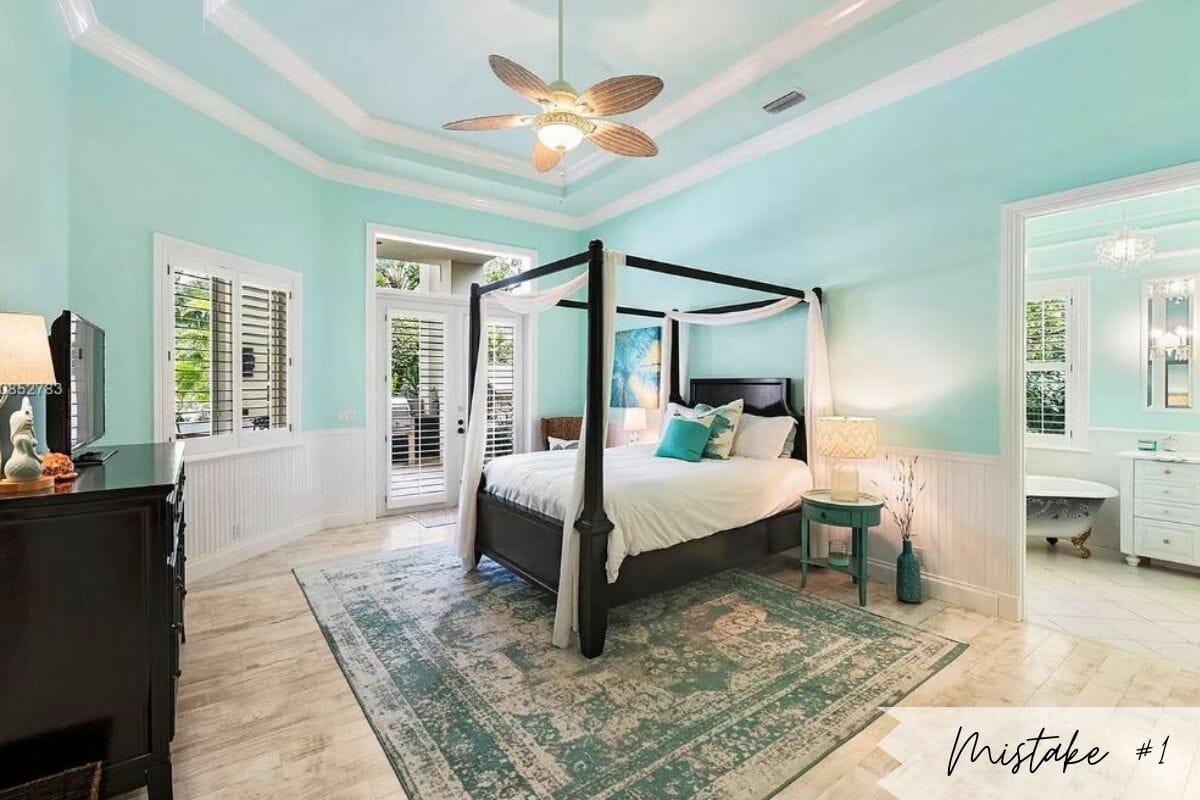
Painting mistakes are among the most common interior design faux pas out there. And, it’s one of the worst ones too. The reason lies in its overwhelming influence on the rest of the space. It impacts the ambiance, mood, and look of the room. Consider color psychology and test swabs in your preferred room before committing paint to the wall.
The Fix: Test or Go Neutral
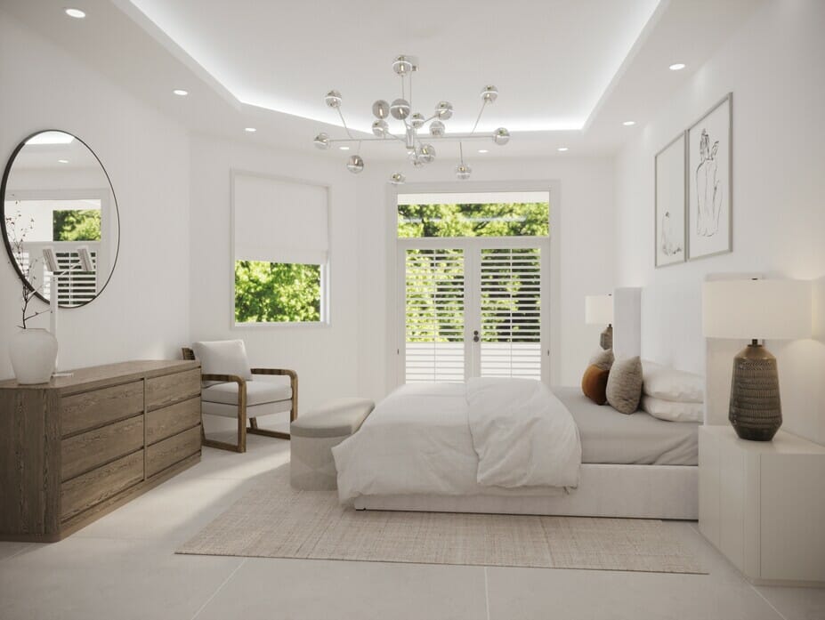
First, choose a base color that’ll stand the test of time. This means large surfaces, like walls, ceilings, and floors, are best in a neutral or muted hue. You can then select supporting tones that work well with the main shade. Playing it safe is often an easy way to avoid interior design errors altogether. Also, if you have existing furniture you want to keep, use them as a guide for your wall colors. Experts in designing living spaces can also help you pick the right colors.
2. Not Balancing the Layout
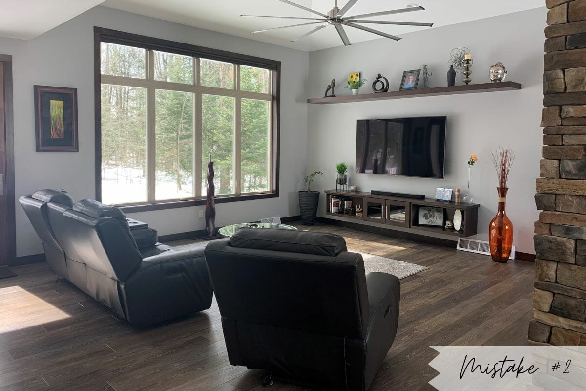
A bad layout is one of the most common interior design mistakes that’s vital to avoid. Often, ill-planned interiors lack a positive visual and practical flow. They neglect the movement of foot traffic as well as aesthetic elements.
The Fix: Plan & Measure
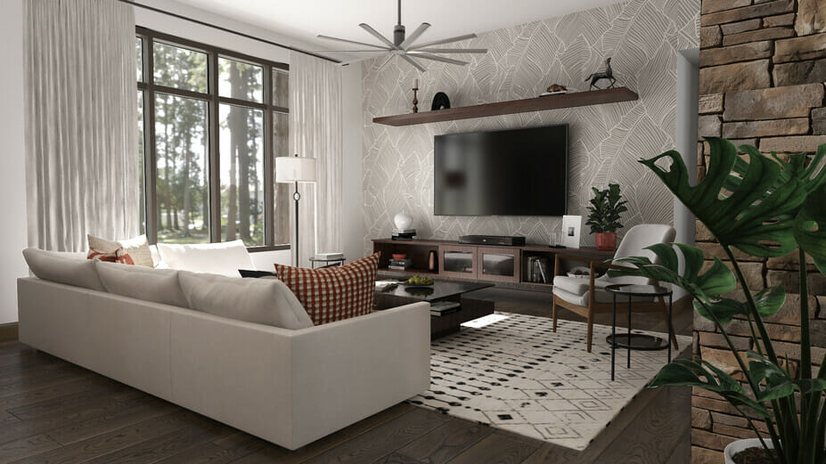
Consider your room size, furniture selection, and placement. Then measure and try different layouts. You can create a harmonious space by decorating around a center – like a coffee table – while ensuring all sides are equally weighted. You can also use 3D design apps online to test your layout or draw them on paper.
3. Opting for Ill-Sized Furniture
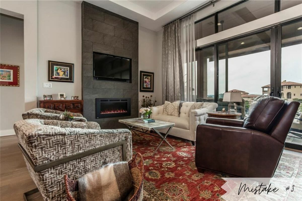
Some interior design mistakes can feel counterintuitive. For example, decorating a small room with small furniture may feel right, but it can make the space look cluttered. On the other hand, too many chairs and sofas can take away the roominess of a large room.
The Fix: Scale & Practice Restraint
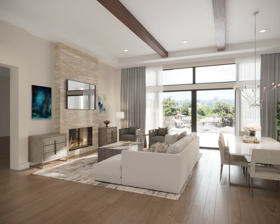
Scale is vital in any given room. Balance small or low-profile pieces with larger or taller items and allow breathing space between objects. The last is especially true with sofas and tables. And finally, avoid clustering chairs around a coffee table.
4. Using Too Small Rugs
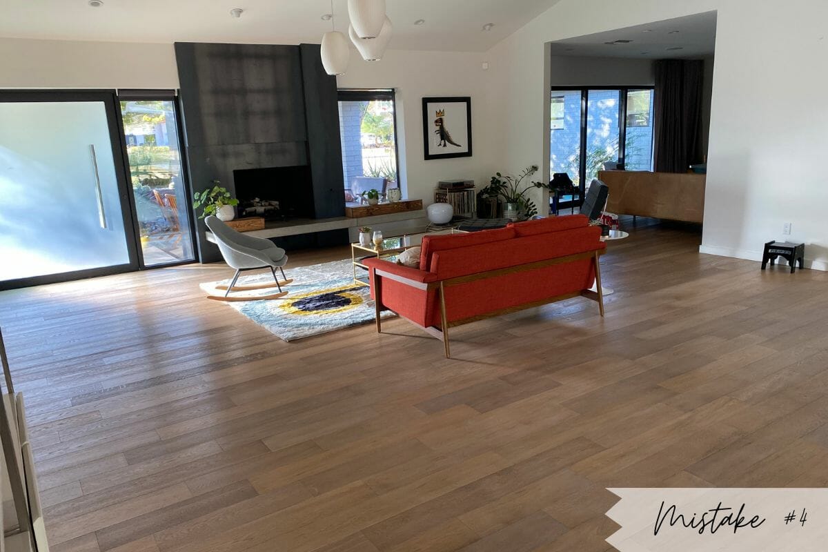
Plushness underfoot can make a room feel so cozy and complete. Yet, when a rug is the incorrect size, it’ll make the interior feel awkward. As one of the worst interior design mistakes to make, getting it right can be so beneficial. A rug is not only grounding, but it can also add depth and definition through zoning and texture.
The Fix: Go Bigger
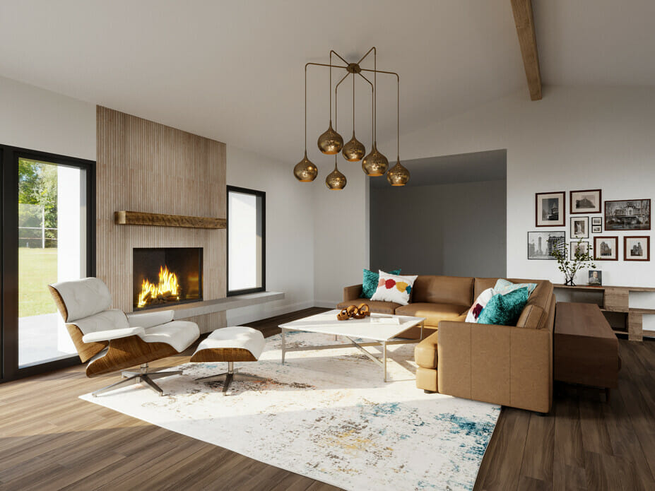
Choosing the correct rug size is an instant fix. However, the right rug varies from one room to the next and depends on the room size, the layout, and furniture. A lounge, for instance, needs a rug big enough to fit at least all the front legs of the seating. A dining room rug must allow space for chairs to be pulled out from the table. And finally, a bedroom rug should extend at least two feet on the sides of the bed.
5. Not Enough Lighting
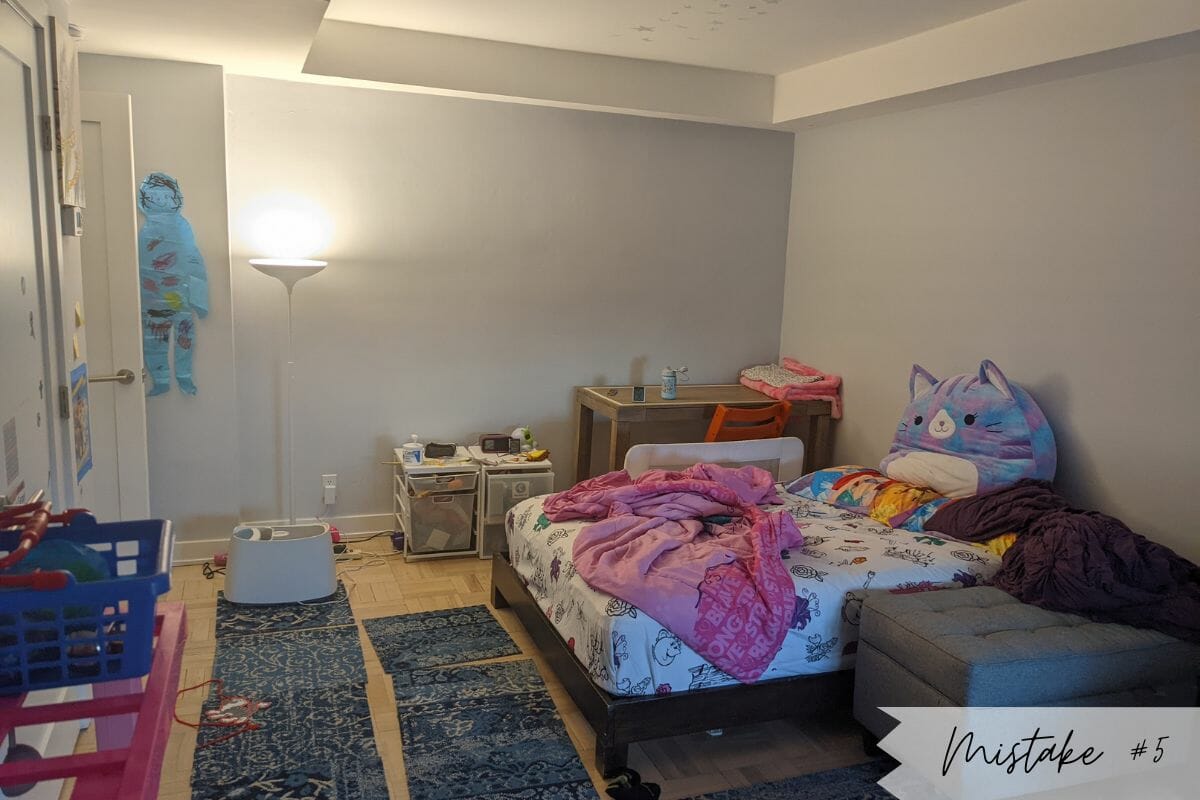
Bad lighting is not only one of the most common bedroom interior design mistakes, but it extends to the whole house and even commercial spaces. Limited light sources result in a dimly or harshly lit room, with no in-between. It can make a room feel very unwelcoming.
The Fix: Layer Light
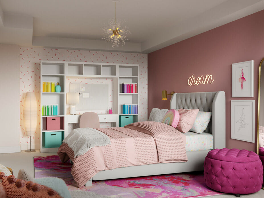
If possible, avoid one of the worst interior design mistakes by integrating lighting design into your build plans. You need three layers of lighting: ambient, task, and accent. Ambient light ensures general illumination throughout a room, like downlights. Second, task lighting (like a desk lamp) makes working, reading, and cooking easier. And lastly, accents highlight special features and define an interior.
6. Ignoring Vertical Space
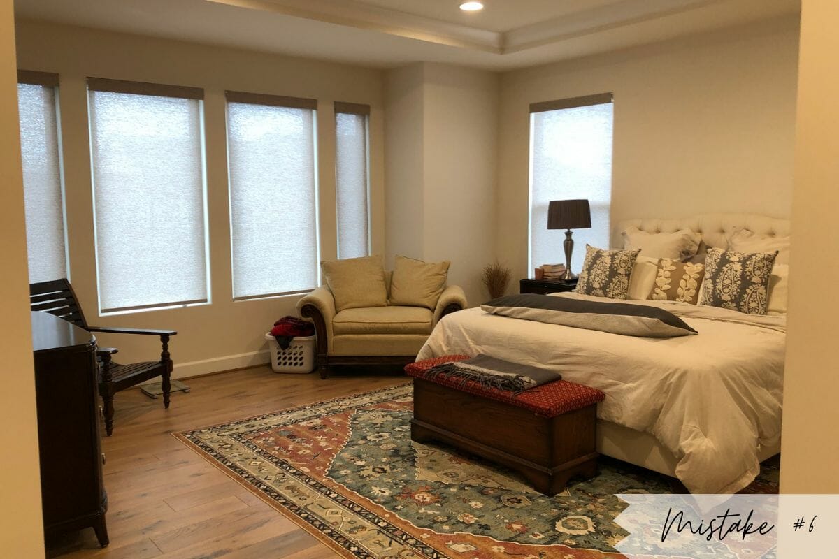
A room can have beautiful furniture yet still feel off. Not utilizing a room effectively is often the culprit. This includes neglecting walls, ceilings, and vertical space. Unfortunately, the bedroom is where these interior design mistakes run wild.
The Fix: Add Height
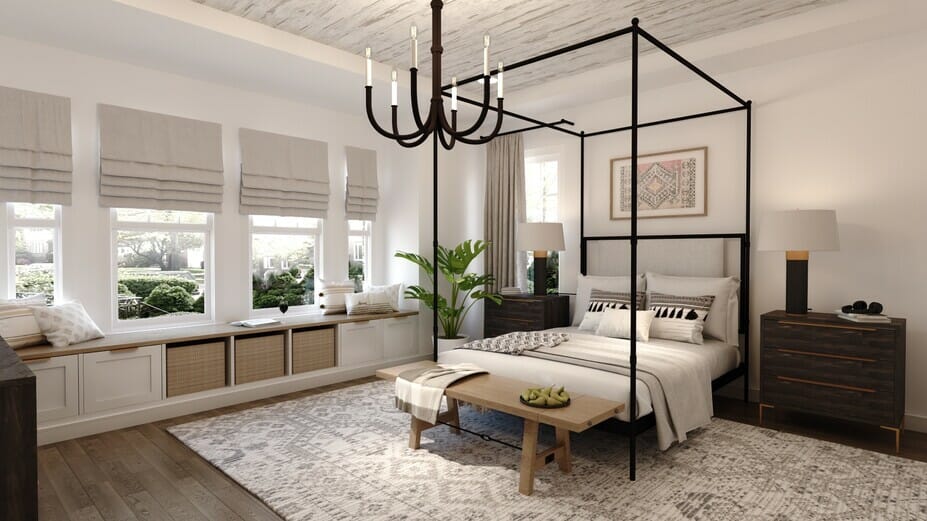
One way to avoid common interior design mistakes is by adding dimension. Use furniture with different heights, artwork, and (pendant or floor) lighting. Don’t be afraid to try something new, like a canopy bed or floor-to-ceiling curtains.
7. Not Adding Variety
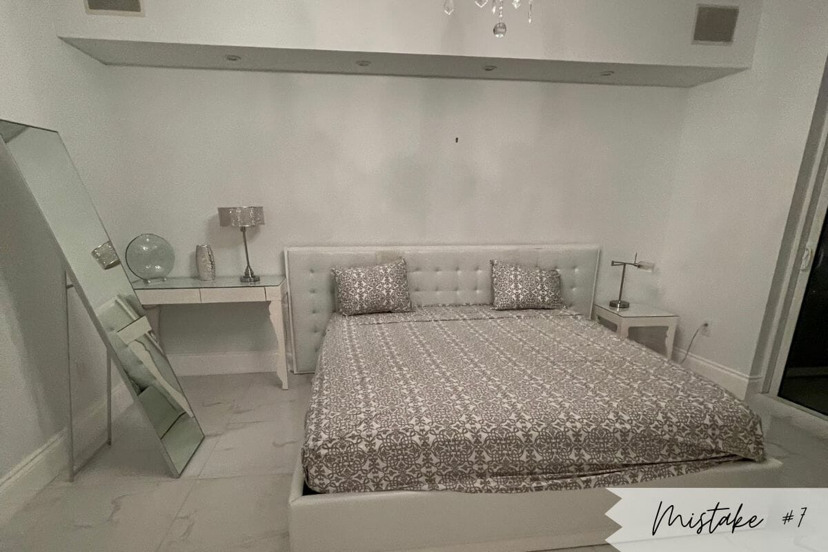
It’s easy to get stuck on a certain look and finish, especially if a trend has caught your eye. But fixating too heavily on one aspect can make the room seem flat and unimaginative. Single-color themes or all-similar finishes can be monotonous without variety. But they are simple interior design mistakes to avoid, especially as these spaces typically feel incomplete.
The Fix: Mix it Up
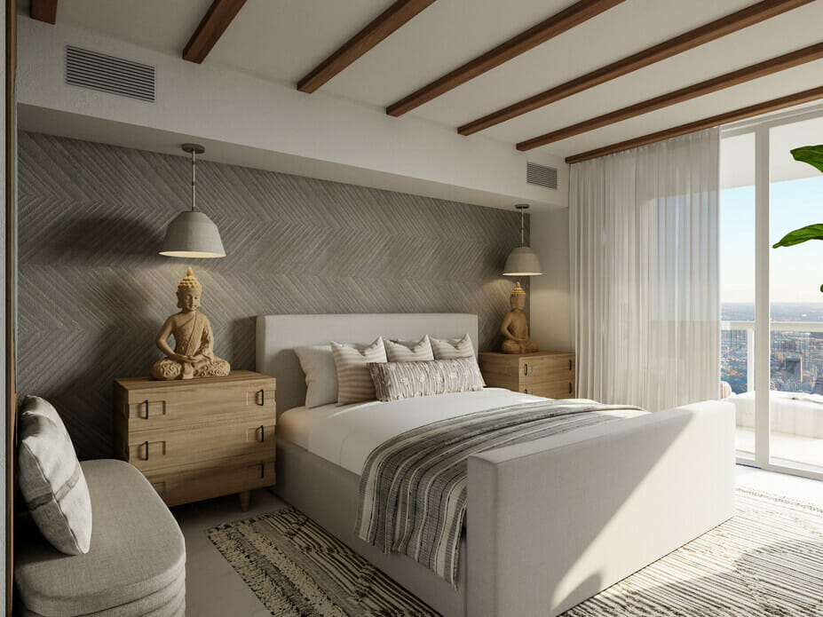
You can create a cohesive whole without matching all your furniture. If you want a neutral or monochromatic scheme, pick a primary color and shades in the same color family. Grays, for instance, have warm and cool tones. A combination of both is sure to add more depth to your space. Additionally, add different textures and materials to avoid the worst design mistakes. These accents can feature as a rug, drapes, throw pillows, upholstery, and even cabinetry.
8. No Focal Point
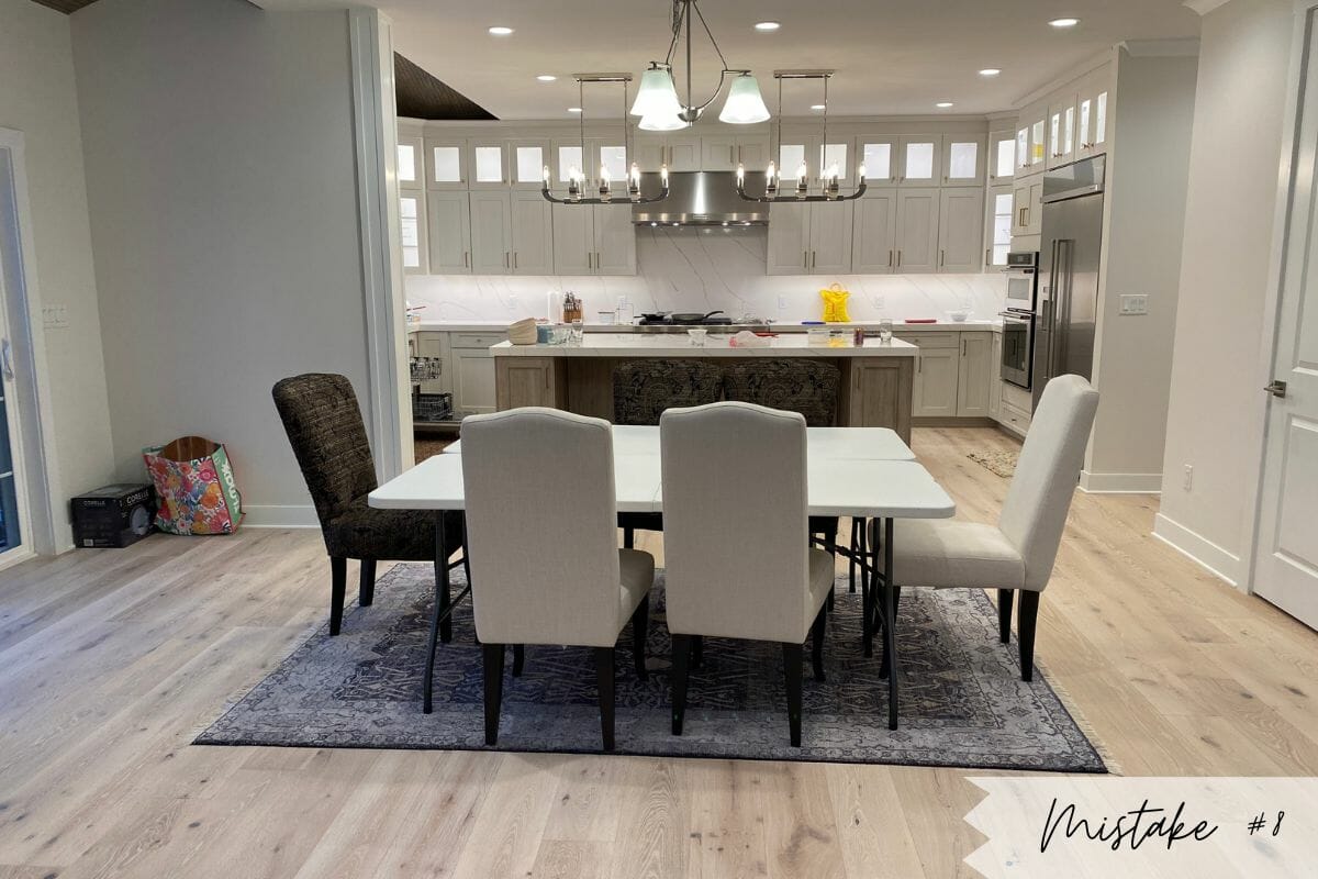
One sure way to make a space feel bland is by forgetting to create a focal point. Without a central focus, there is no place for eyes to rest and a room can feel unorganized yet empty as a result.
The Fix: Create Feature Zones
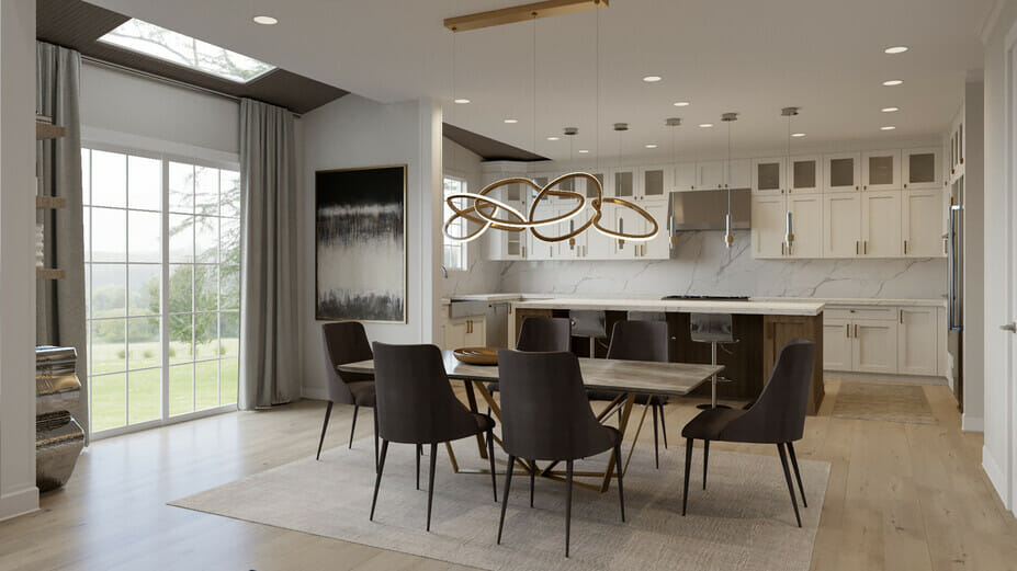
Planning makes interior design mistakes, like this one, easy to avoid. You can create one large focal point in a room or have smaller features per zone in a big space – like an open plan living-kitchen area. The fix above shows how striking contemporary lighting sets the new dining area apart from the rest of the interior. Yet, it is unobtrusive and gives a sly glimpse of the marble backsplash in the kitchen beyond.
9. Forgetting About Traffic Flow
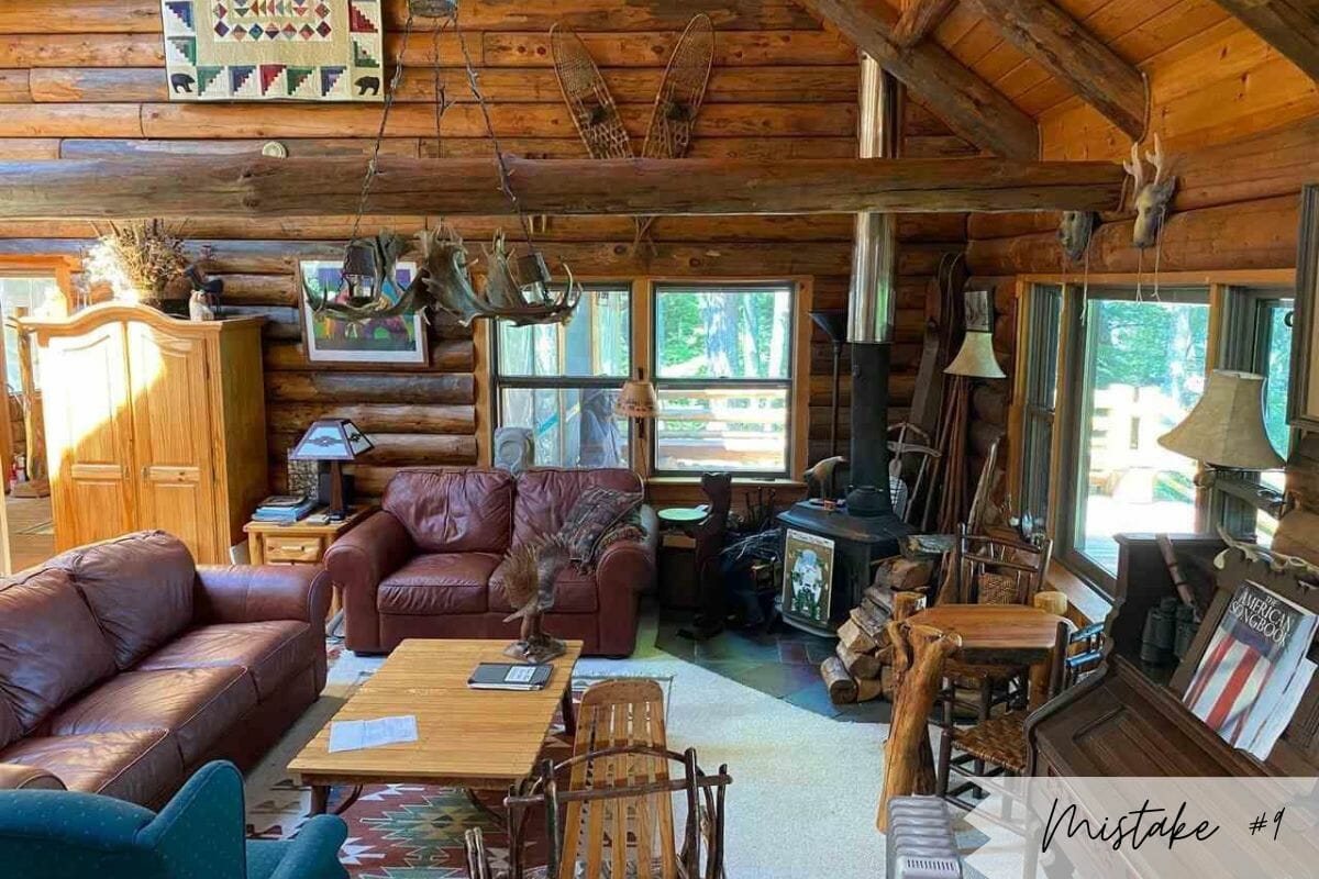
If you have to climb over or shimmy past furniture to enjoy the lounge, there are living room layout mistakes at work. Such a setup not only makes life difficult, but it also has a detrimental visual impact. As a result, a room will feel crowded when you can’t move about freely.
The Fix: Free Flow Layout
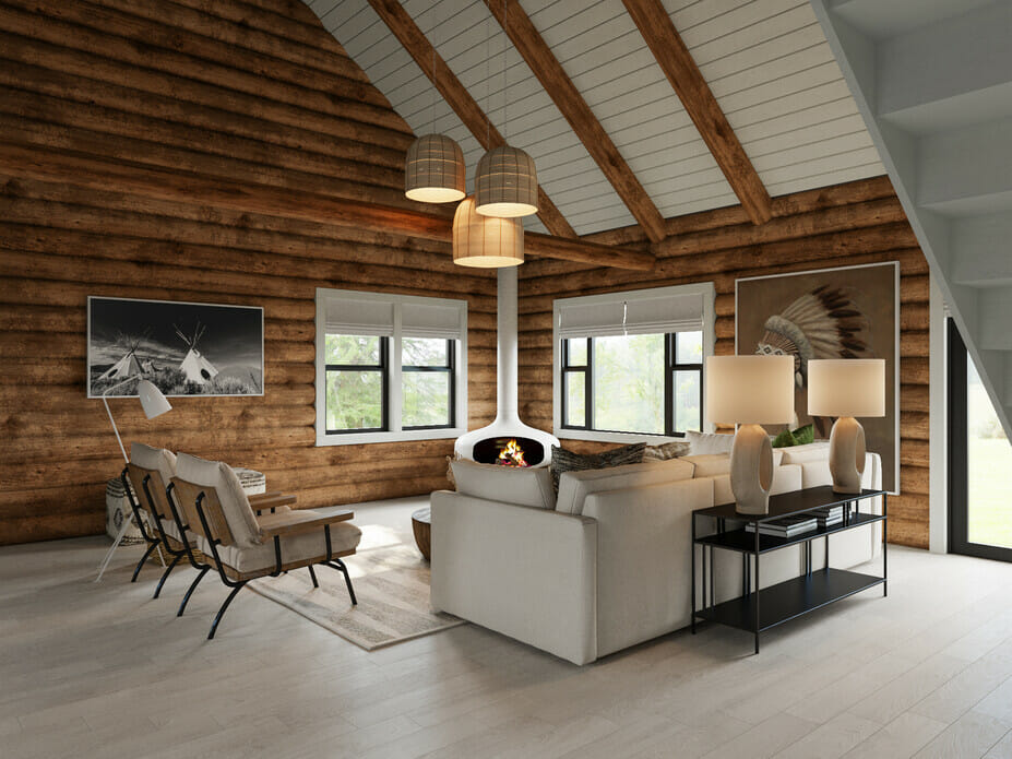
Keep to a natural flow within your interior. Use a floorplan to pick the best layout per room and keep in mind that you should be able to enter and exit the space via the same door. Keep walkways clear and allow for enough space between furniture. Remember: moving around freely is vital to a happy interior.
10. Holding on to Outdated or Inappropriate Furniture & Décor
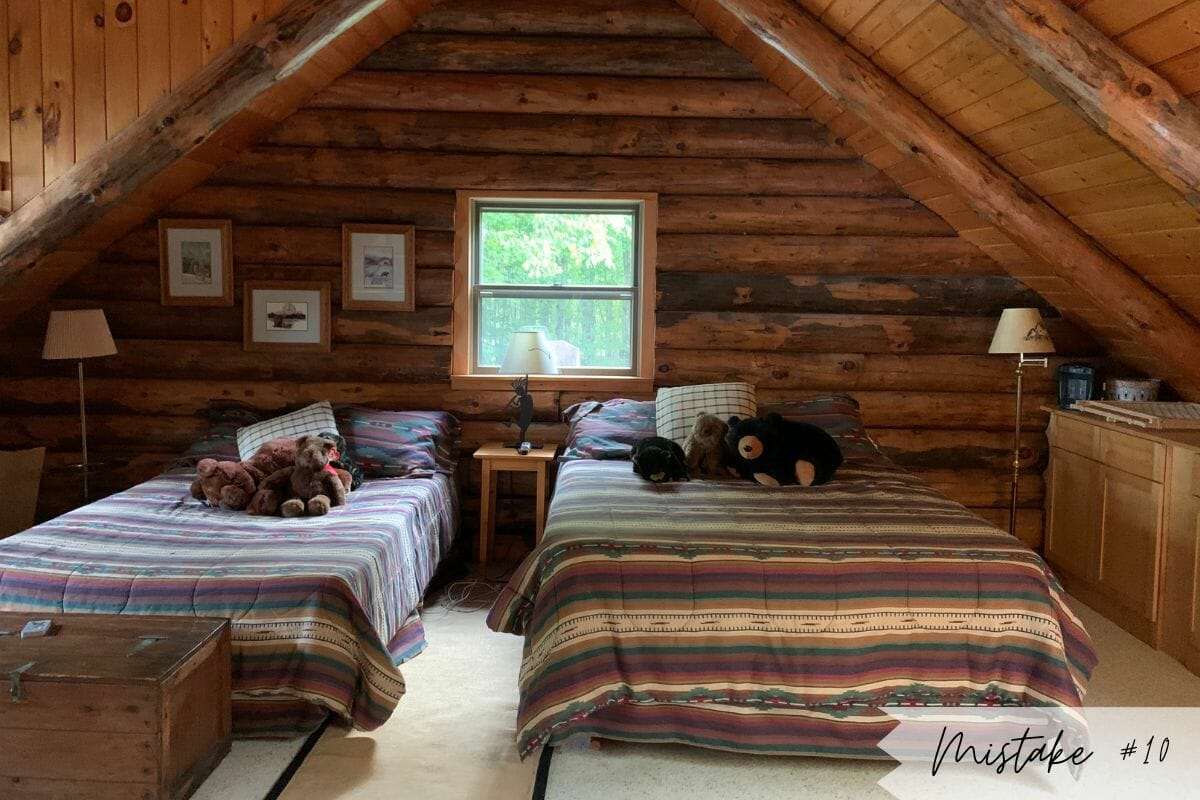
Outdated furniture and décor are typical in interiors rigidly decorated in a certain style or on the whim of trends. Some aged pieces can look stunning in a design, but they need to be incorporated into a cohesive and beautiful whole. In addition, be aware of the age appropriateness of decor pieces. Once the kids have grown up or moved out, store or donate those plush animal keepsakes.
The Fix: Update & Opt for Timelessness
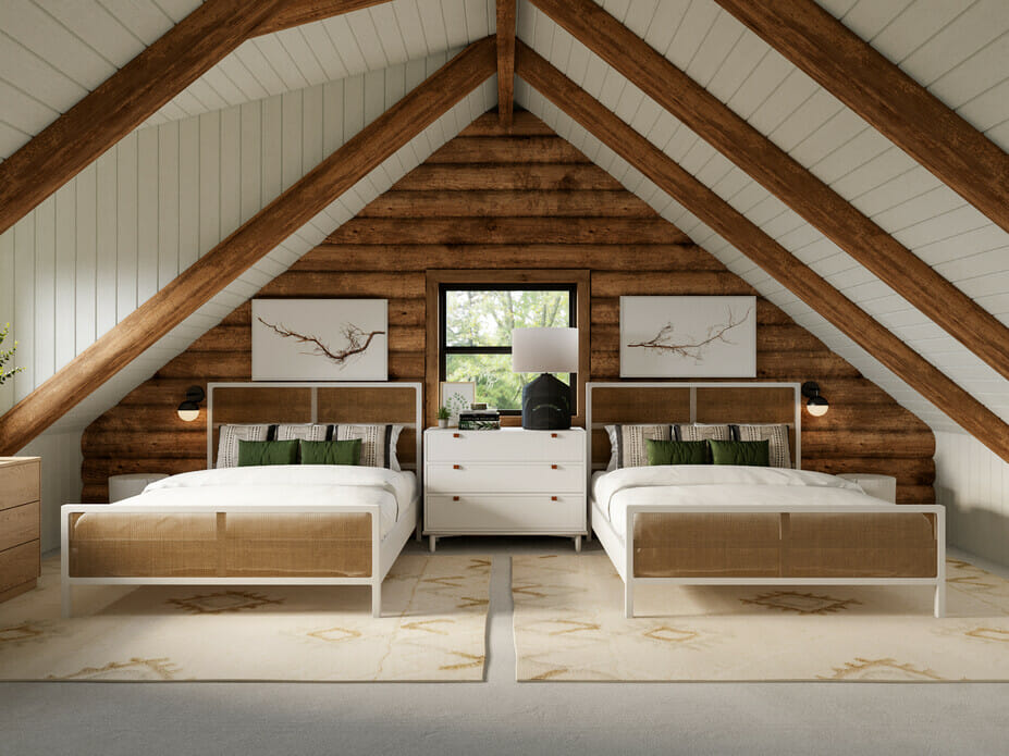
Choosing timeless pieces and accessories is a sure way to make an interior look beautiful regardless of the era. Stick to simple lines and color palettes as your base. You can always spruce up the look with a trendy lampshade or scatter pillow to refresh things later on.
11. Neglecting Texture
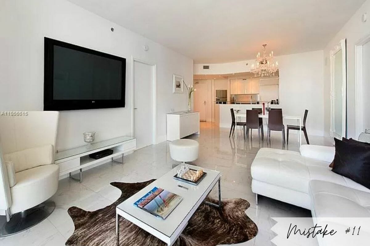
Even if an interior has great furniture, it won’t feel right when everything has the same finish and texture. We function on a multi-sensory level. With this in mind, visual and tactile elements should enhance our experience of a room.
The Fix: Spice it Up
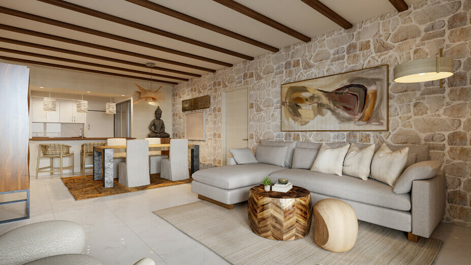
Add depth through various textures, sizes, and heights. Wallpaper and paint effects can create a beautiful backdrop but don’t forget the ceiling. Paint, panels, and moldings can do wonders for the overall feel of a room. You can also bring in lovely tactile elements in the shape of rugs and organic décor or accent tables.
12. Incorrect Curtain Size & Height
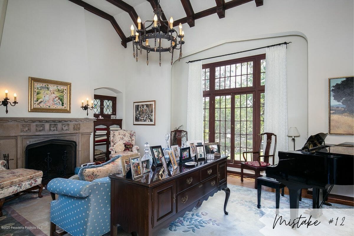
And finally, the worst of all interior decorating mistakes: incorrect window dressing. This is because of how big an impact it has and how easily it can elevate an interior to a stunning level. Curtains hanging just above a window or too far from the ground are bound to cause eyesores.
The Fix: Be Generous
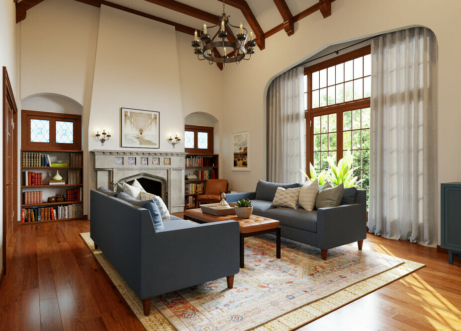
Frame your interior with curtains bigger than you initially think you need. When hanging curtains correctly, you should install the rod higher (4-6 inches above) and wider than the window frame to make a room seem taller and more spacious. Also, consider layered window treatments when you want blinds. Soft, flowy drapes just have a way of bringing an elegant air into any room.
Need help fixing interior design mistakes?
Our team of talented interior designers can help turn any space from “oh no!” to “OMG!”. Schedule a Free Interior Design Consultation to learn more about your design options today!

[images: 1, 2, 3, 4, 5, 6, 7, 8, 9, 10, 11, 12, 13, 14, 15, 16, 17, 18, 19, 20, 21, 22, 23, 24, 25]




Comments