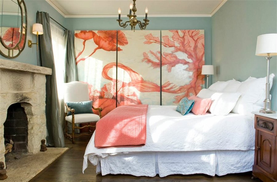
Our interiors have been moving toward vibrancy and life. In textiles, art, and décor we see lively color and motifs take over once serious rooms. After patterns and the blooming obsession with plants, it’s color’s time to shine. Pantone’s color of the year 2019 is the conglomeration of all the vibrant trends of the past few years. This means you don’t have to rely on feminine florals or a green thumb to liven up your interior. All you need is a splash of Living Coral, and here’s how to do it!
1. Add Coral
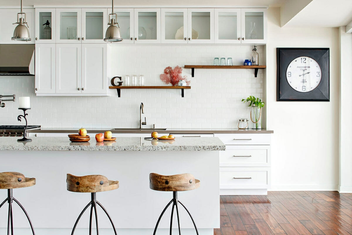
Take the trend literally. Art prints and coveted seascape photographs with coral its subject can make a striking focal point. Frame images of coral to enhance a nautical, contemporary or organic home interior. Alternatively, you can incorporate pieces of coral into your décor.
2. Start with Small Pops Of Pantone’s Color
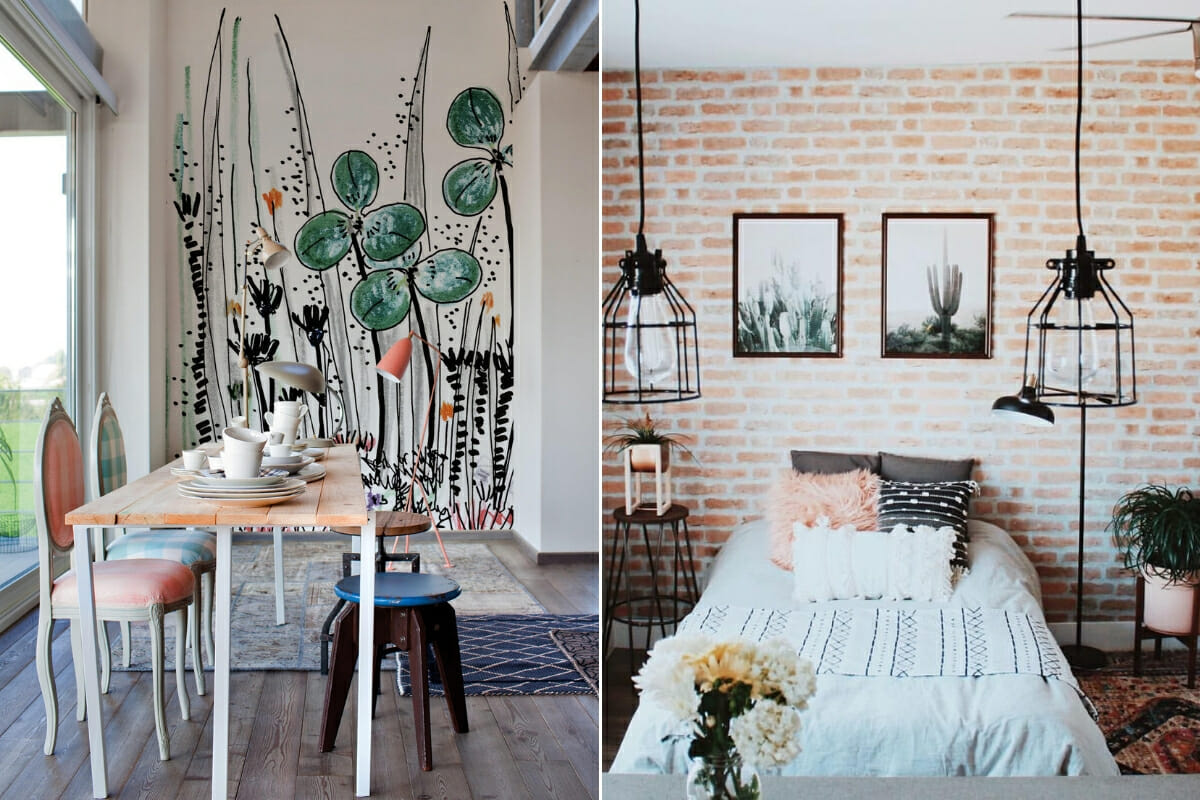
When it comes to trends its best to start small to discover what you like instead of diving in head first. Smaller pieces in the Pantone color of the year 2019 can have a big impact because of its warm and bright pink and orange hue.
3. Update Décor First
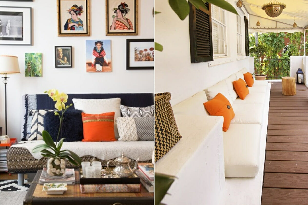
A decorative element is an ideal vehicle to test a new Pantone color of the year. Chose items that you tend to replace seasonally and that won’t make too large a dent in the home budget. Textiles, crockery, and plants are good starting points. With textiles, you can try new scatter cushions, rugs, throws or curtains. Fortunately, if you are reluctant to try bold new paint color schemes, you can incorporate a delicate or faint color detail into a woven upholstery or fabric.
4. Get a Temporary Fix
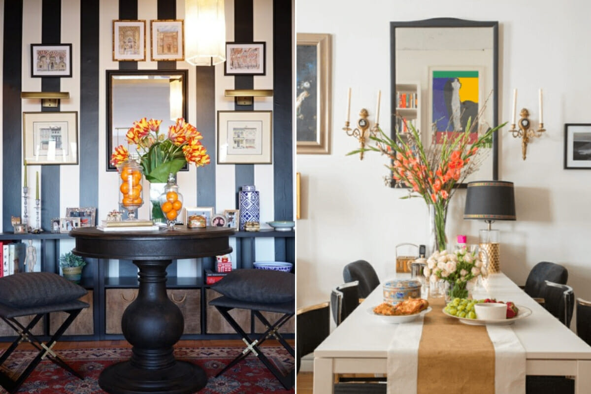
Get the ultimate quick fix with fresh cut flowers or pot plants that flower. Penhill Watermelon or Great Silence dahlias, snapdragons, tulips, and peonies are a few of the many flower varietals that available in Pantone’s coral hue.
5. Opt for Youthful Botanicals with Pantone’s Color of the Year
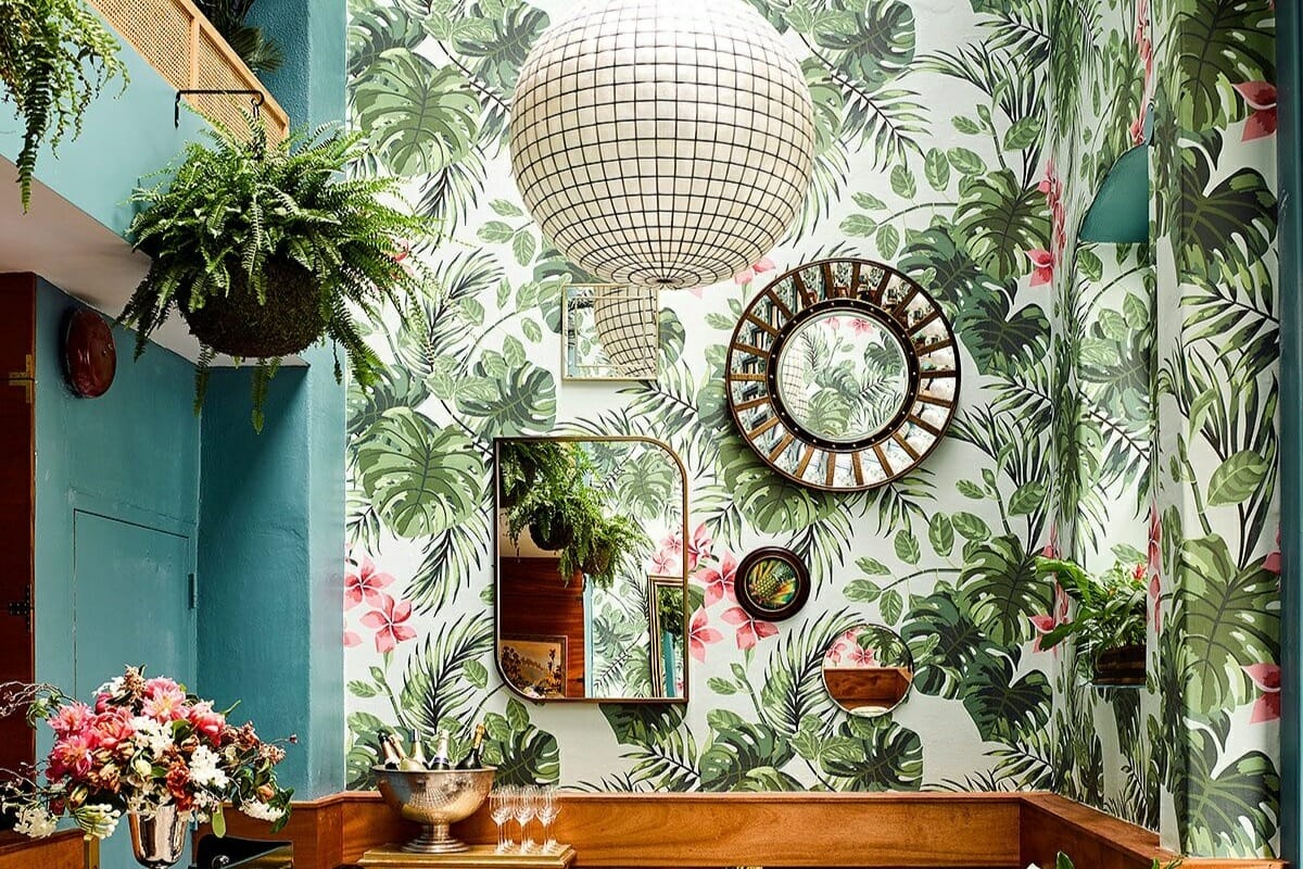
The Pantone color of the year 2019 is the epitome of the floral movement in interior design. Without motif or pattern, living coral is intrinsically feminine and undoubtedly spirited. So now, instead of the realistic florals of 2018, we’re moving toward stylised analogous or monochromatic prints with a touch of wow. Therefore, choose florals with a hint of coral to boost your interior.
6. Create a Coral Focal Point
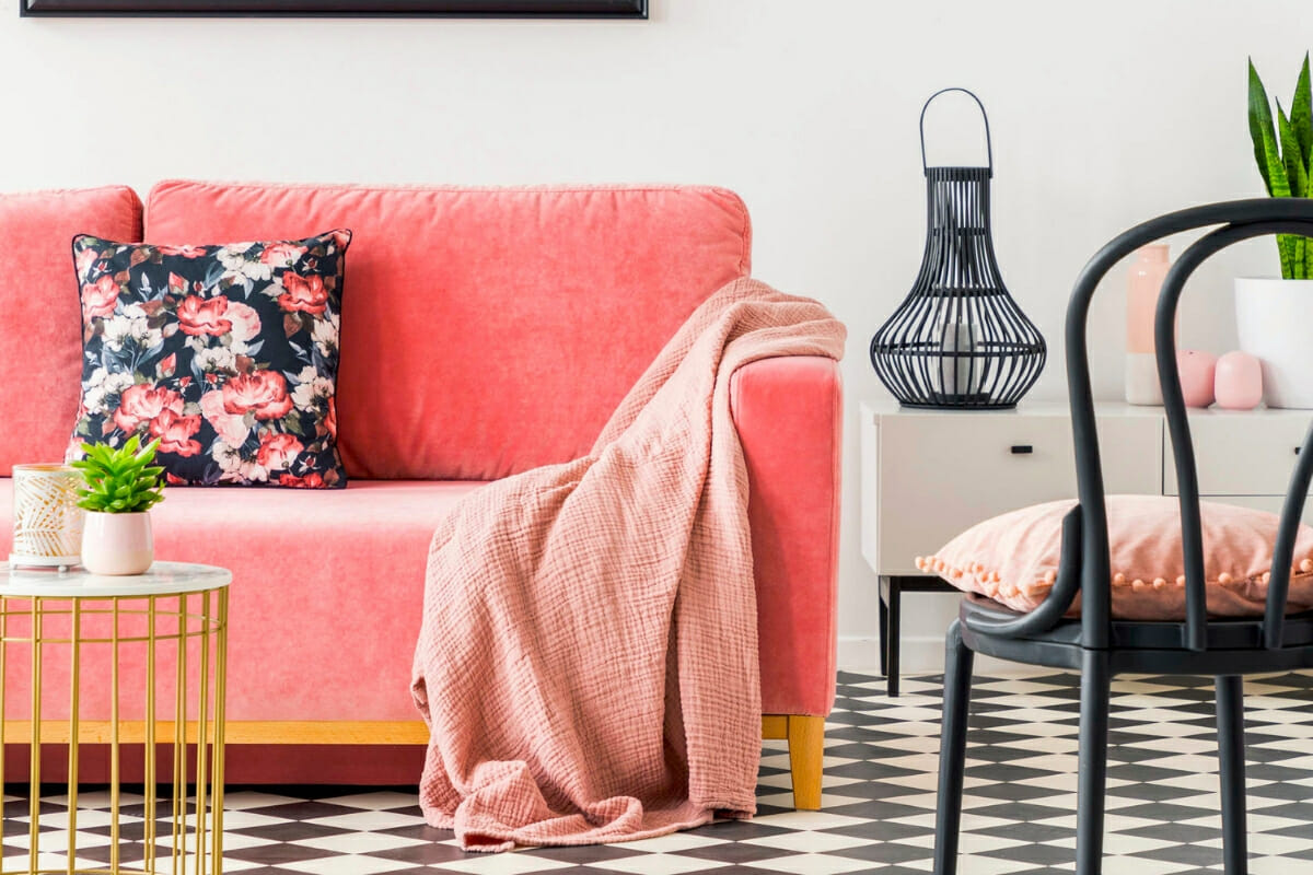
The feature sofa of choice was was velvet emerald last year and this year it’s velvet coral. Create a focal point with as ultra-luxe chaise or make the most of last year’s trend by complementing your cool toned green sofa with the warmth of a living coral throw or scatter cushion. Or, splash out with a bold feature wall in this warm hue.
7. Warm Up Cool Color Schemes
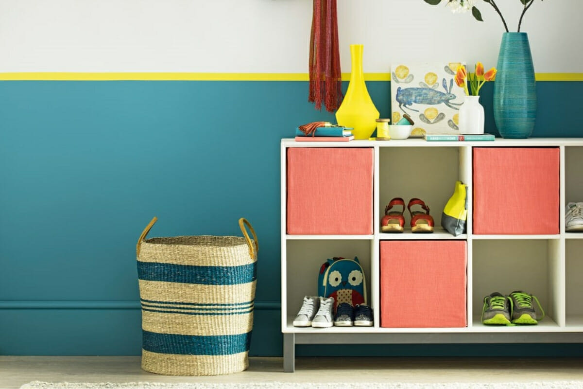
The orange undertone of Pantone’s 2019 color of the year makes it a perfect complementary hue to cooler tones like blues and greens. In desaturated and moody color palettes living color will contrast and energize the interior.
8. Enhance Subdued Pastel Colors
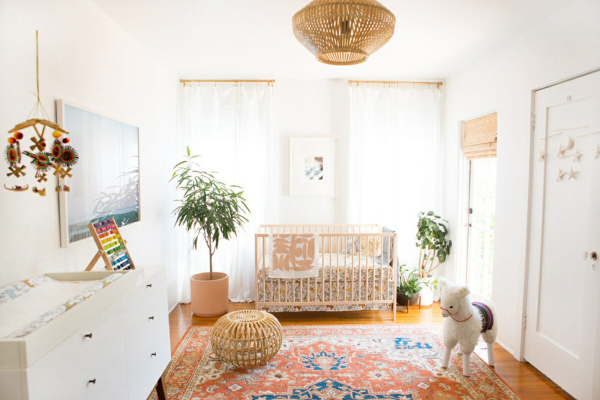
Living coral is a versatile color because it is not as dominant as primary reds and oranges, which mean this color trend can complement cool palettes with ease or enhance a pastel color scheme in a subdued way. Take a mild approach to the Pantone color of the year by pairing it with an analogous color scheme or enhance the earthy tone of a natural-inspired interior.
9. Brighten Dark Places
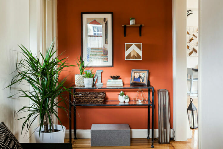
Thanks to the warmth of Pantone’s color of the year 2019, Living Coral will work well with most paint color schemes. Second only to its versatility, living coral can make a room seem brighter than it is. The sunny hue will add warmth to any dark interior. Brighten small spaces like a walk-in closet or powder room to see the effect soon.
10. Neutral Nurseries with Pantone’s Color of the Year
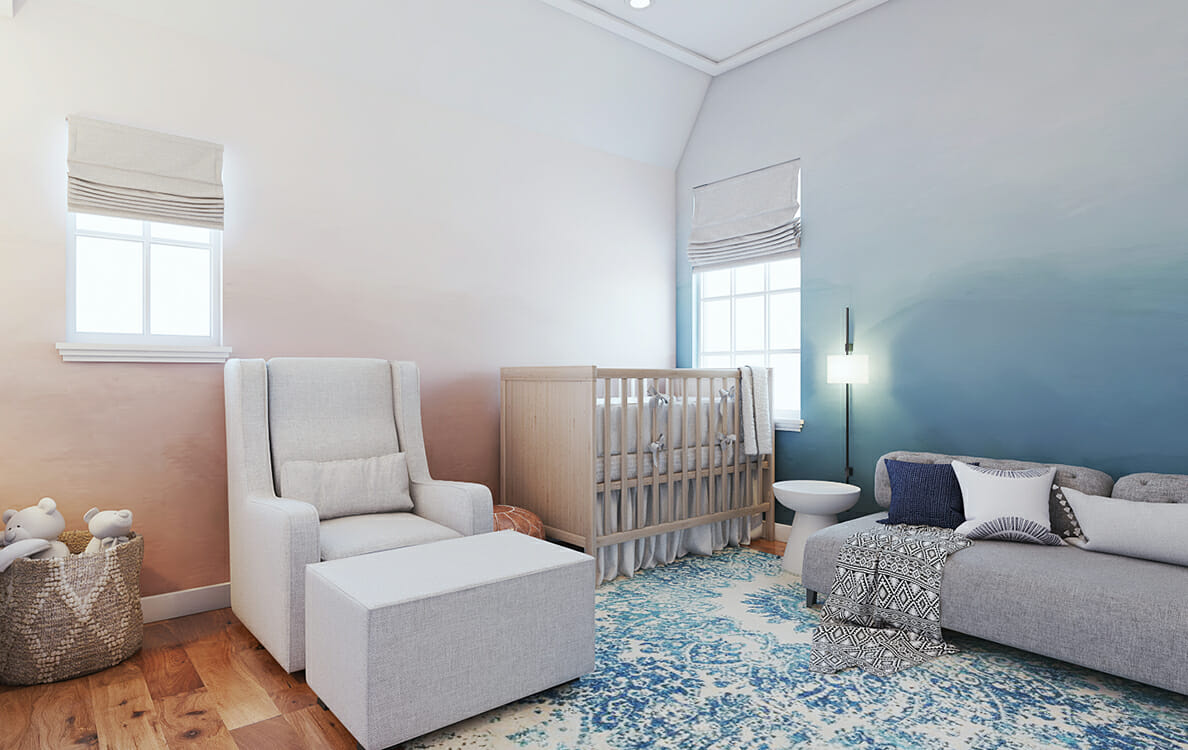
Alongside the Pantone color of the year 2019, other trends have been growing. One of which is a neutral nursery. Although unconventional, living coral can be suited to either gender due to the fact that we can’t quite categories living coral on the color scale. This means the color works well with cool and warm colors.
In a nursery, use living coral in natural or organic materials. These items normally have a warm undertone which the bright orange-red can replace. Alternatively, follow Lauren’s lead by placing a living coral ombre wall next to a contrasting blue ombre.

Now that you know how to use living coral, it’s time to try it out. We’re here to help. If you’re unsure about how to go about decorating your home with the Pantone color of the year for 2019, contact Decorilla and schedule a free chat today!


Comments