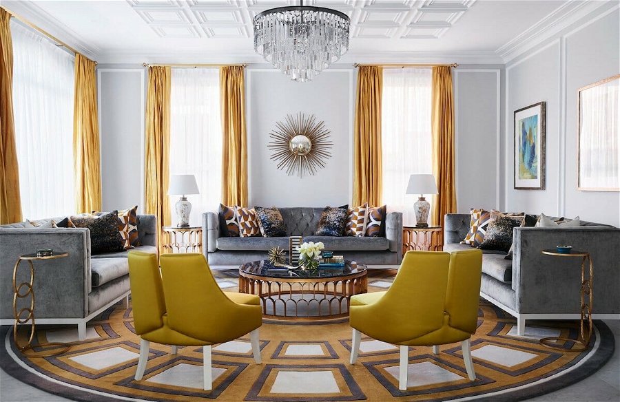
Pantone has revealed it’s 2021 Color of the Year, and this time around, it’s two shades: Ultimate Gray and Illuminating. These hues’ psychological values of warmth and dependability cater to what we need in uncertain times. Pantone Institute describes Illuminating as “a bright and cheerful yellow sparkling with vivacity, warming, imbued with solar power.” Simultaneously, Ultimate Gray is solid like pebbles, emanating “dependable elements which are everlasting and provide a firm foundation.” Needless to say, we can indeed do with more of these qualities. Read on for expert tips on how to style these contrasting colors in your home.
Announcing Pantone Color of the Year 2021
PANTONE 17-5104 Ultimate Gray
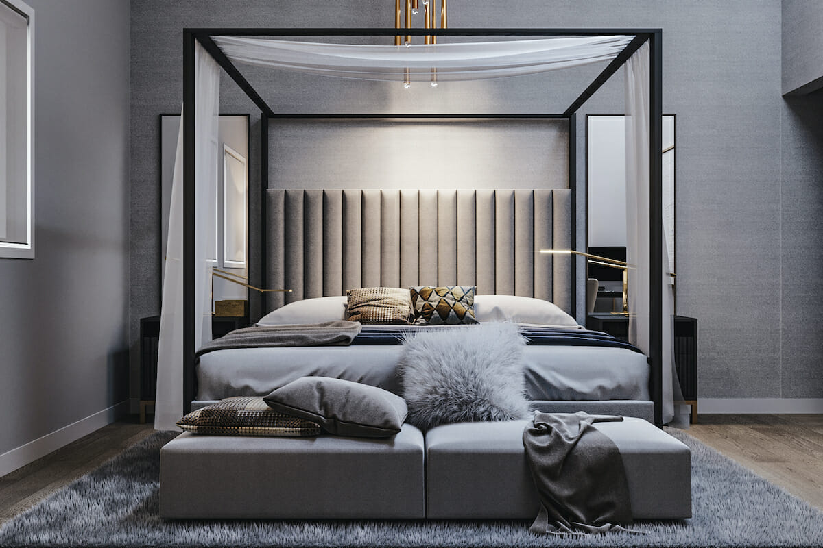
Gray is quite timeless, independent of trends and styles of a moment, and is a great color for tranquil environments. A saturated alternative to white, it presents a perfect neutral background that fits most designs and room functions.
Even better, gray is so universal that it works as a backdrop for any color, or many of them at once. Nothing emphasizes a dramatic statement piece of furniture or art more convincingly than a monochromatic gray environment.
PANTONE 13-0647 Illuminating
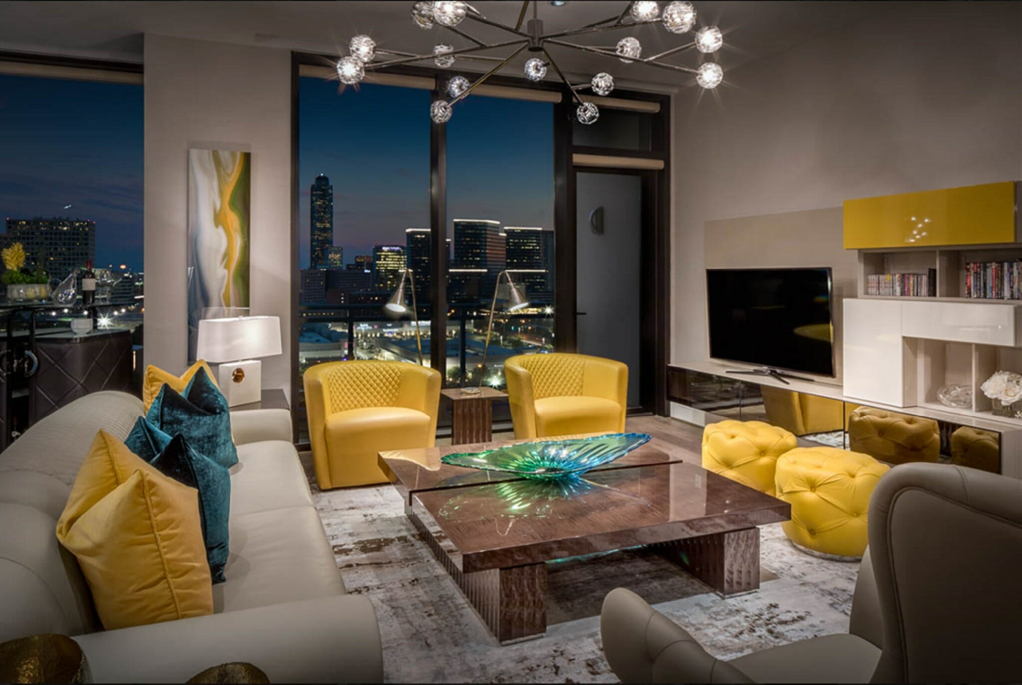
A bright yellow is powerful and energizing, but can also be perceived as aggressive when overused. The rule of thumb is less is more. The joyful hue works its magic best as an accent, impacting all surrounding elements and the room as a whole.
Decorating with this Pantone’s color, cheerful lemony-fresh, brings joy to interiors, making them appear welcoming and radiant. That makes Illuminating ideal for entryways, hallways, and all spaces that need more natural light. A splash of yellow in the rooms you visit in the morning will help you feel more energized as you begin your day.
Ready to update your home with 2021 Pantone color of the year, but not sure where to begin? Schedule your Free Online Interior Design Consultation to get started with the finest interior designers today!
How to Style Pantone 2021 Color of the Year in Your Home
1. Accents Galore: Pillows, Throws & Rugs
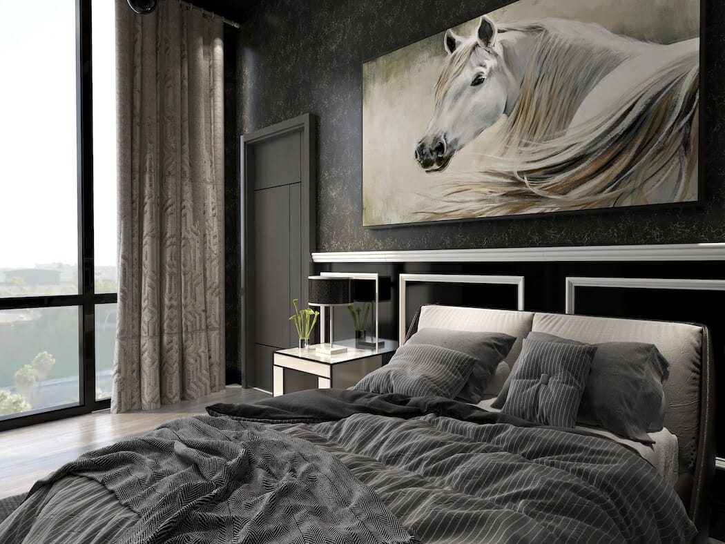
Gray is a neutral canvas for design, ideal for walls and rugs. When the setting is overly vivid, a gray rug and a couple of cushions can tone it down, balancing the interior. Even though it’s rarely seen as a hue for accents and accessories, gray can easily make a funky piece of furniture sophisticated. Furthermore, gray provides a grounding visual layer to a luxurious interior design as an all-neutral setting without compromising its classy vibes.
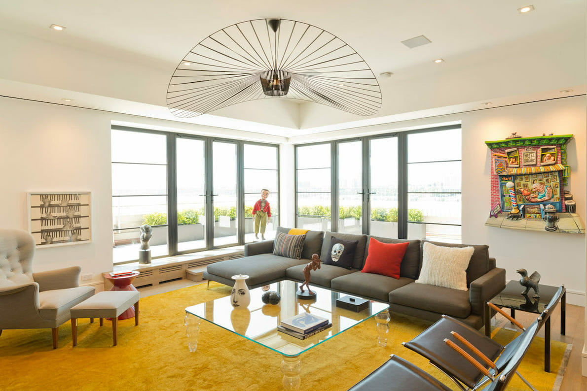
Yellow room decor can be calm, energetic, or even dramatic, depending on the sunny shade and overall palette. Sometimes it’s enough to add a bare touch of yellow to accentuate the whole space. Typically, this color works great against a black, white, blue, or gray background.
However, the ultimate flair of 2021 will be its fusion with dominating interior design and color trends: cheerful kaleidoscopic hues, earthy and jewel tones. Combinations of intense vibrancy, textures, and patterns will lead to the creation of some seriously striking visuals.
2. Feature Wall
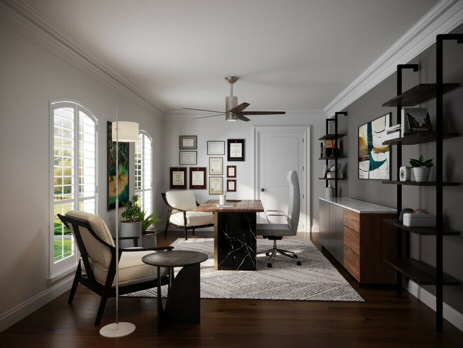
From a neutral backdrop to a feature wall, gray can convey any effect you want: classic or modern, soothing or dramatic, laid-back or highly sophisticated. A range of monochromatic gray shades can define a space as light and airy, refined yet with just the right dynamics. A slightly accentuated feature wall puts the final stamp on this design, emphasized by contrasting white borderlines.
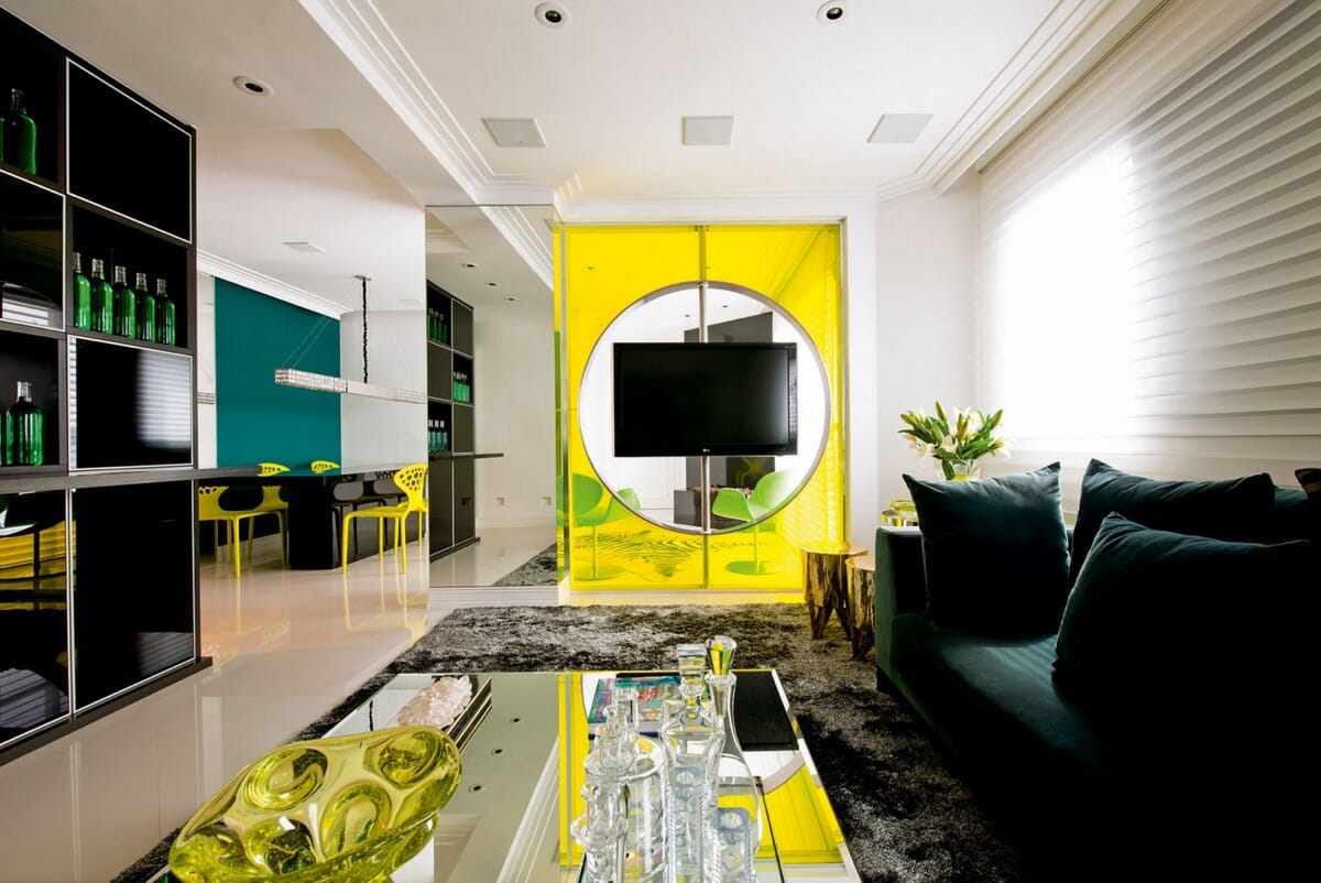
Pantone color of the year 2021 is named Illuminating for a reason. It’s bright and shiny, saturated and impossible to ignore. Those qualities work their best when used in moderation. Having this hue all around can be overstimulating and lead to feelings of anxiousness.
On the other hand, yellow is ideal as an uplifting feature wall, an eye-catcher that never fails to impress. Go one step further by using transparent materials, such as plexiglass, to impress and create a highlighting effect.
3. Pantone Color of the Year 2021 on Draperies
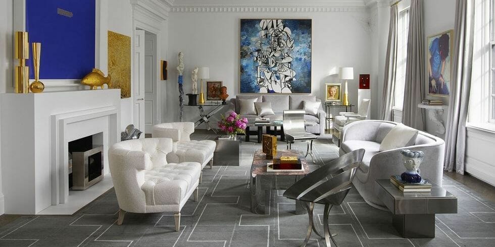
Gray curtains can add timeless style to any space, one that is neutral and resistant to changing trends. In muted or monochromatic settings, like the one pictured above, a neutral gray window dressing can add texture and softness. Their color blends into the background, while breaking the monotony of white without disturbing the continuity. Darker shades of gray can emphasize accents like throws, cushions, art, and other details for a cohesive look.
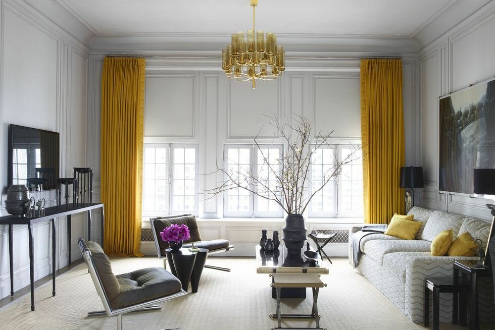
Jewel tone colors on curtains can help to insulate a room, and sunny yellow doubles the warming effect. Moreover, bright yellow drapes can optically increase a small space by promoting lightness and airiness. They work perfectly with dark neutrals, purple walls, and monochromatic schemes.
Surrounded by cold shades, Illuminating will convey strong energizing vibes without being imposing. Apart from the living room, try yellow curtains in the bedroom and kitchen to maximize their psychological benefits. Adding more sunny vibes to every morning can’t be a wrong move.
4. Furniture as a Focal Point
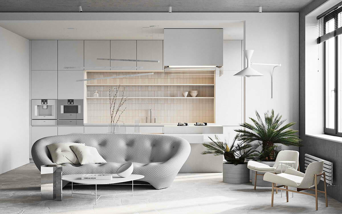
Can something calm, solid, and as inherently neutral as the Ultimate Gray be a statement furniture piece? Absolutely, it can! The trends which emphasize abstract art reflect even in furniture design. Curvy shapes and surrealist designs in neutral hues write a new page of refinement, one that works magic in minimalist interiors. Such items boldly dominate the low-key space without screaming, “I am King!”
Compared to typical contemporary furniture, a sculpted gray sofa lacks nothing in versatility. Accessorized and surrounded by abstract wall design and colorful details, it will feel equally at home in fashionable maximalist settings.
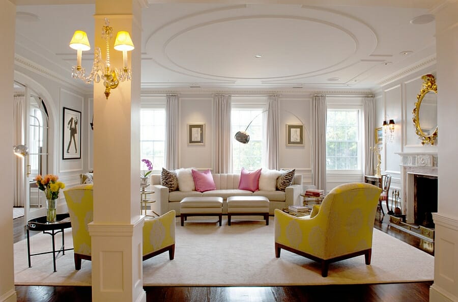
If you have been secretly dreaming about a bright yellow sofa, the Pantone color of the year 2021 just gave you a perfect excuse to create a bold statement. You can go for a new, fashionably abstract piece or update a vintage one with some sumptuous velvet. However, if you’re not ready to commit, just add a nice slipcover.
That said, a bright yellow sofa could be too much for some. If that is the case, a bright chair or two makes a great alternative. Playful interior-lovers can even opt for a cheeky option, like a yellow tea table.
5. Bathroom Tiles
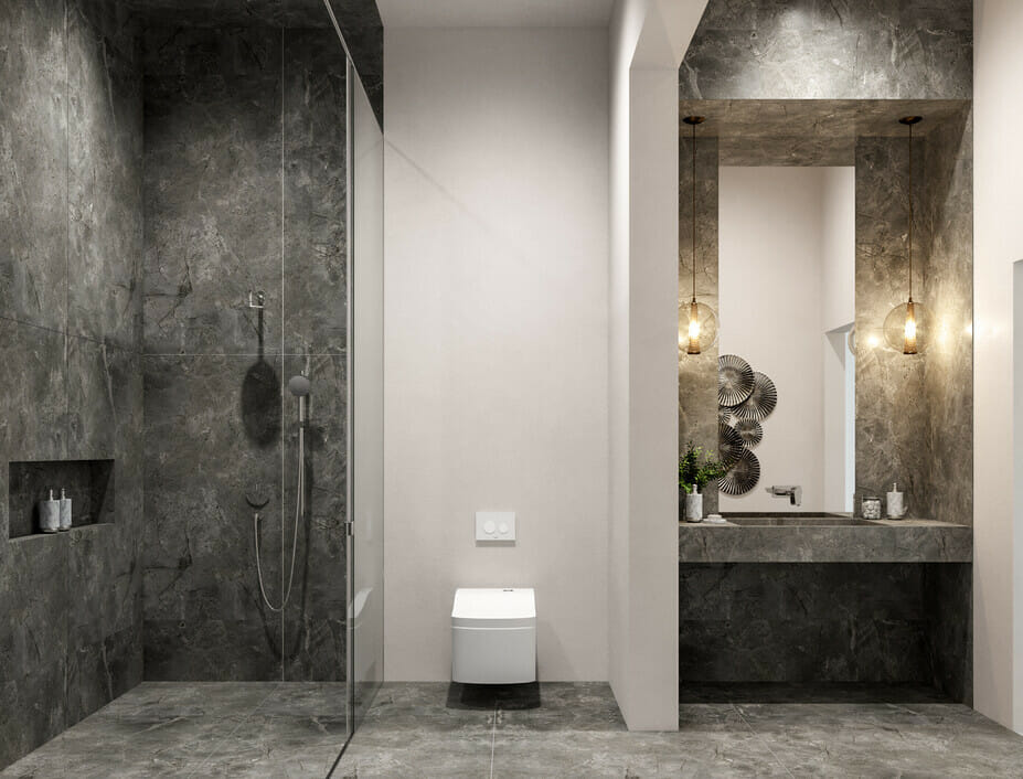
Gray bathroom? Of course, yes! It’s elegant, airy, and ready to accessorize in any possible way. With modern tiles available in a range of shapes, textures, and patterns, gray bathroom designs don’t have to look dull ever again. Besides, it comes with dozens of customization options.
A simple gray bathroom can change with the mood, turning from classy to funky with next to no effort. Also, a gray shower is easy to maintain and is a great alternative to a basic white. For more graphic action, opt for white tiles and a dark Ultimate Gray for grout.
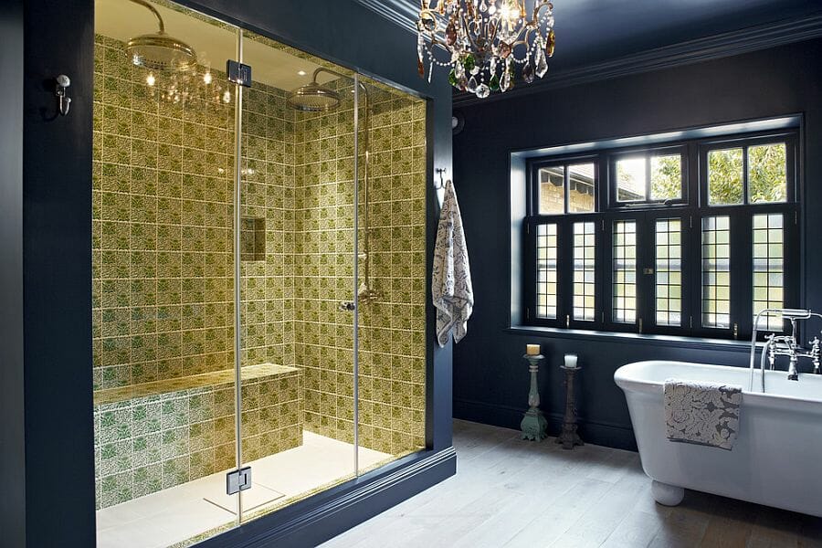
The Pantone color of the year 2021 combo is truly refreshing and works almost anywhere. A yellow floor or accent wall in an all-gray bathroom will certainly make a strong statement. Try it in the shower – either uniformly or by mixing complementary tiles in various shapes and patterns. If you prefer a more subtle look, pass one or two thin accent bands along white, subway-tiled walls instead. Such backgrounds are easy to decorate around.
6. Pantone Color of the Year 2021 on Dining Chairs
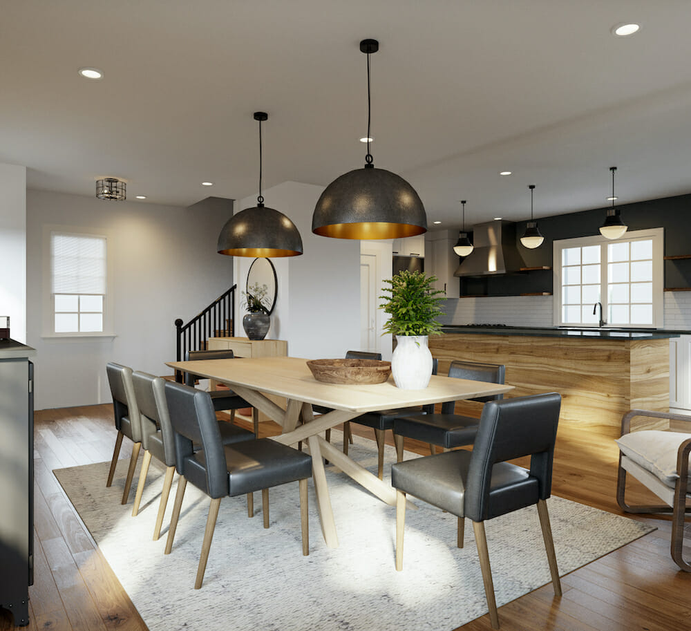
There’s a perfect gray dining chair for any style and setting. From Eames DSW to lavish wingbacks upholstered in velvet, gray dining chairs may be subdued in color but remain very classy and stylish. Traditional or modern, conservative or hip – they fit it all. These dining chairs aren’t going out of style soon, so this might be the perfect time to try it at home.
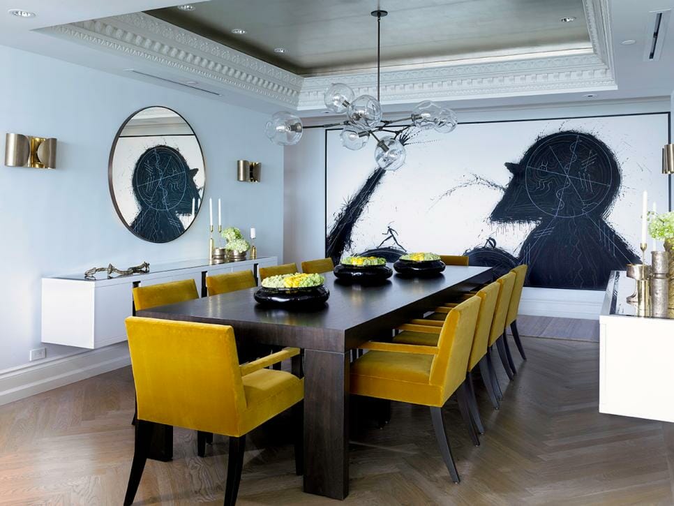
Industrial and rustic designs often rely on neutral, grounded color palettes. With a couple of yellow dining chairs, you can easily break the rules and earn style points in the process. By adding contrasts to a subdued palette, you put an authentic spin on the room. The same applies to traditional dining rooms as bright yellow upholstery will shake things up without crossing the borders.
7. Yellow and Gray for a Kitchen Backsplash
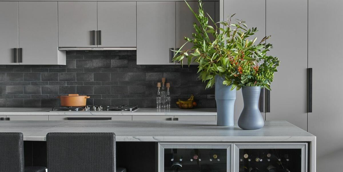
Hexagon tiles are an attractive and convenient choice for a backsplash, with a lot of space for customization. Intricate designs in gray and white or yellow add character and inspiration, sprucing up the whole kitchen. A similar visual effect can be achieved with heavily patterned, eclectic tile sets. For more discrete settings, however, use subway tiles in Ultimate Gray as a sophisticated solution.
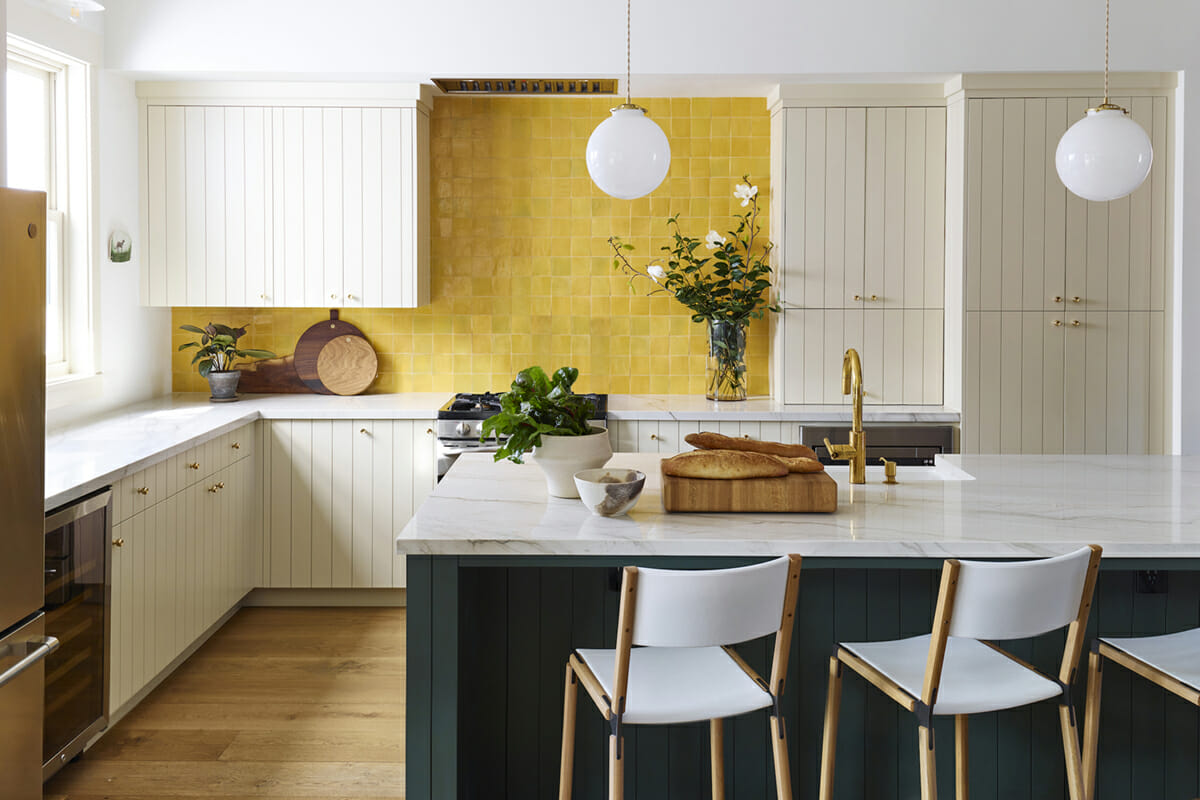
The Pantone color of the year mix is a blessing for small kitchens. This combination is renowned for tricking the senses into an illusion of spaciousness. A yellow backsplash and a couple of other accents, paired with gray and white, will instantly lift the space giving it a chic, contemporary appeal. Such a graphic pattern will raise visual interest. Similarly, adding some checkered black & white details can convey nostalgic mid-century aesthetics.
8. Color Trends Headboards
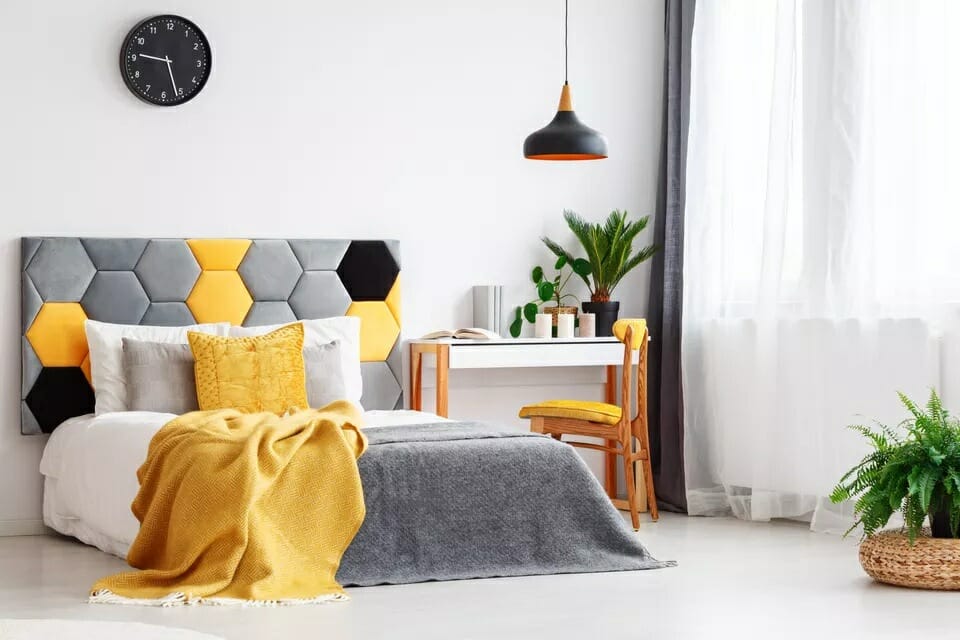
Hexagons are not only for tiles, they make great statement headboards, too. Adding a couple of yellow and black fields to a simple gray headboard turns the common into extraordinary. Strong neutrals, such as Ultimate Gray, need bright accents that prevent the interior from feeling sterile or dull. A touch of yellow adds just enough sparkle to make it work.
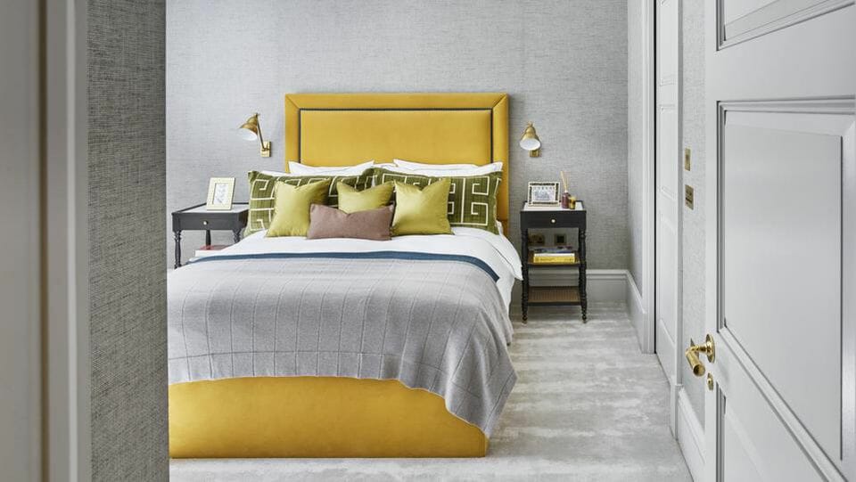
Alternatively, you can go for a prominent yellow headboard – or even the whole bed. A monochromatic backdrop provides a calm and secure resting environment that encourages sleep. Simultaneously, a cheerful, contrasting bed will make the mornings feel fresh and energized. Accessories in diverse textures and patterns will add an extra dimension and round-up the design.
9. Gender Neutral Kids Rooms
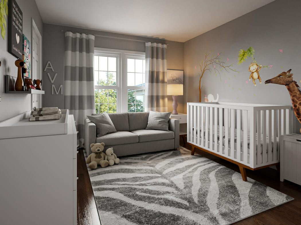
Long gone is the time when kids’ rooms had to be predominantly blue or pink. Still, even in gender-neutral rooms, everything starts with the right color palette. For children, dark walls are rarely a cool option, even if adults think so. Also, similarly to other rooms, a couple of well-curated accents work better than a full sensory invasion. Light gray makes a convenient backdrop, and the rest depends on your (and your kid’s) taste.
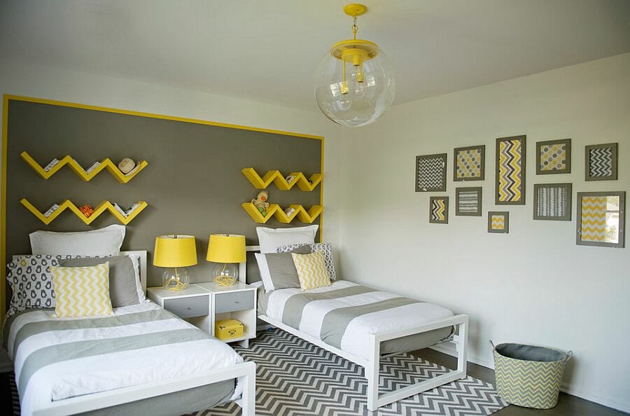
While both yellow and gray are favorites for gender-neutral rooms, they have rarely been used together. Yet, such a setting possesses all the right qualities. It’s tranquil, safe, lively, and inspiring. In short, a perfect place for resting, studying, and playing.
10. Home Office
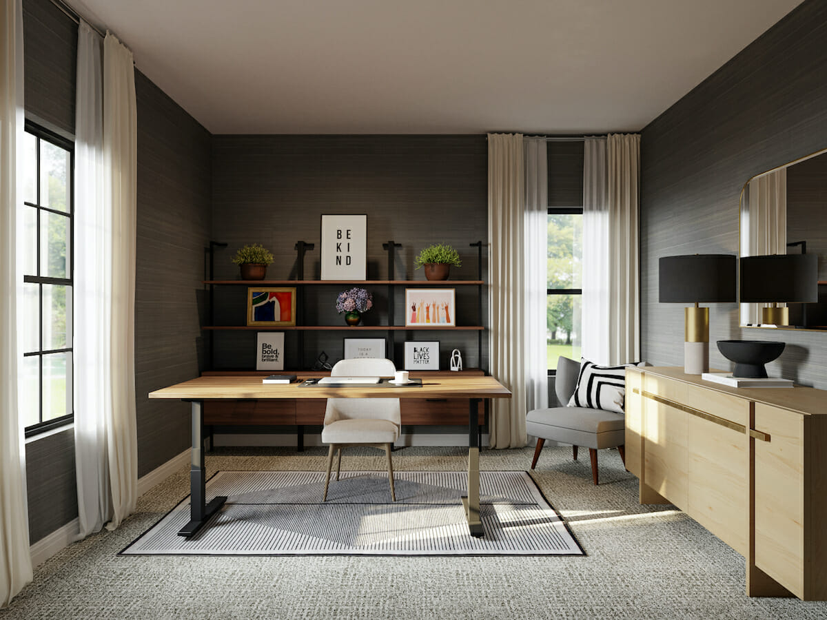
Gray has always had a distinct “business” look. Hence, it’s no wonder that it is the most popular home office color choice worldwide. It bears timeless tradition mixed with a modern sense of style. It’s neutral enough to allow customization and provide a convenient background for video calls. Also, it can be cold or warm, which makes it easy to use with a variety of themes and styles.
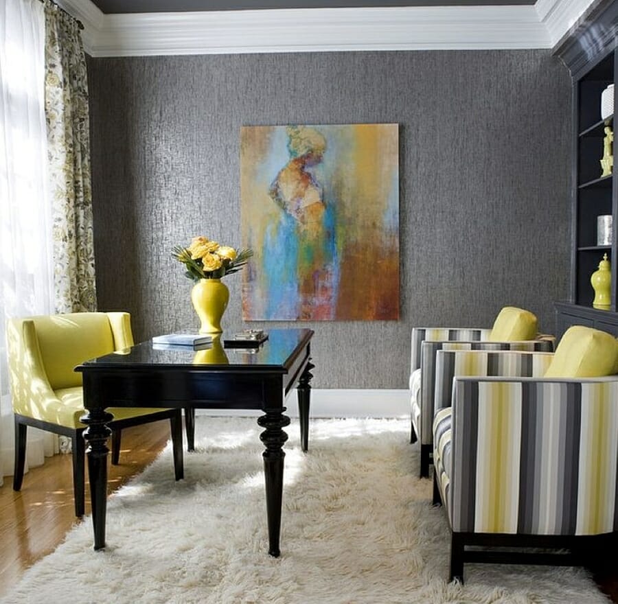
Next to gray, yellow provides as much contrast in look as in the reputation. Illuminating is rarely the first choice when talking business. However, in the right setting, it can be appropriate and invigorating. Too many neutrals in a home office can bring dullness and decrease productivity as a result. Yellow accents, on the contrary, have a positive effect on motivation, energy, and mood.
Still not sure exactly how to use Pantone color of the year 2021 in your home? Schedule a Free Interior Design Consultation for help from the finest interior designers today!
[images: 1, 2, 3, 4, 5, 6, 7, 8, 9, 10, 11, 12, 13, 14, 15, 16, 17, 18, 19, 20, 21, 22, 23]


Comments